Shein is one of the most considerable digital clothing retail platforms that provides its customers with a broad spectrum of goods including male/female and children’s wear in various categories: boots, accessories, and home goods. Today, it has physical outlets in 220 nations and regions. They offer many platforms to buy: website, mobile, and physical.
Meaning and History
![]()
The name “Shein” carries a sense of style and elegance, representing a fashion-forward brand that caters to the modern generation. It is composed of two words: ‘shine’ and ‘inside’. Previously, this combination was more visible, as the original name was Sheinside.
Founded in 2008, this digital storing chain quickly gained popularity by offering a wide range of stylish apparel, accessories, and beauty goods at competitive prices. With a customer-centric approach, Shein has created a global community of fashion lovers who appreciate its on-trend designs.
Throughout its journey, Shein has participated in prominent events that have solidified its position as a leading fashion brand. Collaborations with influential fashion bloggers and social media influencers have generated buzz and expanded its reach. Shein’s frequent releases of new collections and its engagement with fashion enthusiasts on various online platforms have further established its presence in the industry.
What is Shein?
Shein is an online fashion retailer renowned for its trendy and affordable selection of apparel, accessories, and other goods. They also have physical outlets in 220 countries, and a customer base spanning the globe.
2011 – 2012
![]()
The 2011 Shein logo showcased the original name “Sheinside” in jet symbols without serifs. The standout feature was the stylized “S,” with a combination of thick and slim lines, including a double line segment. The logo was complemented by the registered trademark symbol in the upper right corner.
2012 – 2013
![]()
The logo saw a subtle change with the addition of elegant serifs to the capitalized “I,” while the other letters remained untouched.
2013 – 2015
![]()
Soon after, the lowercase “i” was reintroduced, accompanied by wider and taller lowercase letters with close spacing,
2015 – 2016
![]()
In 2015, the official name was shortened to just ‘Shein’ It was accompanied by the transformation of the official signboard, which included two title case characters, ‘S’ and ‘I’, whereas the ‘I’ was executed in the style of 2012 logo. The other characters were lowercase and got tiny serifs. The word was split into two parts, ‘She’ and ‘In’.
2016 – 2017
![]()
In an attempt to create a more stylish and daring look, Shein’s brand designers italicized the moniker and removed the serifs. The new typeface appeared thicker, exuding a sense of power. Retaining the familiar black color and incorporating the recognizable “S,” the logo enabled consumers to quickly align it with the brand they know.
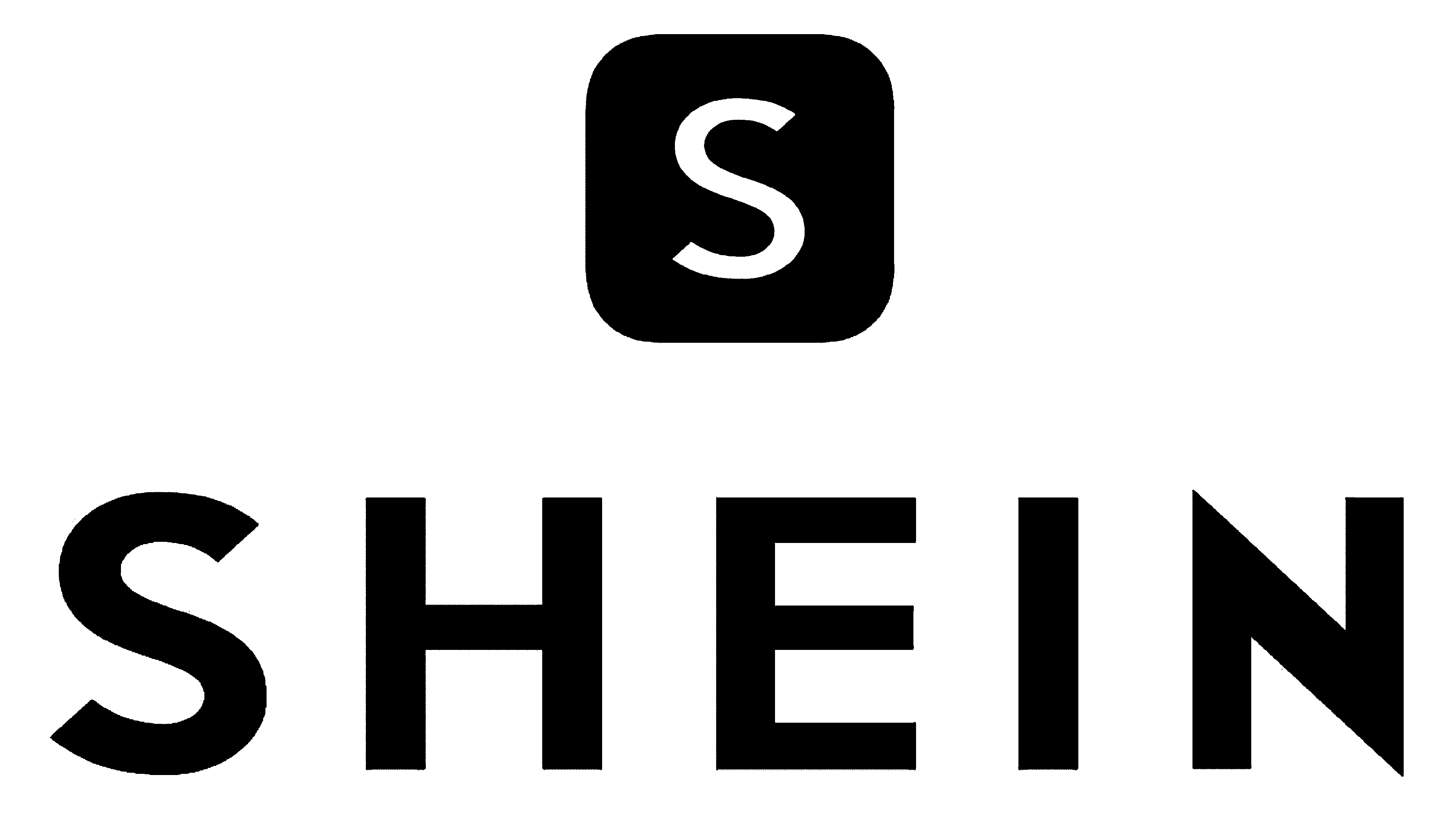
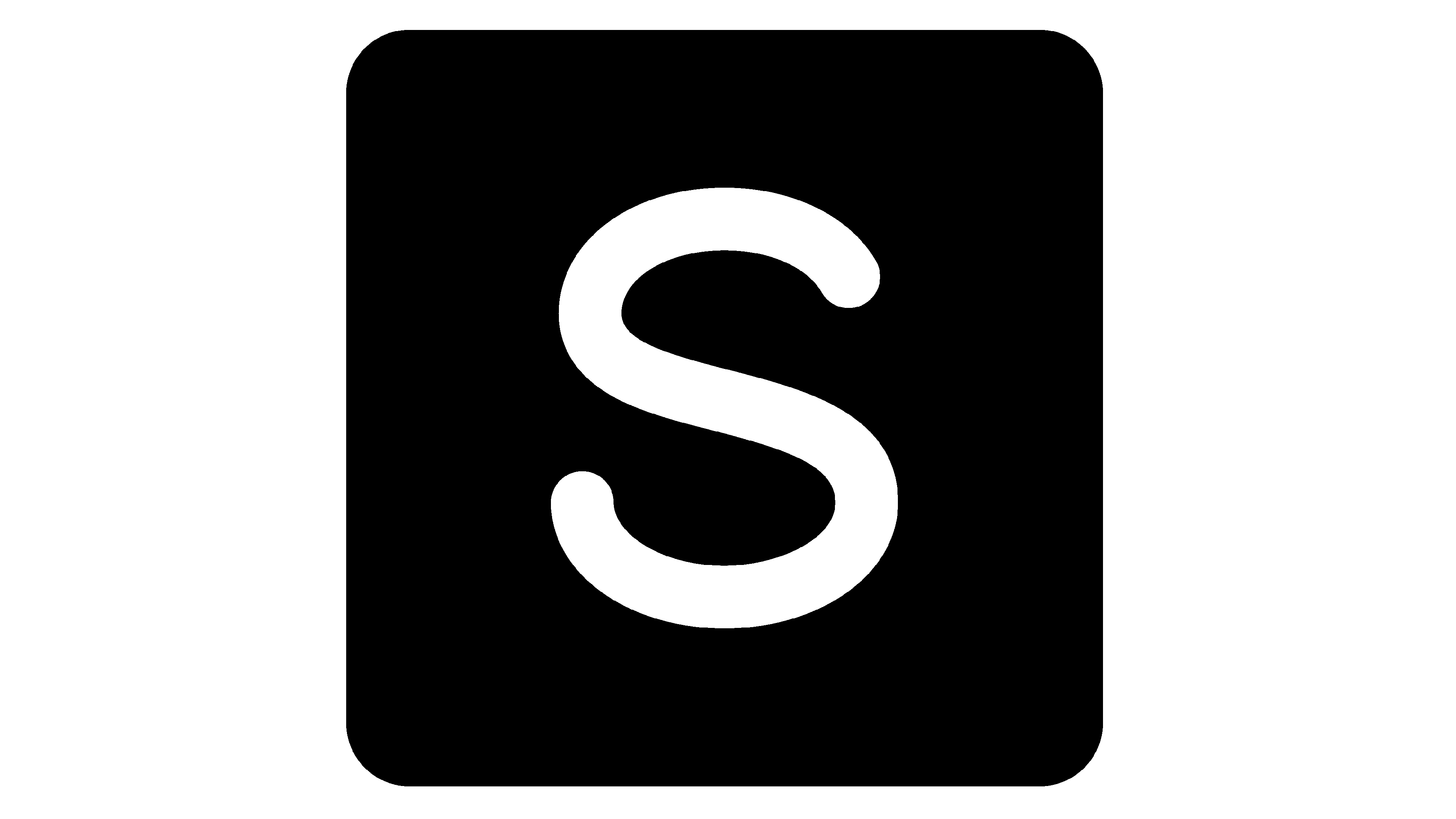
2017 – today
![]()
The brand’s latter logotype features a classic and minimalistic appearance. The new design depicts the thick capitalized characters under a quadrangle with rounded corners. At its center, the white capital ‘S’ finds its place.
Color
Like many other fashion-related brands, Shein chooses classic black and white as its main color code.
Font
Today, Shien uses a minimalistic typeface that features extra bold characters with wide gaps in between. Additionally, the last ‘N’ has gotten sharp upper left and lower right tips.