Roblox is more like a playground rather than a standalone game. Like Minecraft, it is probably closest to the idea of a metaverse. With a large user base of millions of people, mostly children, from all over the world, Roblox provides a virtual world in which children can create their own games and share their ideas with a community of like-minded people. The games here are free, but one can use Robux (internal currency) to buy virtual characters, upgrades, etc. While this is a very popular game, parents should keep in mind that it doesn’t mean there aren’t some potential dangers in some corners of Roblox.
Meaning and History
![]()
Founded on September 1, 2004, Roblox was the result of the work of David Baszucki and Eric Cassel. Its name is a play on the words “robot” and “blocks”. The platform itself was launched two years later, in 2006. It all started with Roblox Studio: a playground where developers could build their games. Before that, though, David launched an Interactive Physics project in 1989. Since kids liked it, he decided to create a 3D game design platform, which he called GoBlocks. Then, they wanted to use “DynaBlocks” for the name, but it was decided to create a simpler and easier-to-remember name. In 2020, due to the pandemic, the number of Roblox users began to grow rapidly, reaching over 30 million per day. Recently, thanks to this popularity, Roblox has become the most valuable company in the world in its market.
What is Roblox?
Roblox is a free platform that provides its users with the ability to build their own games and share them with others. This is a unique interactive environment that combines an exciting game world and the functionality of an educational visual designer.
1989 – 2007
![]()
It is the logo for “Interactive Physics,” which is a physics simulation software. The logo features a stylized, cursive inscription of the words “Interactive Physics” with a distinctive red color. The text is slightly tilted upwards to the right, giving it a dynamic feel. The “Physics” part of the text is underlined with a swooping curve that starts from the letter “P” and underlines the rest of the word, emphasizing the subject of the software. The background is white, contrasting with the black and red text, and the overall aesthetic is somewhat playful and educational, suitable for an educational software tool.
2003
![]()
Before Roblox came to life, the name “DynaBlocks” was a serious consideration. It was printed using Arial Black and featured unique colors for each symbol. At the end of the name, there was a bold, black dot and the word “Beta” printed in a smaller, fine print. Considering that it was intended for games, the fun colors were very appropriate.
2003 – 2004
![]()
The alpha version of the website we know today was titled GoBlocks. It used rather traditional green and blue colors along with a basic, sans-serif typeface. In the end, it said “alpha” in smaller font. Although professionally looking, the logo did not have anything unique about it.
2004
![]()
Although the previous logo did not stay for long, the idea of fun, diverse colors were preserved. The founders even used a similar font – Arial Bold. The first letters were capitalized and dark blue. The other colors included different shades of green, orange, red, and purple. A gray shadow behind all the letters gave the logo a more cohesive look. The word “beta” was printed in a smaller font using all lowercase letters.
2004 – 2005
![]()
The beta logo versions were great, but the actual logo the company used on the website had a completely different feel. It featured geometric, sharp lines forming the name of the company. They were white or silver and had a shadow behind them. Each letter also had a thick red outline, which added to the overall boldness.
2005 – 2006
![]()
The updated version has a lot in common with the previous one. The letters were printed using a different font and had a 3D appearance, which was enhanced by a blue-and-white metallic gradient. The father-in-law of David Baszucki brought it to life. It was used until the website was officially launched.
2006 – 2009
![]()
The logo designed by Mike Rayhawk became an official logo. It featured funky letters that overlapped each other and had varying thicknesses of strokes. All the letters were uppercase. The lettering itself was done in white, while a red outline made them pop against almost any background.
2007 – 2009 (secondary), 2009 – 2010
![]()
Although at first sight the logo stayed the same, it was slightly modified to make the lines look cleaner when enlarged or printed. Otherwise, the logo introduced back in 2006 was used until 2010.
2010 – 2015
![]()
The logo created by Mike Rayhawk underwent some changes again. The red outline now had a thin darker outline on the inside and outside. The bottom also looked darker. These modifications made the letters look three-dimensional and more stylish.
2015 – 2017
![]()
Although the modifications done in 2010 gave the logo a new look, the company decided to go back to the original. It surely had a more modern look.
2017 – 2018, 2018 – 2022 (secondary)
![]()
The only thing a new design had in common with other logos is the red color. The logo featured a modified Gill Sans Ultra Bold. A unique feature of this logo was two “O”s that looked like squares, one of which was tilting to the right. It added some dynamics and reminded of building blocks. Mike Rayhawk had similar ideas when he was developing the logo back in 2006.
2018 – 2022
![]()
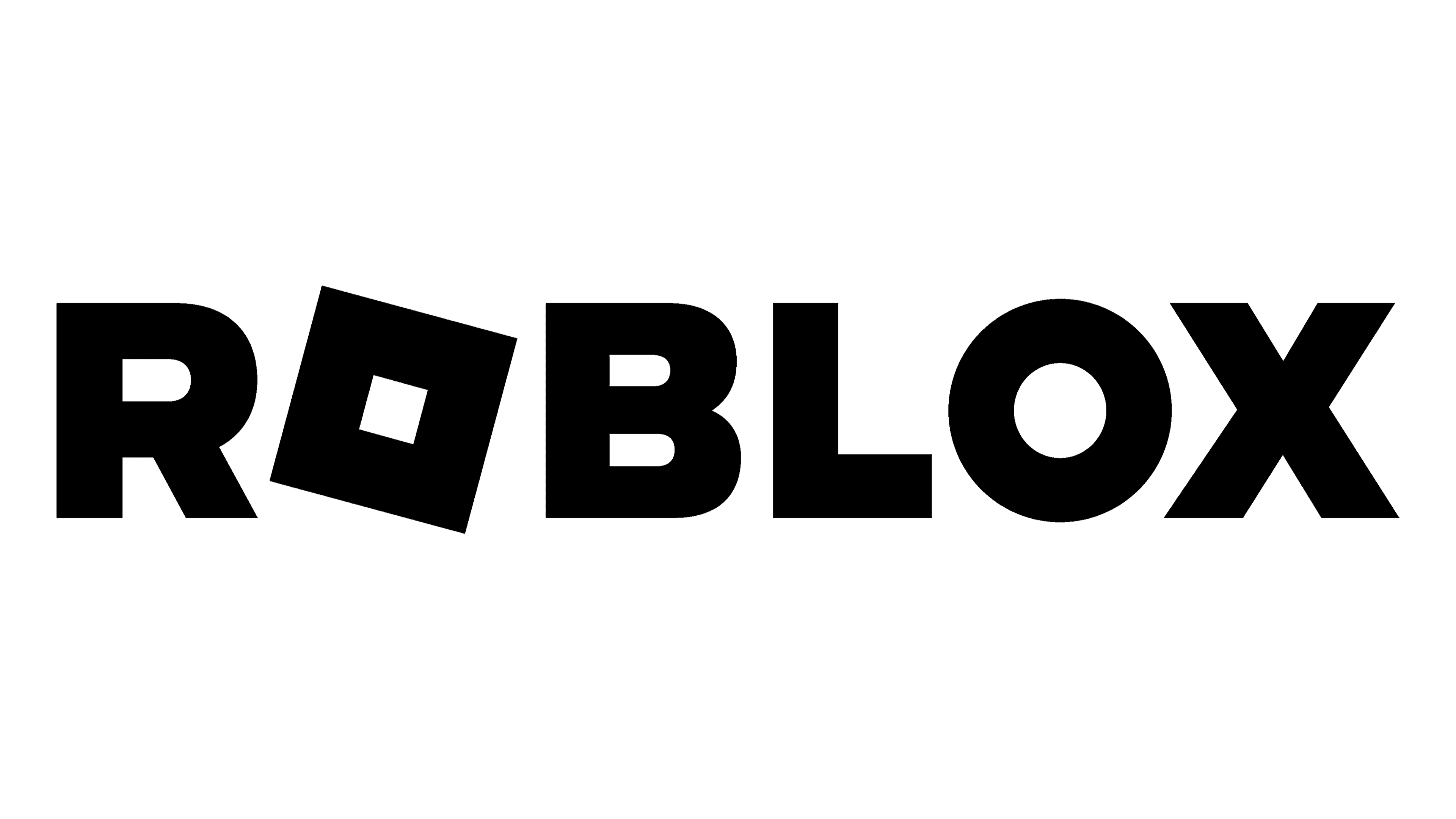
A black color was introduced for the first time. The previous logo was simply done in a monochrome color palette.
2022 – Today
Although this brand image had a lot in common with the one the company used previously, it featured a new font. It was a geometric, sans-serif called Gotham. The logo still featured a tilted square box for the letter “O”. The second “O”, though, was round. It gave the logo even more interest.
Font and Color
Although the company was experimenting with a multicolor color palette during the development stage, it went for red and white. It was not until 2017 that red became the only color. Soon, it was replaced by a solid black. When it comes to fonts, the company started an easily available font, Arial Black, which was later replaced by Arial Bold. However, later, it began testing bolder, geometric fonts that would go better with the nature of the gaming platform. Its first logo, which was redesigned several times, featured a custom version of such fonts. An altered Gill Sans Ultra Bold replaced the custom font. The 2022 logo features a similar font – Gotham.