Rick and Morty is an American comedy science fiction animated series for adults about a mad scientist and his teenage grandson. Rick is quite an unusual old man. He is as cynical as he is brilliant. In addition, he has serious problems with alcohol. Due to his bad character, he constantly gets into trouble. He has a 14-year-old grandson, Morty, with whom he travels through space. They happen to be on other planets, in other realities, and simply outside of time. On every journey, some unforeseen situations happen to them, which entail even more unforeseen consequences. The characters constantly find themselves in funny and sometimes simply ridiculous situations.
Meaning and History
Created by Dan Harmon and Justin Roiland, it premiered at the end of 2013 on the Cartoon Network programming block. The second season was released in 2015. There were several more seasons. The premiere of the sixth season took place at the end of year 2022. Critics gave the series, which originated from a crazy animated spoof of the Back to the Future series, very positive reviews, highlighting its distinctive style, ingenuousness, and sense of humor in particular.
What is Rick and Morty?
Rick and Morty is an American fantasy animated series. It is about the adventures of schoolboy Morty and his not entirely sane grandfather Rick. In a few years, the series with a dynamic plot conquered the hearts of millions of fans of animated films and found supporters in all countries among audiences of all ages.
2013 – Today
![]()
The title of the series is the only element in this logo. Nonetheless, it looks quite busy and unique thanks to the font choice. First of all, the strokes had an uneven, wavy edge that created an association with the transition through different realities and the chaotic and surprising life of the main characters. This impression was supported by rather random placement of the characters at different angles and slightly different heights. The logo god a vibrant color palette with a neon effect, making the logo look even more intriguing and unusual.
Font and Color
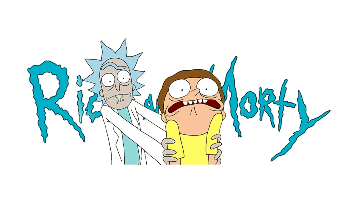
The light green color in the logo instantly creates an association with the portal fluid that the characters use to transport themselves to other realities and dimensions. There is also a contrasting black, but the main color here is turquoise. Although this color often symbolizes stability, there is little of this in the show. Instead. It is more of a reference to the strong link of the blue present in the color to the ocean and sky. The other color that goes into turquoise is green, which is also associated with nature. Additionally, turquoise may carry the same energy as yellow, making it an optimistic color. It is creative, cheerful, and friendly.
The font choice in this logo is just as creative. It is called The Get Schwifty Font and was designed by Mr. Jonizaak. It features rough, uneven strokes that instantly attract attention. Its unusual look can be associated with something unexpected, dangerous, and mysterious.