Paris Saint-Germain is a high-end soccer club with origins in the French central city. It appeared in 1970, and since then turned out into one of the most considerable teams. With lots of home/international awards, trophies, and cups, PSG competes in the top matches of Ligue 1. Their domestic stadium is Parc des Princes, known for its vibrant and passionate atmosphere.
Meaning and History
![]()
Their name combines their origins from the city and the particular district where the team was born. Saint-Germain lies on the left shore of the Seine River. It carries a storied history, characterized by an artistic and intellectual vibe.
It was set up in 1970 as a Paris FC and Saint Germain joint project. The initial success came in the 1980s, under the control of Canal+. With funding from the top players and staff, PSG won its first significant cup in 1986, which let them into Ligue 1.
The 1990s and early 2000s saw the club’s further development. It secured its reputation, winning in European tournaments, and reaching the semifinals of UEFA championships in 1995 and 1996. Additionally, they won a line of Coup De France tournaments.
In 2011, Qatar Sports Investments (a sub-company belonging to Qatari Sovereign Wealth Fund) purchases the soccer club. That was a prominent milestone in its history; more investments flowed into the sports club, and the team got new resources and talents like Lionel Messi or Kylian Mbappé. It allowed them to transform into the best in French football and win a line of Ligue 1 contests. The last prominent episode in their chronology was in 2020 when they achieved the final stages of the UEFA Champions League.
What is PSG?
PSG (Paris Saint-Germain) is one of the planet’s most significant soccer clubs, established in 1970. It has triumphed a multitude of tournaments in the French Ligue 1, as well as titles in Europe and internationally. Its domestic games occur in Parc Des Princes, a stadium placed in Paris.
1970 – 1972
![]()
The earliest logotype of the team depicted a blue ball composed of numerous hexagons, separated from one another. One of the hexes was replaced by a red depiction of a ship – an unchanging symbol of Paris.
1972 – 1982
![]()
The latter image displayed another Parisian symbol and a landmark – The Eiffel Tower. It was styled as a red shape placed centrally on a dark blue circle. Below it was a white bed and an insignia of Saint-Germain, looking like the Royal Lilac. It has this design for a reason: the castle of Saint-Germain has often been residential for the French kings.
1982 – 1990
![]()
During the 1982-1990 period, the team utilized a logotype based on the previous one plus the depiction of Parc Des Princes. It was placed in white under the circle.
1990 – 1992
![]()
For two years, the team utilized the old 1972 version of the logo.
1992 – 1996
![]()
The 1992 variant of the logotype represented the three rectangles, each containing one letter from the ‘PSG’ acronym. The side shapes were blue, while the central one was red. The letters occupied most of the rectangles’ space. Below, there was a one-line inscription with the brand’s full name.
1996 – 2002
![]()
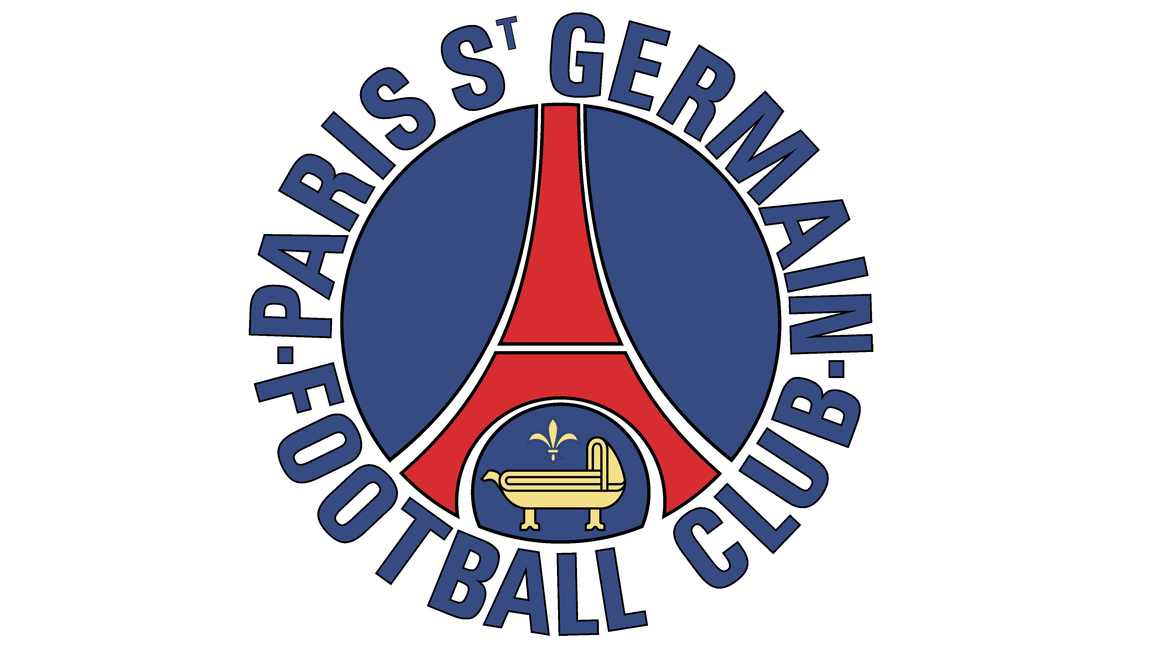
In the mid-90s, the club reinvented its logotype, getting back to the familiar circle. The picture showed the red depiction of the Eiffel Tower contoured white. It was placed centrally on a blue backdrop that was brighter than previously. Under the tower, there was a lilac and a cradle. It was additionally decorated by a white contour, on which the year of the team’s foundation and its full name found their places.
2002 – 2010
![]()
It was later updated to include a thicker frame of the circle. It was also recolored the same shade of blue as the inner part; to distinguish two sections, two thin white contours were added.
2010 – 2011
![]()
To mark the celebration of their 40th anniversary, they introduced the special logotype. It showed the 2002 logo plus two outer contours, one thinner than the other. Centrally below was the inscription ‘2010’; centrally above, they wrote ’40 ans’, which can be translated as ’40 years’.
2011 – 2013
![]()
In 2011, they returned the 2002 version.
2013 – today
![]()
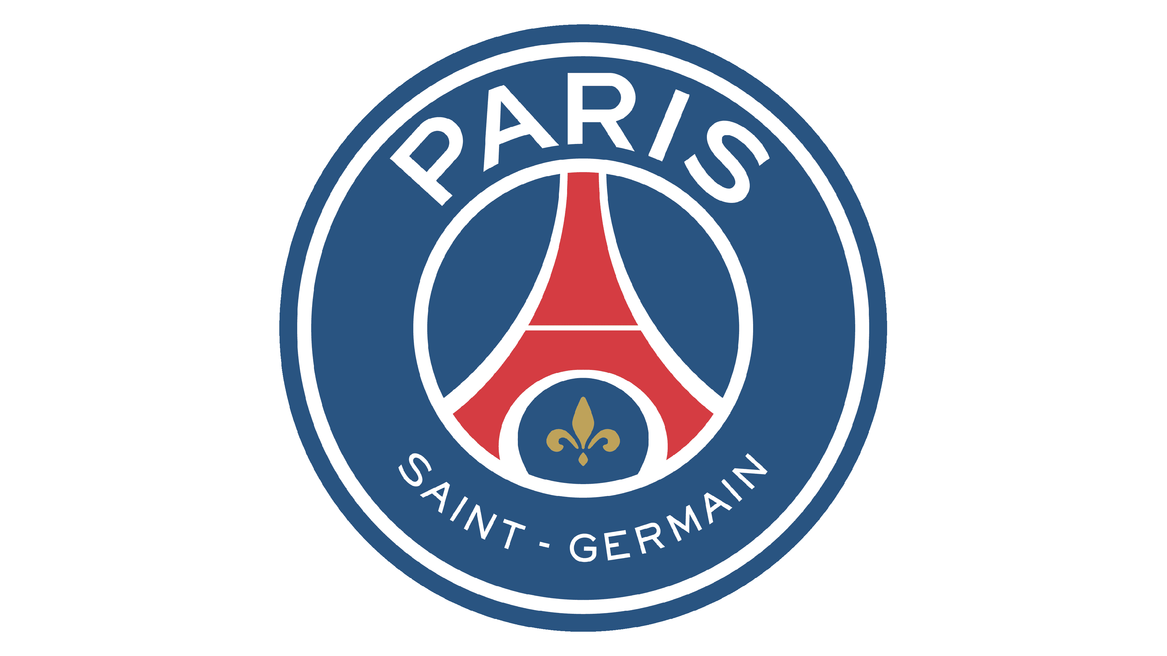
The contemporary edition of the official brand logo depicts the familiar circle, painted gradient deep blue and white. The frame has been enlarged, and now the caption ‘Paris’ finds its place atop the circle in large notes. The part with the tower was made significantly smaller. The French lilac, recolored golden, turned out into a single object under the tower. The ‘Saint-Germain’ part in small characters was at the bottom.
Font
The nameplate on their latest logo is executed in two fonts, one for the word ‘Paris’ and another one for ‘Saint-Germain’.
The upper word is executed in capitalized thick characters with no serifs. The characters have distinguished corners and slight curves. ‘Saint-Germain’ has another design: the characters, although uppercase, are much thinner and smaller.
Color
The symbol showcases the colors of the French, approved in 1792, with the proclamation of the First French Republic and approval of the new flag.