Brighton Hove Albion Football Club, or simply Brighton, is an experienced professional soccer team nestled in Brighton and Hove, England. The club was founded back in 1901. Currently, Brighton Hove Albion competes at the top tier of English football, namely the Premier League. Their home games go down at the American Express Community Stadium, which is in Falmer, a suburb of the sity.
Meaning and History
![]()
Brighton & Hove Albion’s storied journey through the world of football has been marked by a line of triumphs and tribulations, featuring notable promotions and relegations across various tiers of English football. In contemporary times, the club has solidified its position as a Premier League participant, diligently crafting a competitive roster. With a passionate and unwavering fan base and a history steeped in tradition, Brighton & Hove Albion holds a cherished role within the fabric of football culture in the South East of England.
What is Brighton Hove Albion?
Brighton Hove Albion is a prominent English soccer club, founded in 1901, that has earned its place in the prestigious Premier League. Their home ground, the American Express Community Stadium, is situated in Falmer, a suburb of Brighton.
1948 – 1970
![]()
The club’s initial official emblem was a masterpiece of simplicity and tradition. It featured twin crests, symbolizing the twin cities of Brighton and Hove. The design epitomized elegance, consisting of delicate dark blue lines set against a pristine white backdrop, framed with a touch of fancy blue.
1956 – 1958
![]()
In 1956, the logo adopted an all-blue theme, featuring a crest with a pointed top and a dual outline, one thick and the other thin, both in blue and white. The highlight was an elegant white monogram, showcasing elongated, curvaceous uppercase letters.
1968 – 1969
![]()
The late 1960s ushered in a minimalist aesthetic, characterized by an electric-blue square bearing bold white uppercase letters in a clean sans-serif font. This version exuded simplicity, devoid of any football motifs or embellishments.
1970 – 1971
![]()
In 1970, a brief departure from the bold sans-serif style saw the introduction of a handwritten cursive script, maintaining the same color scheme but projecting a softer, more delicate vibe.
1974 – 1975
![]()
This era introduced the club’s inaugural mascot image, albeit not a seagull, but a dolphin. The badge featured a circular design with a solid blue center, enclosed in white with double blue outlines. A modest blue inscription accompanied a stylized blue and white dolphin at the center. Regrettably, this dolphin emblem had a short-lived tenure.
1977 – 1980
![]()
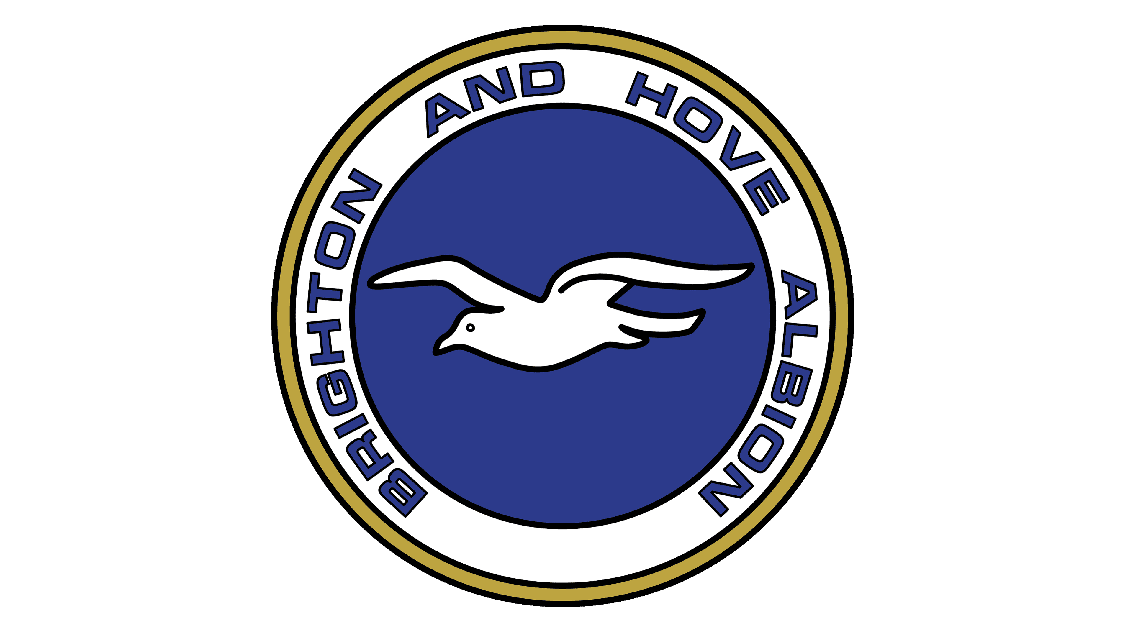
1977 marked the debut of the seagull-themed badge. It retained the blue and white color scheme but incorporated a golden outline. The lettering around the white frame received a bolder treatment, symbolizing progress and growth. At the heart of the emblem, a graceful white seagull took flight, facing left.
1980 – 1998
![]()
The 1980s witnessed refinement in the logo as the golden outlines vanished, and the white frame expanded to accommodate more legible lettering. The seagull remained a prominent feature, albeit with a cleaner, more polished appearance.
1998 – 2000
![]()
In 1998, the emblem underwent a significant overhaul, featuring a larger seagull outlined in red on a blue crest. Bold white lettering appeared both above and below the bird, contributing to a straightforward yet impactful look.
2000 – 2011
![]()
The early 2000s embraced a bolder aesthetic, with the abbreviation “B&H AFC” evolving into the full “Brighton Hove Albion,” rendered in sleek white capital letters, exuding an air of professionalism.
2001 – 2002
![]()
For a brief interlude in 2001, the club revisited its original two-crest design, painstakingly rendered to pay homage to its historical roots.
2002 – 2004
![]()
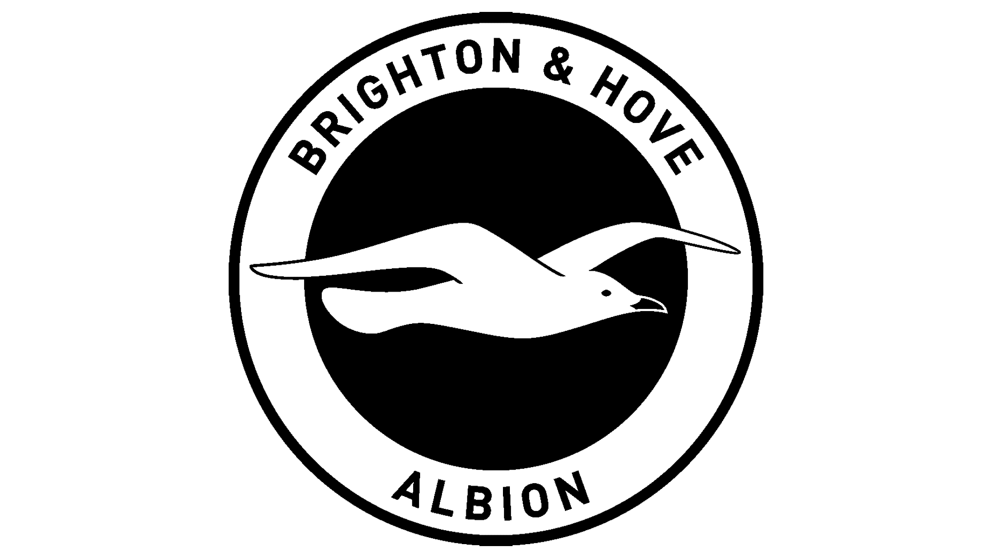
The early 2000s embraced ultra-minimalism, featuring an elegant black seagull outline on a three-segmented rectangular badge with blue in the middle and white on the sides. This version embraced simplicity without embellishments.
2011 – today
![]()
In 2011, a significant redesign introduced a circular badge with a seagull facing right, symbolizing growth and determination while retaining the club’s classic blue and white color palette.
Color
Brighton Hove Albion maintains its trusted brand colors of blue and white.
Font
The club employs a simple sans-serif font in capitalized script, devoid of intricate details.