The roots of AC Milan, the revered Italian soccer club, date back to 1899 when it was founded as Associazione Calcio Milan. Throughout its illustrious history, the team has been a dominant force in Serie A, holding an impressive fourth place in global rankings. AC Milan’s journey is adorned with triumphs in top-level competitions, including three Intercontinental Cups and a FIFA Club World Cup victory.
Meaning and History
AC Milan’s origins can be traced to 1899, when two English expatriates established the club. This historical connection explains the English spelling of “Milan” instead of the Italian “Milano.” Over time, the club has amassed a remarkable collection of trophies and gained a reputation for nurturing top-tier players. However, its most significant turning point came in 1986 when former Italian Prime Minister Silvio Berlusconi saved the club from bankruptcy by acquiring it.
What is AC Milan?
Founded in 1899 by two Englishmen, Alfred Edwards and Herbert Kilpin, AC Milan stands as the strongest and most renowned Italian soccer club, with a remarkable record of winning numerous prestigious FIFA and UEFA titles. As one of the leading teams in European soccer, AC Milan has left an indelible mark in the history of the sport.
1899 – 1916
The original emblem featured a simple square divided vertically into two parts: a red cross on the right and vertical black and red stripes on the left.
1916 – 1920
The emblem transitioned to a circular shape with an ornate border, symbolizing the club’s heritage and traditions.
1920 – 1937
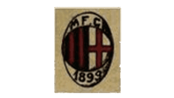
The emblem depicted a circle with stripes and a cross inside an oval, bearing “MFC” at the top and “1899” at the bottom.
1937 – 1946
A minimalist design was introduced, showcasing a bold red outline of a white-red-black circle, exuding confidence and vigor.
1946 – 1961
A laurel wreath surrounded a white oval containing the iconic circle.
1961 – 1964
The emblem featured a red devil sitting on a white oval situated on a flag with black and red vertical stripes.
1964 – 1967
The previous logo took a shield shape with a straight top and pointed bottom. The designers removed the white oval base, placing the devil and other elements directly onto the striped background and also slightly enlarging them. This created a more cohesive image and in no way did the busy stripes make these elements get lost.
1967 – 1968
The oval was removed, and the flag evolved into a shield, with the black inscription “Milan” at the top.
1968 – 1969
The shield changed to a rhombus set against a dark rectangular background.
1969 – 1972
Although this logo has some of the elements, including a red devil and striped background, seen in earlier versions, the emblem had a completely different spin. It used a rectangular gray background with an elongated diamond shape placed over it. The diamond had the familiar red and black stripes as well as the devil’s head placed on a white circle. Other elements included a yellow symbol in the lower left corner, and another round symbol with a castle fountain in the right corner, along with location, establishment date, and division (Serie A) in the upper corners. The logo turned out quite informative and symbolic, but it did not look overwhelming.
1972 – 1973
A white shield with a Red Cross appeared on a red and black square.
1973 – 1974
The shield shape was brought back, but now it featured a caricature drawing of a devil holding a fork with a football ball at his feet. This illustration was placed on a white circle in the center of the emblem. In addition, the designers flipped the colors, making the banner behind the “Milano” black and the inscription white. The black color matches the bold pattern of the shield much better. This logo was used only for one year.
1974 – 1976
The prototype of the current emblem emerged, featuring a circle with stripes and a cross inside an oval. The inscription “ACM” appeared at the top, and “1899” was enclosed in a yellow border at the bottom.
1976 – 1980
The logo the team used earlier has been slightly modified. First of all, the designers used a golden color instead of bright yellow and made the red not as bright as well. Other changes included a new inscription across the bottom, which now said “Milan”, and an enlargement of the circle in the center so it touched the sides of the oval shape.
1980 – 1983
The devil returned to the logo, positioned above a bold “M” inside a white oval on a striped background.
1980 – 1987
A logo featuring a smiling devil stylized in red flames was used.
1983 – 1987
The background was eliminated, giving the Devil logo a modern and powerful look, enclosed in a yellow and black border.
1987 – 1994
The club returned to its roots, with a circle featuring red and black stripes on the left and a Red Cross on a white background on the right, placed inside an oval with a yellow outline. The inscription “Milan 1899” in yellow was placed between the circle and the border.
1994 – 1995
The word “Milan” changed to “ACM,” and the yellow color changed to black.
1995 – 1997
The color scheme changed to orange and black, with bolder and larger lettering.
1997 – 1998
The changes to the logo done in 1977 were quite minimal. In fact, the designers mainly changed the inscription, which now featured thinner strokes and larger characters that repeated the oval shape. The foundation year, on the other hand, was made bolder and there was more spacing between the numbers, which created a more balanced look.
1998 – 2021
Minor changes were made to the thickness and placement of lines and outlines, resulting in a recognizable and influential emblem.
2021 – today
Minor changes were made to the thickness and placement of lines and outlines, giving the emblem a refreshed and updated appearance.
Font
The abbreviation “ACM” in the AC Milan logo is displayed in a bold and confident sans-serif font. The capital letters maintain clear proportions and a subtle slope, adding a sense of fluidity and dynamism to the design. The arrangement of the letters is uniform, featuring equal thickness and weight, creating a well-balanced and poised appearance.
Color
Since its inception, Associazione Calcio Milan proudly adopts black and red as its official colors. These colors are the inspiration behind the nickname “rossoneri,” which translates to “red-black” in Italian.


