Arsenal Logo
Tags: England | London | professional club
Arsenal is an English professional football club. It is a thirteen-time winner of the English Championship and a twelve-time winner of the FA Cup. It is the most titled club in London, ahead of London’s Chelsea by 9 national trophies. The Emirates Stadium became its home in 2006. Before that, the legendary Highbury was its home for almost 100 years. It is 8th on the list of the most expensive football clubs in the world, according to Forbes data for 2021.
Meaning and History
Arsenal football club traces its history back to the end of the 19th century. In 1886, a group of workers at an arms factory got together to play football under the name Dial Square. A couple of weeks later, it was renamed Royal Arsenal, then Woolwich Arsenal. The prefix “Woolwich” disappeared in 1913. Since 1919, the Gunners have not been relegated from it, and it seems that they are not planning for this to happen in the foreseeable future. In 1992 Arsenal was one of the founders of the EPL. As you know, Arsenal players have been called “gunners” for ages. They received this nickname because the club was founded by the workers of an arms factory. However, now the fans call the players and themselves “Gooners”. By itself, “Gooner” does not mean anything, but it sounds more vulgar and bold. That is, it is just a deliberately mangled “Gunner”.
What is Arsenal?
Arsenal is a London-based football club. During their more than 130-year history, the Gunners have won millions of fans’ hearts, gaining popularity in all corners of our planet. Arsenal is famous for its ambition and the highest motivation. The club is one of the main contenders for all titles played in Foggy Albion.
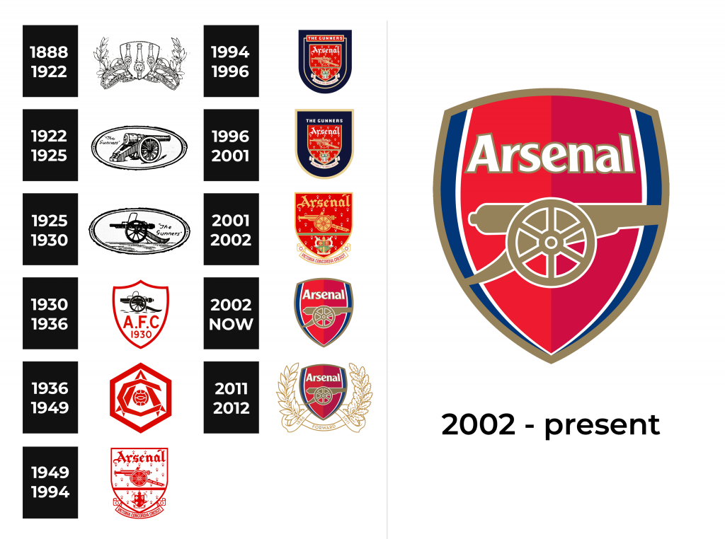
1888 – 1922
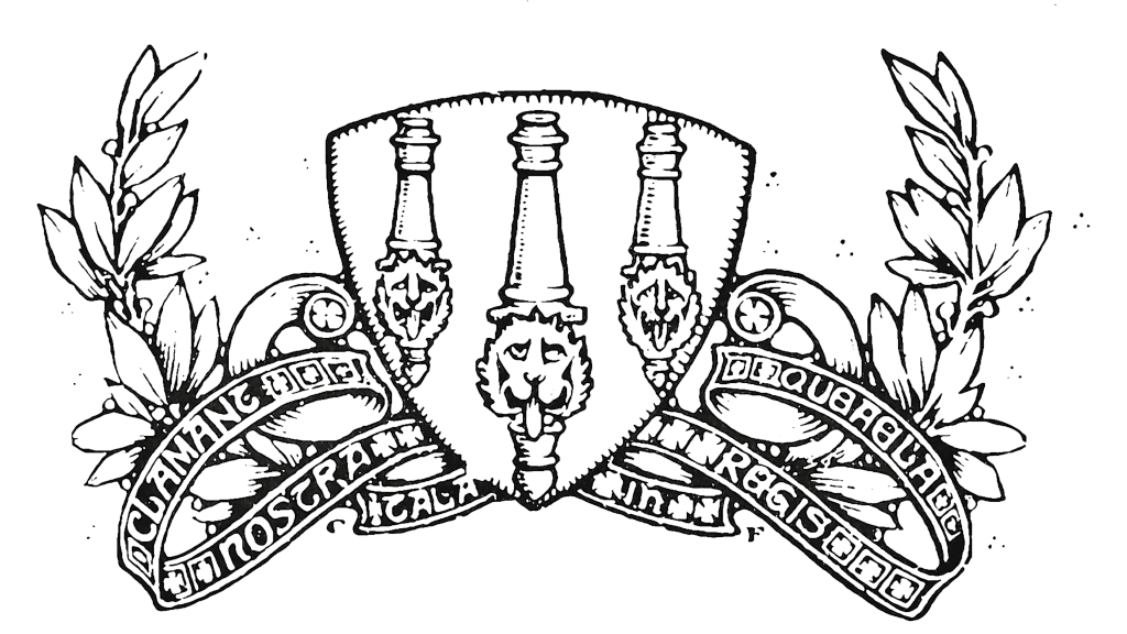
Like many logos back in the day, this logo looks sophisticated and quite detailed. The crest of Woolwich Borough was given the main spot. The shield was decorated with ribbons and laurel branches and had just a grand drawing of three lions in the center. The first have long been used to represent victory, so it was a very appropriate symbol for a team with great ambitions.
1922 – 1925
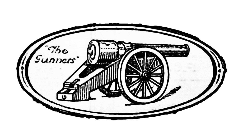
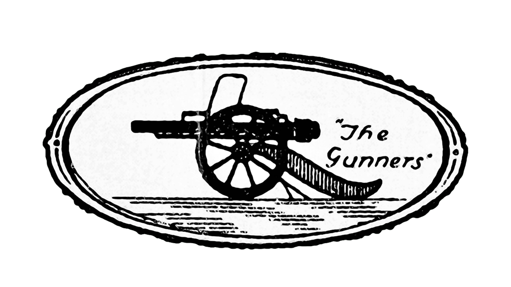
The club has embraced its origin and nickname here. The emblem is a horizontal oval shape with a simple, yet elegant border. A detailed drawing of a cannon did not look as graceful but rather showed that these players are serious guys whom you would not want to mess with. To the left, the emblem had their nickname printed in two lines using a basic handwriting style font.
1925 – 1930
A mirror image of the earlier version with the cannon now pointing to the left became the basis of a new visual identity. It was less detailed and much darker with a road replacing a barely noticeable shadow. The inscription featured the same font but was slightly enlarged because otherwise it would get lost next to a bold drawing.
1930 – 1936
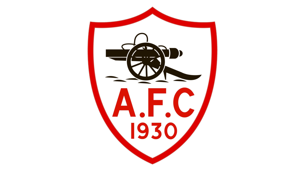
The new design brought the shield shape seen in the original logo while preserving the cannon image used by the team for the past several years. It was placed at the top of the shield with large, red “A.F.C” lettering and the year “1930” in the bottom half. The red was also used on the borderline of the shield. The overall image looked daring and eye-catching.
1936 – 1949
Many sports clubs have tried to use a monogram as their logo and many have done it very successfully. Arsenal Club created a bold, geometric, symmetrical look with angular “AC” lettering. The horizontal bar of the “A” was stylized as a ball to strengthen the association with sports. The initials were placed in a hexagon shape. The logo was done in red to enhance the strong and confident feel.
1949 – 1994
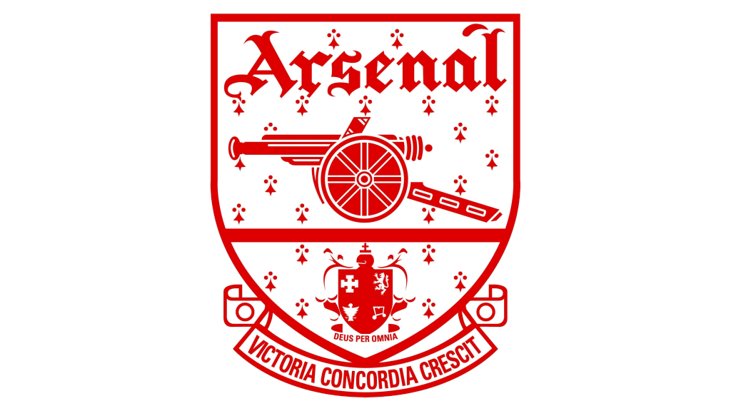
A shield, but now with a straight top, once again became part of the club’s visual identity. Across the top, it said “Arsenal” using an Old English typeface. The cannon, which was featured in earlier versions, took the center position with a horizontal line running under it. At the very bottom, the logo had another crest with a Latin term for “In God We Trust”. Underneath the shield, the logo featured the club’s motto “Victory grows out of harmony” in Latin. It was written by Harry Homer and reflected the club’s belief that their strength is in teamwork. The club continued to use a powerful red-and-white color palette.
1994 – 1996
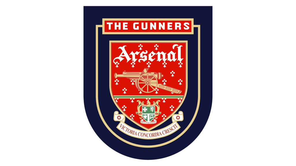
The previous emblem had red and white colors inversed. With a few modifications, it was also placed on a larger dark blue shield, which featured a horizontal bar saying “The Gunners”. They also introduced a golden color, using it for borders and outlines, the cannon, and some other elements. The result was a majestic emblem that was a good representation of an amazing team with a long history.
1996 – 2001
Here, the designers removed the rectangular background behind the “Gunners” and the framing line that was coming out of it. Instead, they moved it to the outer edge, giving it a bit more thickness. This change put the accent on the red crest and made all the other elements serve as a backdrop.
2001 – 2002
The blue base was used for a relatively short period of time and the team returned to a red crest without it. All the elements were redrawn and some even changed the color but the overall idea stayed almost unchanged.
2002 – Today
The new emblem had very little in common with earlier designs. It ceased to have that royal look and acquired a modern, daring appearance. An addition of blue and white lines on either side as well as a vertical line running down the shield created a 3D appearance. “Arsenal” was now printed in a simple, sans-serif font of white color.
2011 – 2012
The lack of intricate, elegant details was made up during the year the club celebrated its 125th anniversary. It was decorated with white laurel branches with a golden outline. A ribbon had “Forward” printed in the center and reflected the ambitious goals of the club. They also put the foundation year along with the anniversary year on either side of the emblem.
Font and Color
The earlier Arsenal Club logos feature an elegant Old English typeface. Since 2002, the logo features a font similar to Clear Gothic TS DemiBold. Although originally the logo was done in strict white and black, it later moved to a bold and daring red and white. It also added golden, blue, and a bit of green.
