Pringles is a popular American brand of chips, sold in an iconic tube instead of the regular chip packs. The brand is popular throughout the world. In America, the birthplace of this brand, Pringles has 34 flavors. There are plenty of unique flavors in other countries. Pringles is considered a generally more expensive type of chips in most nations.
Meaning and History
Pringles was created in 1968 by Procter & Gamble, and they continued to own and produce these chips until 2012. It was then sold to Kellogg’s, a giant American food corporation that, besides Pringles, own a large variety of mostly America-exclusive snacks and food products. The name’s origin is unclear, but the chips were originally sold as ‘Newfangled Potato Chips’.
What is Pringles?
Pringles is a globally popular brand of potato chips, sold in round tubes. They are generally considered a more expensive, quality-made brand of chips throughout the world. The American version has 34 flavors, but there are many more abroad.
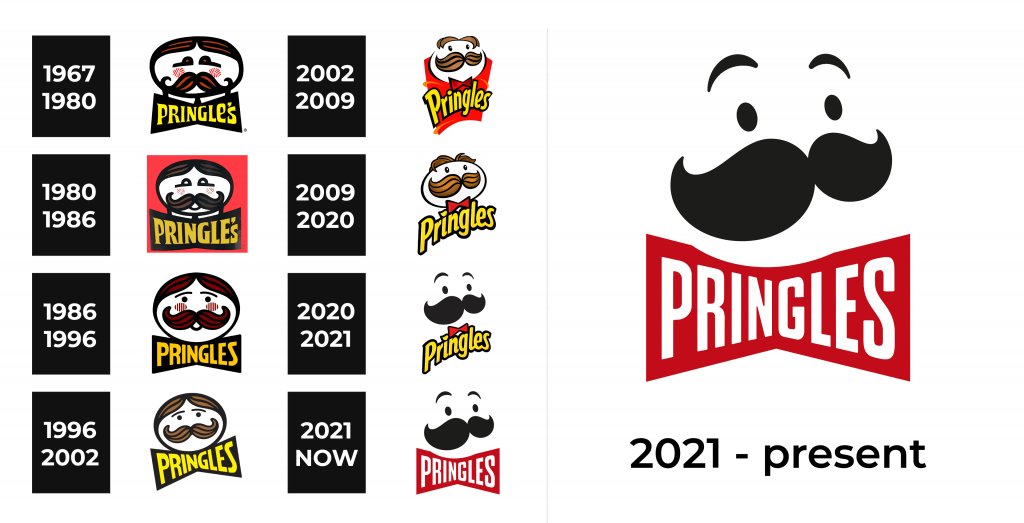
1967 – 1980
The original logo depicted the oval head of Mr. Pringles. It’s mostly white, but has a pair of lush mustaches, combed hair and eyebrows – all a mix between ginger and light brown. Additionally, there are two red spots on his cheeks, which are supposed to display the youthful enthusiasm.
The name is depicted right beneath his head, arranged in a form of a bowtie. Rather, it is a big black bowtie with the word ‘Pringle’s’ inside, written in yellow letters that become shorter near the middle of the word. The font is a peculiar sort of serif with very bold and unusual forms.
1980 – 1986
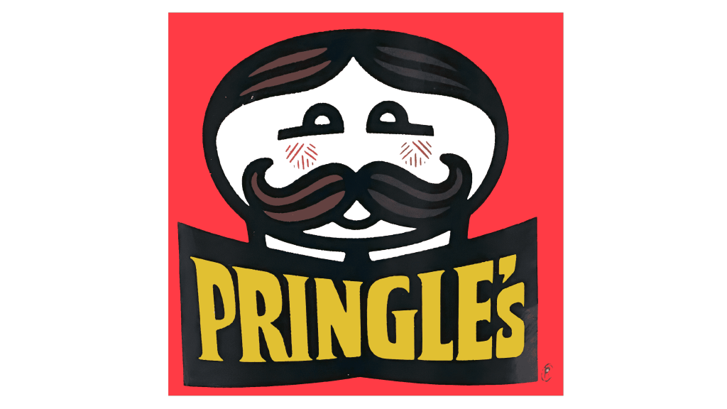
The 1980 edition is largely the same. They did update the color scheme, making the hair a much darker brown shade, as well as adding a little smile beneath the moustache. The nameplate beneath has also become less of a bowtie shape, but it still retains that general form.
1986 – 1996
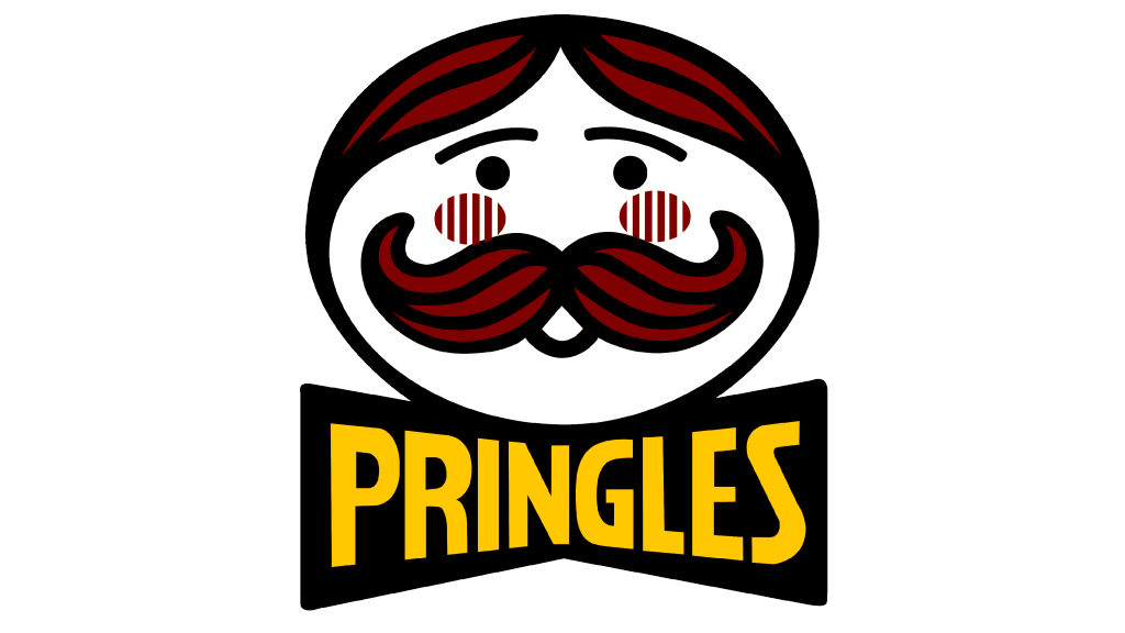
The main change in this version is that the oval was replaced with a mostly basic circle, with some flatness on the sides to make it look more like a head. The face itself changed little, save for the black dots under the brows that act like eyes. As for the text part, the font was updated to be more like a generic sans-serif, and they’ve also removed the apostrophe.
1996 – 2002
In 1996, the design came a lot close to the contemporary variant. They’ve basically returned the oval shape, bleached the hair and removed some parts, like the smile and the red cheeks. They’ve also turned the logo a bit counterclockwise and made the bowtie piece a lot more prominent once more.
2002 – 2009
Come 2002, they decided to add more volume to their logotype. They did it by adding specks of light to certain parts of the logo. The hair and moustache were also redrawn to have more details instead of the usual cluster of 2D lines. It’s particularly visible with the hair, but they’ve also added some to the lines and to the other elements. In particular, they’ve removed the big black bowtie shape.
Instead, they’ve placed a smaller red bowtie, an actual drawing of one, right below the head. Behind both of these elements is a big red rectangle, warped in places and surrounded by orange swishes. That’s supposed to be a tube package is a stylistic depiction.
Lastly, there’s the brand name in the middle, written in a mix of lowercase and uppercase letters in a jumbled, unusual sans-serif script.
2009 – 2020
The big change that happened to this edition is that the big red shape in the background is removed. They’ve also altered the word ‘Pringles’ to make it smoother and more balanced. On a minor note, the dot above ‘i’ became a little chip symbol. They’ve also made the hair more detailed in this edition.
2020 – 2021 (USA)
This alternative American design depicts many of the same elements, but in a different style. The eyebrows, eyes and moustache became a uniform black color, but the other face elements are gone. As for the bowtie and name, they remained as they were.
2021 – today (International)
The alternative international design continues what the previous American logo started. They also use the black silhouettes in this logo, and the only big change happened to the bowtie area. It’s essentially a big, flat and red bowtie with the white, thin letters inside – like in the earlier logotypes.
Font
The font used in some of the more recent logotypes uses tall, soft letters. They are usually rounded and not very strict in terms of their appearance. They are also sans-serif and use both lowercase and uppercase characters. However, there are many other designs, which include especially the fresh 2021 international logo.
Color
The two colors that were in use the longest are yellow and red. The yellow represents the potato chips, naturally, while the red mostly like means spices or a general zesty flavor. Black and brown are also iconic, used to color the facial features and hair of Mr. Pringles respectively.
