PlayStation is a brand of gaming consoles that include home consoles, handheld consoles and various other products. It’s the most popular such brand in the world, owned by the American corporation Sony. Many computer games are either developed exclusively for PlayStation consoles or released for this platform on day one. There are currently 5 main consoles of this brand.
Meaning and History
![]()
The first PlayStation console (PS1) was released in 1994 by Sony. After that, four more consoles followed in 2000, 2006, 2013 and 2020. They are considered some of the most technologically advanced pieces of gaming hardware in the world. And many AAA games continue to be released exclusively for PS. It wasn’t one of the first gaming consoles, but it turned out the most prolific and successful.
What is PlayStation?
PlayStation is a line of gaming consoles that include five main versions and several minor products. It’s the most successful and popular such brand on the market and many high-tier games are developed exclusively for this platform.
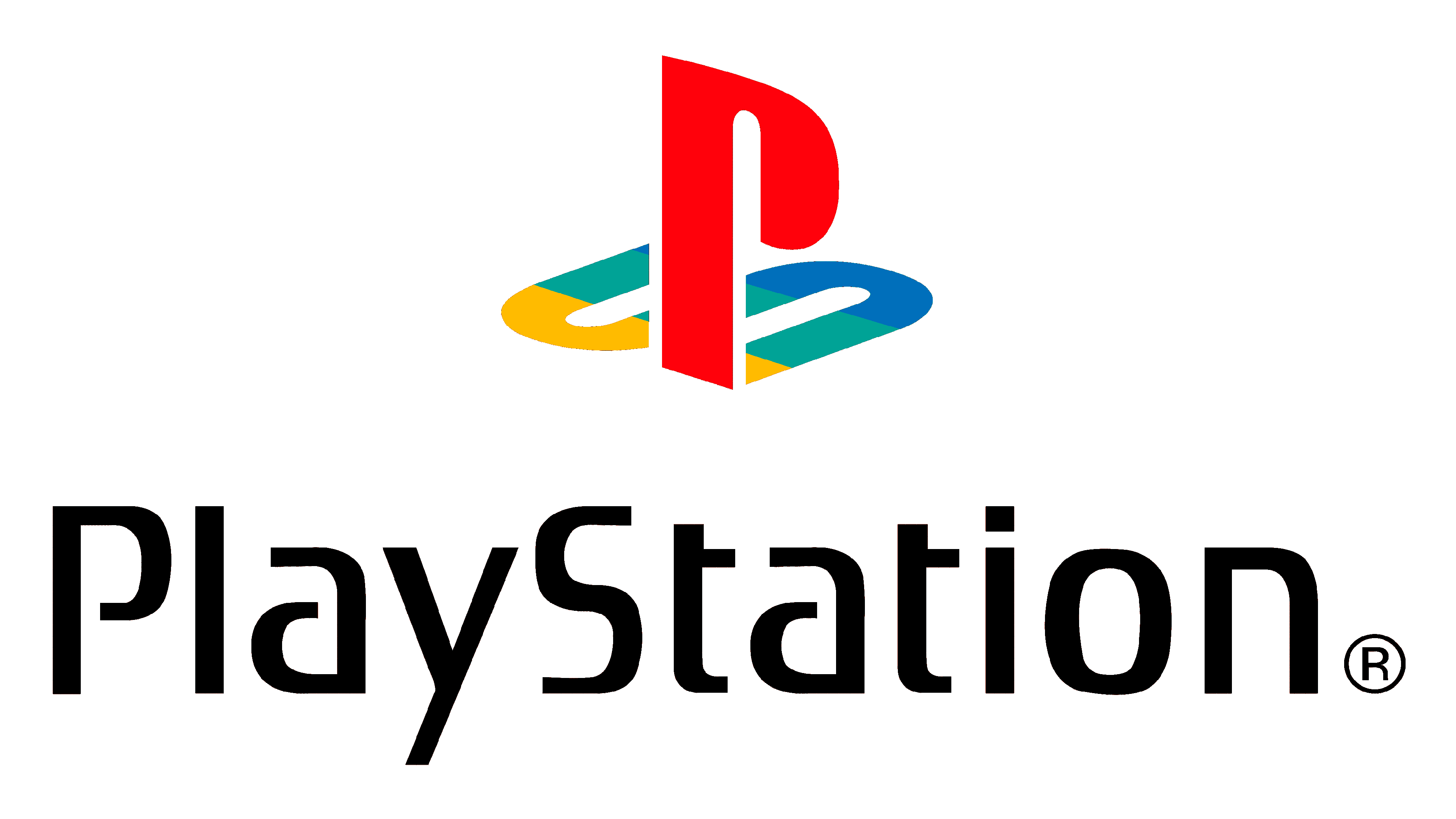
1994 – 2009
![]()
The original logotype is an emblem that remains in use by this brand even now, albeit with changes. It’s designed with perspective in mind, with the letter P standing upright but rotated towards the onlooker. It creates an effect of being looked upon from above and slightly to the side. The letter S, which is depicted lying on the ground like a shadow, also has this perspective.
They colored the letter P a bright red, while the S is a combination of yellow, blue and green – the color of the PS controller buttons.
2000
![]()
The logotype used specifically for PS2 is a bit different. It doesn’t feature the usual emblem, although it was still widely in use. Instead, the emblem was just the name of the new console twice: once as an emblem (as ‘PS2’), once as the full name, written beneath the emblem.
The emblem uses three characters, written with straight lines and square, sharp corners. They also miss certain parts, catering to the minimalistic approach. The colored this part blue, with a dark-light gradient from top to bottom. Beneath, they’ve put the console’s full name, written in stylized, bold sans-serif letters. They are all black.
2006
![]()
The PS3 logo continues the general design set by the previous logotype. This version in particular was reused in several following logotypes. In particular, the ‘PS3’ bit is similar to the previous design in appearance, but the style is smoother, rounder and softer, but it still lacks certain parts, making it look pretty minimalistic. They also made it black this time.
The full name beneath adopted a similar style, except the letters are a lot more ordinary and not that simplistic.
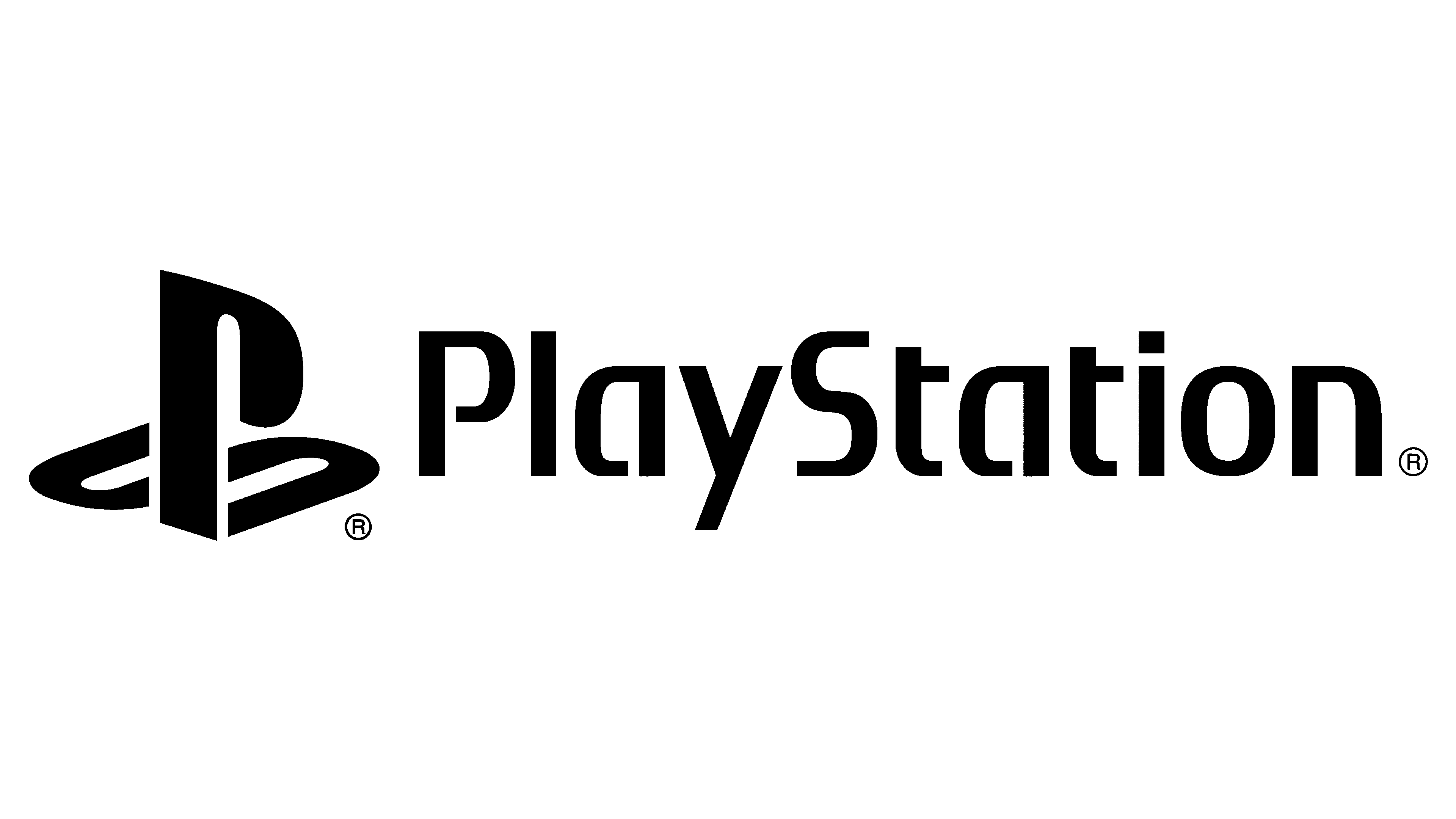
2009 – today
![]()
This version is the brand-wide emblem. It’s not connected to any one console, although PS4 and PS5 logos certainly used it. It’s basically the previous brand-wide logo (the 1994 one), but fully black. Both parts also have white outlines as to make the image more discernable.
2013
![]()
From PS4 and going forward, the logotypes became pretty uniform. It’s the same emblem as in the PS3 logo, except with the number 4. The full name is absent but they did put the main brand logo on the left – just slightly taller than the letters on the right.
2020
![]()
The PS5 logo is very similar, except the emblem is slightly bigger and they’ve also switched the number.
Font
The font used for the abbreviated names of these consoles is very unique to PlayStation. It’s simplistic, while the letters are wide, bold but ultimately thin. They have round, smooth shapes and look purposefully more like vague imitations of the letters they are supposed to be. PlayStation also has a wordmark that includes just the name of the brand itself, which they write in the font similar to the one used in the PS2 logo.
Color
Historically, PlayStation used bright colors to use on their logo, including red, yellow, blue and green. These colors in particular correspond with the ones found on their controllers, making them pretty iconic. These colors are supposed to associate with fun and the many opportunities offered by gaming. The later logotypes are almost fully black, instead representing professionalism and high-tier technology.