Pizza Hut is a company that operates a group of restaurants with a main focus on pizza and foods related to Italy. They serve various types of pizza, not only Italian but Italian-America too. The brand appeared in Witchita, Kansas, in the late 50s thanks to the Carney brothers, and since then has expanded to offer its services in 17,000 locations across 100 countries.
Meaning and History
Pizza Hut originated in 1958 when the Carney brothers, students at WSU, decided to open their Italian pizzeria in their home city of Wichita, Kansas. Within a short span of half a year, they grew to open second place, and by the end of the decade, they had launched a successful fast-food chain comprising nine eateries. Understanding the potential for further expansion, the brothers adopted a franchise system in 1959.
In 1963, the iconic design of Pizza Hut’s buildings was introduced, depicting the distinct red roof. The architectural idea was developed by George Lindstrom, a renowned architect from Chicago. The implementation of this design across Pizza Hut’s places was completed by 1969, solidifying its visual identity.
In 1977, Pizza Hut underwent a change in ownership when it was purchased by PepsiCo. Subsequently, in 1997, Pizza Hut, alongside Kentucky Fried Chicken and Taco Bell, separated from PepsiCo and formed a new organization called Tricon Global Restaurants, Inc. However, in a later rebranding effort, it was renamed Yum! Brands at the end of 2020.
Over the decades, the contributions of George Lindstrom in shaping the brand’s visual identity cannot be overlooked. Today, Pizza Hut continues to thrive as a popular pizza chain, with an international presence and a rich franchise history comprising nine distinct brand logotypes.
What is Pizza Hut?
Pizza Hut is an operator of 17,000 Italian-styled eateries that offer not only pizza, but other dishes of the Italian cuisine. The company was registered in Witchita, Kansas, by Carney brothers in the late 50s.
1958 – 1970
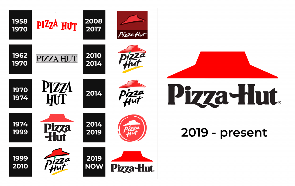
The initial logo of Pizza Hut featured a horizontally aligned name with lively, “bouncing” letters. The intention behind this design was to convey the anticipation and excitement experienced by customers awaiting their delicious orders. The scarlet uppercase letters, styled with sharp serifs, symbolized the great flavor of Pizza Hut’s foods.
1962 – 1970
The subsequent brand’s symbol also incorporated the title but with a distinct style. The chromatic scheme was different, and the notes featured straight bars with even ups. However, upon closer inspection, one would notice subtle variations in the alignment of certain symbols, such as the elongated right bar of the “A” and the taller “U.” Thin lines were added overhead and beneath the inscription.
1970 – 1974
Then, the artists developed a new logo, which retained the appearance of the characters from the earliest insignia while incorporating the color scheme of the 1962 version. Additionally, the text’s location was altered, with the name executed in two levels. The iconic “bouncing” characters were meticulously custom-made.
1974 – 1999
The insignia introduced in 1974 holds a special place in Pizza Hut’s history. Created by Lippincott in partnership with marketer Sam Moyers, it is renowned for featuring the well-known red roof, reminiscent of the firm’s distinctive eateries. Underneath the roof, an inscription in two lines was displayed in a reworked typography, utilizing wavy bars for the bottom lines of lowercase “z” and the central bar of the title case “H.”
1999 – 2010
In 1999, Pizza Hut’s brand symbol was reworked, which resulted in the formation of its most enduring and well-known logo. The texting received a bold and daring appearance. It was positioned diagonally and accentuated by an addition of yellow underscore. The iconic red roof got a bold black contour. This logo, authored by Landor Associates, left a long-lasting impression.
2008 – 2017
A noteworthy change occurred in 2008 when Pizza Hut reinvented its chromatic code to deep red and white. The entire lettering was set in the lower part of a dark quadrangle, while the red roof picture was made bigger and positioned centrally.
2010 – 2014
In 2010, the firm reverted to the coloring of 1999 but introduced gradient effects to the red hat, enhancing its vibrant appearance. The components underwent meticulous redrawing, with the black words increased in size and featuring bolder lines. The yellow underscore became longer, and the roof was subtly enlarged compared to previous iterations of the Pizza Hut visual sign.
2014
For its North American restaurants, in 2014 Pizza Hut adopted the same logo as its general variant from 2010, with one noticeable difference—the absence of the yellow line. The simplified coloring presented a more serious and professional image, exuding a feeling of tradition and expertise.
2014 – 2019
In 2014, Pizza Hut embraced a new logo concept. While retaining the same script and renowned roof, the components were rendered in white and positioned on a circular red backdrop, reminiscent of a pizza shape with intentionally uneven outlines.
2019 – today
Paying a nod to its history and heritage, Pizza Hut reintroduced its 1974 logo in 2019. Featuring a jet inscription located beneath a crisp and straight red roof, this insignia coexists alongside the 2014 version, reflecting the Hut’s traditional values and tight binding to its roots.
Font
The present iteration of the Pizza Hut logo features a distinctive script for the wordmark, adding a touch of uniqueness to the brand identity. Alongside the logo, Pizza Hut introduced a complementary typeface for its Flavor of Now campaign tagline. This industrial-inspired font family boasts a clean and straightforward design with a serif-free style, characterized by title-case letters throughout.
Color
Over the course of its extensive history, the Pizza Hut logo has predominantly showcased a vibrant color palette consisting of red, black, and yellow. These colors have been the hallmark of the restaurant chain’s visual identity. Additionally, there have been occasional appearances of green, further diversifying the brand’s color scheme.


