Petco is a well-known name in the world of pet care, known for its commitment to providing everything your beloved pets need. From delicious snacks, treats, and vitamins for animals, birds, and fish to high-quality toys, care products, and accessories, you will find everything in Petco. As part of the loyalty program, this leading online pet store accrues increased bonuses on pet birthdays and sends owners samples as a gift. The retailer also launched a customization service: customers can order name collars, bowls, and plates for their pets. The scientific base is especially pleasing as Petco has its own team of veterinarians. Expert nutritionists prepare special diets for animals with health problems such as obesity, digestive disorders, and diabetes. All ingredients used in the preparation of dishes are certified.
Meaning and History
![]()
This well-recognized brand started its existence in 1965. It changed hands several times with one of the more recent takeovers being in 2015 when the deal closed at $4.6 billion. In early 2021, the company once again became public and had its shares quickly rise in price. In recognition of its excellent standards for animal care and attention, Petco was the first pet shop to get the prestigious American Humane Certified Seal of Approval the following year. Their approach to doing business surely pays off as the brand has over 21 million customer base.
What is Petco?
With over 50 years of experience, Petco provides everything you need to take care of your pet friends. The range includes medicines, food, and accessories for cats, dogs, fish, turtles, rodents, and birds. The network of pet stores includes more than 1,500 retail outlets.
1965 – 1974
Initially, the company did not have a specific logo designed for it. It was just one of many veterinary clinics that sold pet products in addition to taking care of their health.
1974 – 1979
![]()
As the company developed, it had a logo created to set itself apart from its competitors and unite its stores. Here, we can see its name at the time printed in two lines. The top line, which spells out “UPCO”, uses large, bold, sans-serif characters that can be seen from far and easily printed. Right underneath, there is the rest of the name, “Animal Supplies Unlimited”. It not only specifies what the company is doing but also uses the same font to create a cohesive image. Although this logo looks more like a simple banner on the store, its minimalistic design and black color make it look quite professional.
1979 – 1989
![]()
The idea of the logo we know today was born back in 1979 when the company changed its name again. The word “Petco” is handwritten using thick, rounded strokes. Similarly to the earlier version, it says “Animal Supply Super Markets” right underneath using a smaller sans-serif font. This time, though, the designers added quite realistic and at the same time very adorable drawings of horse head, cat, and dog. There was now no doubt what you could get at the store.
1989 – 1991
![]()
This logo looks very familiar not only thanks to the same color choices but also the drawing of a cat and dog sitting right next to each other. The dog is done in a lively blue color, while the red color of the cat matches the red inscription underneath. The latter features a cleaner appearance with all the characters being of the same size and placed into a single line. The red color attracts attention, while the rounded shape of the letters creates a welcoming and approachable brand image.
1989 – 2011
![]()
The logo presents a bold, sans-serif typeface that spells out “PETCO.” The text is uniform in size, creating a strong and balanced visual impression. The color of the letters is a vivid red, a hue that is associated with energy and, in the context of branding, conveys a sense of strength. The choice of red – is a reference to vitality and life, which is fitting for a company that deals with pets and animals.
The letters are rounded, which gives the logo a friendly and approachable feel. This design choice is a company that is customer-friendly and inviting, aiming to present itself as welcoming to pet owners. The roundness of the letters also adds a sense of playfulness to the logo, which is appropriate for a brand in the pet industry.
There is no additional imagery or embellishment, which allows the simplicity of the design to stand out. This minimalist approach ensures that the brand name is instantly recognizable and memorable. The straightforwardness of the design indicates the brand’s confidence and clarity in its identity and services. Overall, the logo’s simplicity, combined with the strong color choice, effectively communicates the brand’s essence and ensures high visibility in various applications.
1991 – 2011
![]()
The furry friends have not only switched colors but also moved to the lower right corner of the logo. They were completely redrawn, so they are about the same size. A perfectionist can notice one interesting detail of how their ear fit perfectly together and look symmetrical. The company also added a slogan at the bottom in black that matched the outline of the animals. It said “Where the pets go.”, stressing that they are very much focused on fulfilling the needs and preferences of our animal companions.
2011 – 2020
![]()
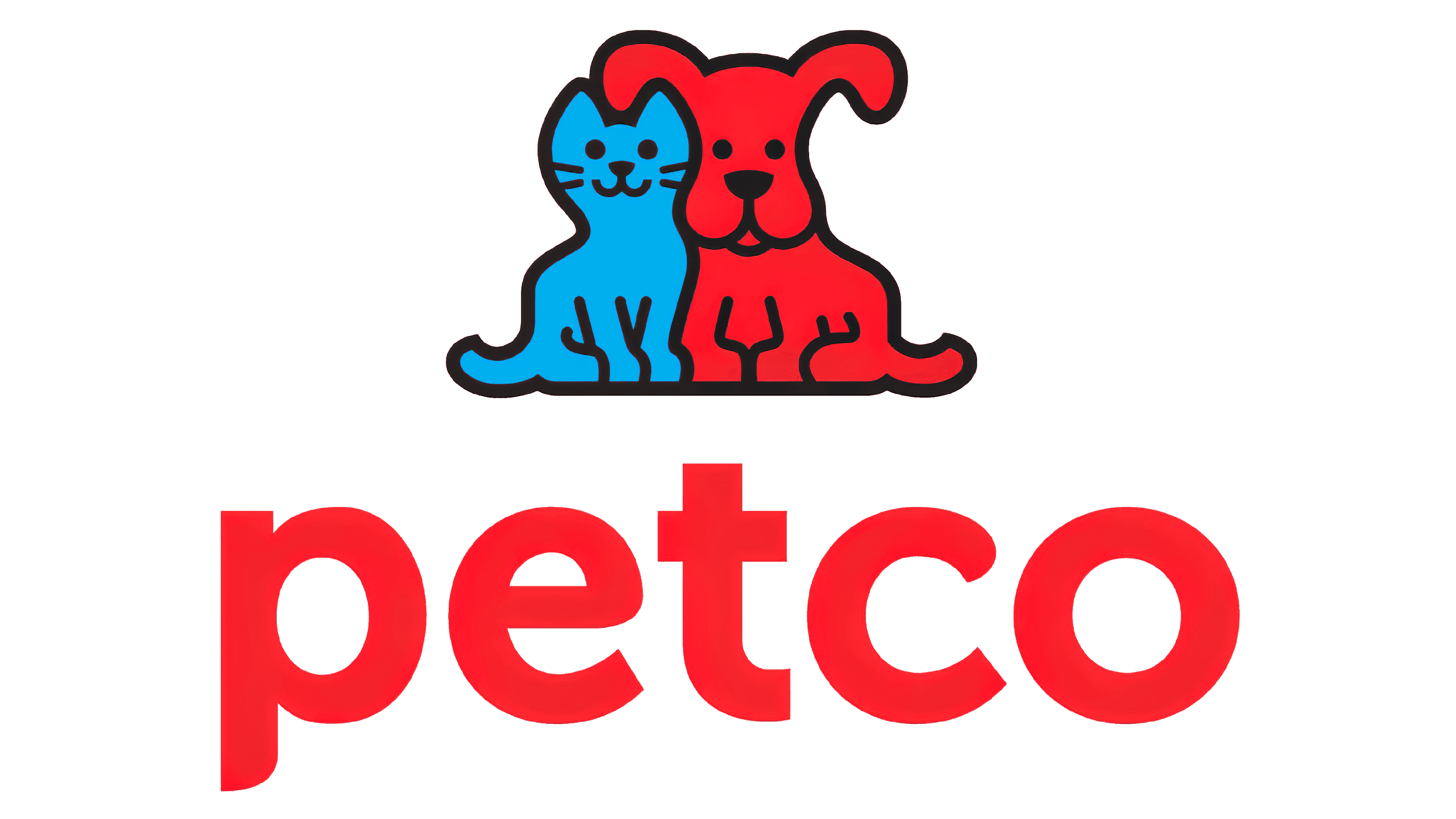
The slogan was removed and the logo has undergone a few other modifications. First of all, the animals were enlarged and placed slightly further from the inscription. The latter, on the other hand, now featured all lowercase letters and a new sans-serif font. Its unique feature was rounded ends of the letters that resembled the rounded shape of the pet, in particular their ears. The color palette was preserved the same, although the shades of both blue and red have slightly changed.
2020 – Today
![]()
A new, modern look was presented in 2020. It had very little in common with all the earlier Petco logos. The deep blue looked very different from the bright and cheery blue seen in other logos. It also contributed greatly to the stylish and contemporary look of the inscription. The latter is printed using all lowercase, sans-serif letters. There is only one small detail that connects this logo to the previous version and that is the first letter, where the vertical line has the top cut straight, while the bottom features a beautiful curve. The inscription looks very balanced and its clean lines create a feeling of perfection.
Font and Color
For many years, the company used a rather modest black-and-white color palette that created that classic look. In 1989, it was changed to bright blue and bold red. These colors reflected a new stage in the company’s history and its stability as well as its strong position in the market. The vivid colors also served as a great attention-grabbing tool. This all changed when the company returned to a more conservative color palette using a deep blue as the only color. It gave the logo a very modern and stylish appearance.
Originally, the company’s logos looked handwritten and featured thick, rounded strokes. Over time, the lines got cleaner and the inscriptions looked more professional. It was in 2011 when a rather basic font was changed for something more original with interesting stroke ends. The latest logo appears to be using a modified version of Helvetica Now Display Bold font. The designers took the letter “P” with its rounded bottom end from the previous logo and repeated the rounded element in the letter “T”.