Peppa Pig, a British animated series created by Neville Astley and Mark Baker, debuted in 2004 and quickly became a hit with preschool audiences. The show centers around Peppa, a playful young pig, and her family, engaging in everyday adventures that resonate with its young viewers. With its distinct, colorful animation and five-minute episodes, the series is tailored to captivate and educate its preschool audience, offering simple yet relatable stories.
Meaning and History
The series transcended its initial role as a children’s show to become a global brand, encompassing a wide range of merchandise and international broadcasts in over 180 countries. Its unique blend of child-friendly storytelling and subtle humor appeals to both children and adults, making it a family favorite. The international success of Peppa Pig is a testament to its universal appeal and the creators’ understanding of what entertains and engages young minds.
Educationally, Peppa Pig stands out for its emphasis on social and emotional learning. The show’s narratives often focus on themes like friendship, teamwork, and problem-solving, which are crucial for early childhood development. It has also influenced language development in young viewers, famously leading to some adopting British accents and phrases. This cultural phenomenon reflects the show’s broad impact, not only as a source of entertainment but also as a tool for early education.
What is Peppa Pig?
Peppa Pig is a globally renowned cartoon show for child education. It tells the story of a family of pigs, who interact with each other and the outside world, highlighting the topics of friendship, teamwork, etc. The show’s main character is Peppa, a piggy who learns about the world around her together with the viewers
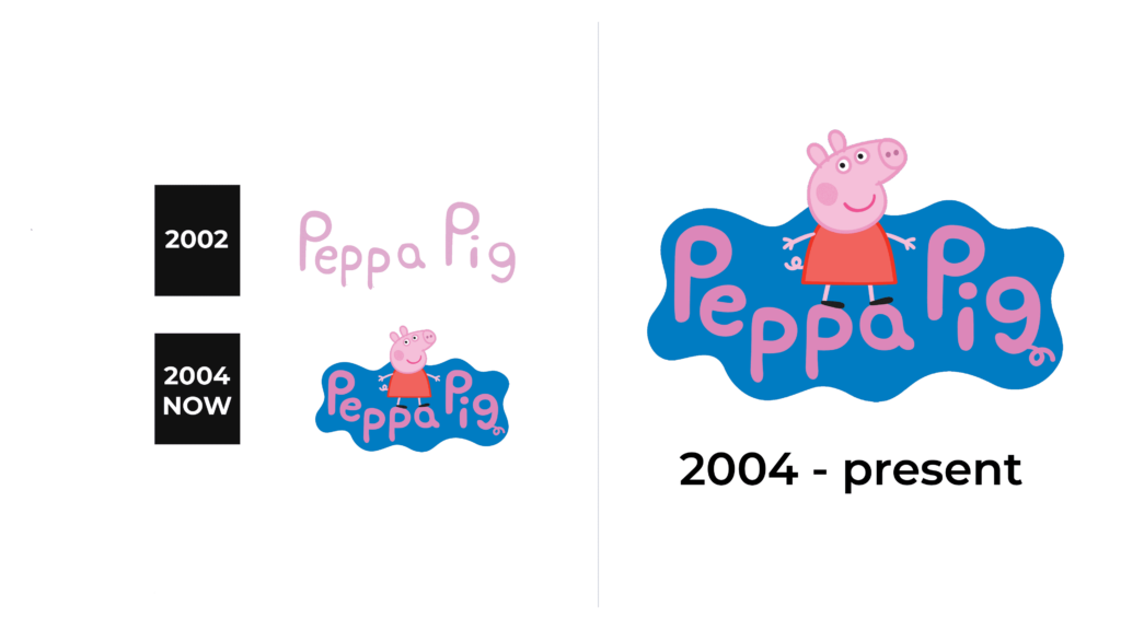
2002
Initially, they used a minimalist and pink handwritten nameplate, spelling out ‘Peppa Pig.’ The inscription stands in a single line, maintaining a uniform color and style that suggests simplicity and approachability. Rounded letters characterize the font, presenting an informal and friendly aesthetic appropriate for a children’s brand.
2004 – today
The logo has transformed to frame ‘Peppa Pig’ within a playful, blue shape that recalls a puddle or cloud, adding a splash of dynamic color. The typeface has become thicker, with a vivid pink hue that lends the text a more striking and engaging look. Peppa Pig herself appears beneath the text in its iconic posture, which infuses the logo with personality and directly appeals to the show’s intended young demographic.
Color
Since the show targets children and their parents as the main audience, the developers have selected an appealing color palette of pink, blue, bright red & purple. There is also a touch of black and white as secondary colors, supposed to add contrast and depth to the logo elements.
Font
The font in the Peppa Pig logo evolution is specifically crafted for the brand’s identity. Featuring rounded edges and a uniform stroke width, the earlier version (2002-2004) is handwritten, projecting a soft and inviting vibe that resonates well with a children’s brand. Its simplicity and informality are key to its charm. With the transition to the later version (2004-present), the typeface becomes bolder and the characters more rounded.


