Parental Advisory is the name of a label put on the covers of music recordings, video games, movies and other multimedia sold in stores to specify that the content pieces the parents are about to consume are not suitable for their children. This label came about in the 80’s when explicit and provocative music and films were on the rise in the US and UK.
Meaning and History
![]()
The Parental Advisory mark has appeared as a response of the American & British officials on the growing popularity of the music that raised the topics of sex, violence, war, and other things, unpleasant in casual discussion. People in the 80s wanted to somehow prevent their children from buying this provocative music and at least make them aware that these songs are sung for adults.
In particular, Tipper Gore, the future Second Lady of the United States, founded the Parents Music Resource Center in 1985 and developed a special label for inappropriate music. Subsequently, the scope of the label was expanded to include all works with provocative content, including movies, films, games, TV shows, etc.
What is Parental Advisory?
Parental Advisory is a special logotype on the packaging of music, video games, movies, and other types of content indicating that they are not intended for children.
1980s – 2001
![]()
The earliest logo is quite modest, with a vintage feel. It features an off-white circular background with a serif font that reads ‘WARNING Tone of this record unsuitable for minors’. The text is placed at the center to occupy the prominent place on the shape.
1990 – 2001
![]()
During this period, the logo adopts a stark black and white color scheme for high contrast and visibility. The text ‘PARENTAL ADVISORY EXPLICIT LYRICS’ is in a bold, all-caps serif-free typeface. The design is straightforward, aiming for clear communication rather than aesthetic flair. This logo places emphasis on the ‘explicit lyrics’ component, directly addressing the content that requires parental discretion.
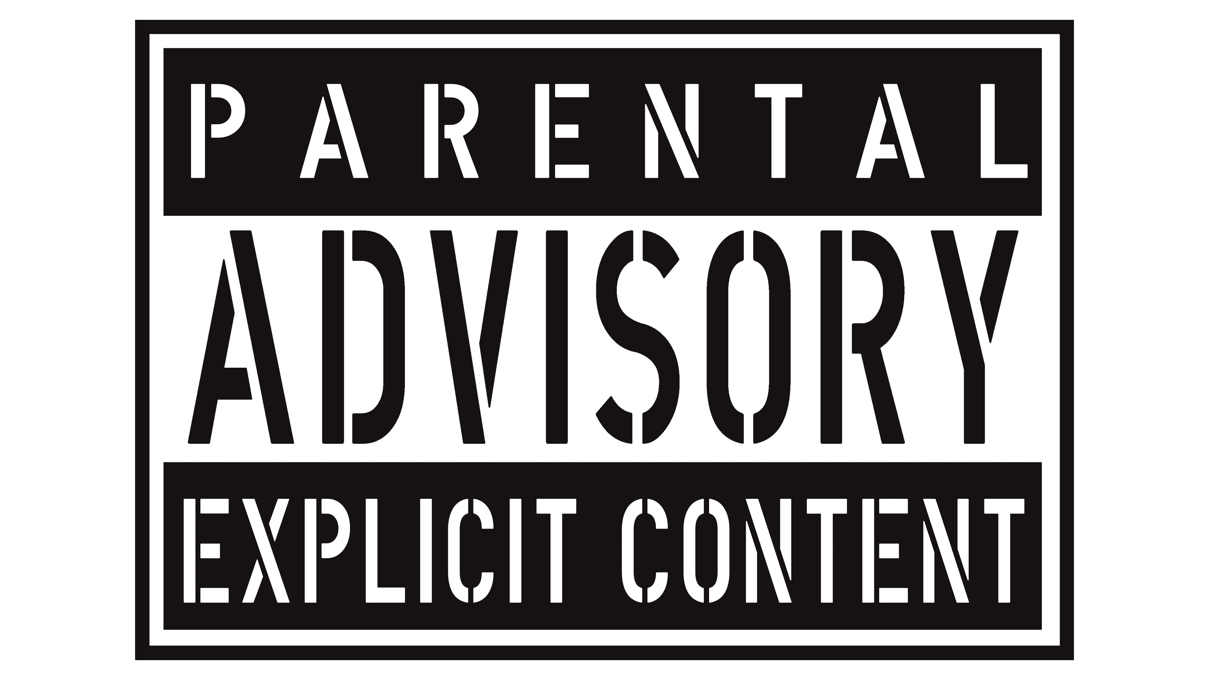
1996 – today
![]()
This iteration maintains the black and white color palette but introduces the term ‘EXPLICIT CONTENT’ instead of ‘explicit lyrics,’ broadening the scope to encompass all forms of media content, not just music. The font is sans-serif, thick, and condensed, allowing for a more impactful and attention-grabbing presence. The words ‘PARENTAL ADVISORY’ sit above ‘EXPLICIT CONTENT,’ both enclosed within a rectangular border, signalling a standardized warning label.
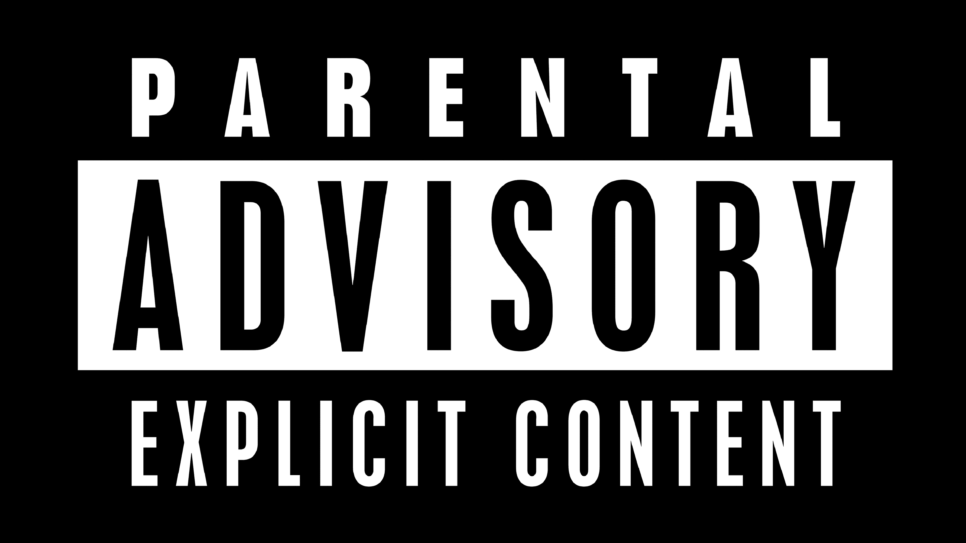
2001 – today
![]()
The most recent design in the evolution maintains the previous logo’s text but opts for a sleeker, more modern sans-serif font. The words are evenly spaced and balanced, ensuring legibility and a contemporary aesthetic. The consistency of this design with the one from 1996 suggests a solidification of the branding and indicates that this warning label has become an established and recognized symbol in media consumption.
Font
The typeface used in the image features thick, narrowed letterforms with no serifs. Their only purpose is to be seen, hence the attention-grabbing, somewhat commanding style of the inscription.
Color
The color palette follows the same goal, with white and black letters arranged on a black and white background and reversed as needed. In combination with bold font, this coloring allows the label to capture the viewers’ attention and convey information to them.