Panera Bread is a fast-casual chain of cafe-bakeries. While the chain is a network concept geared toward mass consumption and quick service, its menu features more elaborate dishes than traditional fast food, including dishes made with complex ingredients like fresh dough. Panera Bread is also renowned for its cutting-edge IT system. This is a special IT system designed for this specific company, not just a program to automate routine restaurant business procedures. It helps establish new competitive advantages in servicing clients.
Meaning and History
![]()
Au Bon Pain Co. was founded in 1981 by Ron Schaich and a partner. After going public in 1991, Au Bon Pain acquired the bakery, which became Panera, two years later. In 1999, Au Bon Pain was sold to concentrate on Panera. In order to expand its presence in airports, hospitals, and colleges, Panera Bread announced in 2017, that it was purchasing the bakery business Au Bon Pain. In the same year, JAB Holding Co., a coffee conglomerate, agreed to pay $7.5 billion to acquire Panera Bread Co. Panera filed trademark applications toward the end of 2022. In its application, it discusses employing collectible tokens (NFTs) to carry out business transactions including virtual food and beverages, and use computer programs to gain access to these metaverse tokens. The firm intends to introduce its own virtual eating establishments with home delivery features along with the new Paneraverse brand.
What is Panera Bread?
Being a bakery and café, Panera Bread’s menu includes made-to-order sandwiches, soups, salads, coffee prepared from freshly ground and roasted beans, and other light drinks. All baked products are produced in-house using fresh dough. As it grows, the network actively employs the franchising model.
1987 – 2005
![]()
The logo of Panera Bread has undergone minimal changes. An illustration of a young woman with flowing hair carefully and with love holding a loaf of bread. The original version only has a black outline and white background. Right underneath is a familiar brand name inscription done in two lines. The first word features thick, rounded strokes, while the second is printed using smaller characters with a hand-drawn oval shape as a frame. The frame was actually a reference to the loaf of bread.
2005 – 2011
![]()
The logo was refined in 2005. One of the first things that catches the attention is the addition of a muted yellow shading behind the woman drawing. It added a warm and happy feeling. The illustration was also enlarged, while the “Bread” line got even smaller. A closer look will make it clear that the strokes were refined, mainly the letter “P”, making the name look sophisticated.
2011 – 2020
![]()
Many years later, the company decided to remove the oval border although the bread was still part of the logo. The logo got even warmer as the classic black was replaced by the brown. Another major update was the introduction of a new font for the “Bread” portion of the name. A clean, traditional, sans-serif font and all uppercase characters created a nice contrast to the smooth, rounded font of the top line.
2019 – 2020
![]()
This version looks the most different from any other. The main difference is the drawing of the woman. She is now holding a wheat grass bouquet, which symbolizes the beginning of the breadmaking. The woman’s hair also looks a bit different. Even with these changes the brand did not lose its identity and continued to be loved by people who enjoy the scrumptious baked goods.
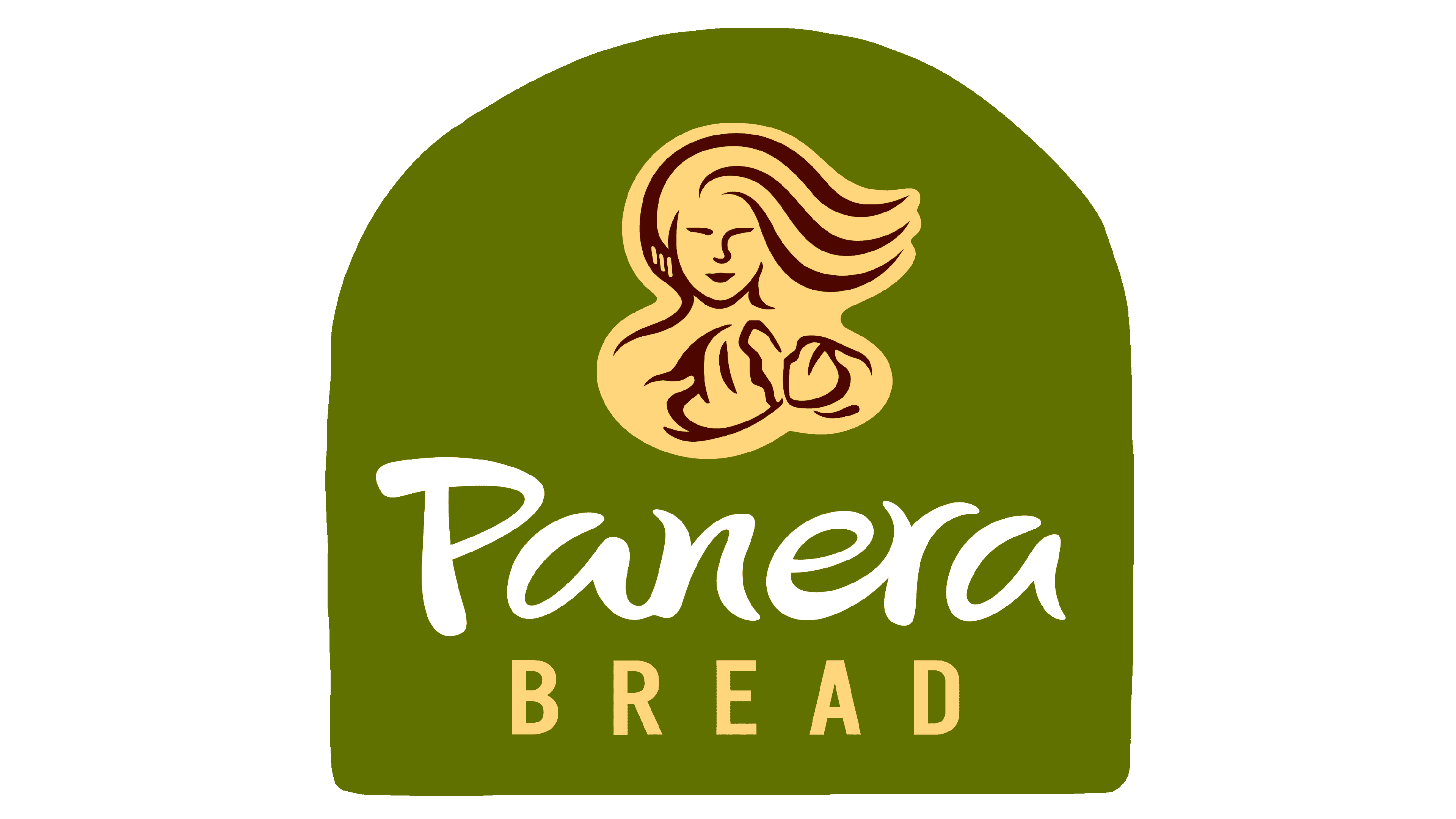
2020 – Today
![]()
Unlike previous logos, this version has the woman facing forward and offering broken bread. Her hair is flowing to the side and the image has a yellow shading, similar to the earlier versions. This illustration makes the bakeries appear more welcoming and whole-hearted. The name was printed in the same style, which gave the logo a recognizable appearance.
Font and Color
The “Panera” portion of the name is printed using a custom font that was slightly adjusted in some versions. It features smooth, thick strokes that have thinner ends. This varying thickness of the strokes created a unique and friendly wordmark.
The color of the logo remained pretty neutral with a black/brown and muted yellow color palette and white serving as the base. These colors allowed the brand image to stay in style throughout the years. At the same time, the yellow added a friendly and welcoming touch.