Luz is a teenage girl who is not afraid of anything and has incredible confidence in her abilities. One day she finds herself in a magical world, where she immediately makes new friends: a little demon named King, as well as a witch named Ida with a rebellious character. After this, she decides to make her dream come true and become a witch, although she was not born with any magical powers. To do this, Luz has to hide the fact that she is an ordinary human (due to prejudice towards people) and learn everything she possibly can in the Owl’s House.
Meaning and History
The Owl House is Dana Terrace’s first project of her own, but fortunately, she has the help of screenwriter Rachel Vine. The world premiere took place on the Canadian Disney Channel. The series was planned to be ready in 2019, but it was delayed until 2020. Interestingly, even before the premiere of the first season, the second was already approved. In May 2021, the series was renewed for a third season. Unfortunately, it was canceled in October 2021 and shortened to three special episodes due to its inconsistency with the Disney brand.
What is Owl House?
The Owl House is an American fantasy animated series about a girl named Luz. It cannot be called original, but Dana Terrace’s series still has its own unique charm. There are lively and humane heroes, a world with its own atmosphere, good jokes, and a plot that can give a lot of pleasant emotions.
2020
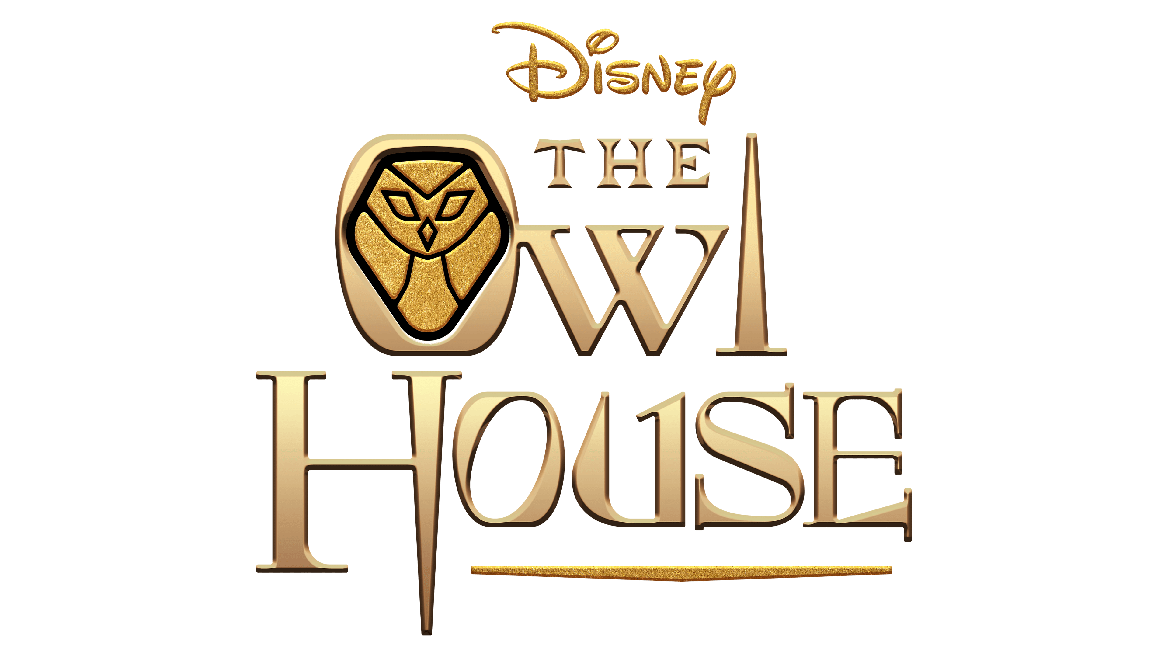
The logo reflects the genre of the animated series. The name is printed in three lines with the top line featuring a much smaller font size. The metallic golden color of the inscription creates a magical feel. the characters also have a three-dimensional appearance that enhances the grand look. To show that there is some horror involved in the series, the designers chose a font that had pointed ends. It is not surprising that the owl character is also included in the logo. It is engraved in the center of the “O” in the Owl. The drawing of the bird has the form of a precious stone and golden color, which enhances its significant role. It can also be thought to resemble a shield, making this element a symbol of protection and showing that there might be a danger that one might face. The mesmerizing image of the owl reminds of drawings one would see in ancient caves, adding a mysterious touch.
Font and Color
The designers created a custom font for the inscription. However, it looks like it was largely inspired by the Foxcroft NF. The latter first appeared back in the late 1800s in the Farmer, Little & Co. Book. Its creator Nick Curtis, in turn, used the Vassar typeface as the basis.
As for the color, the golden serves as the main choice, while black creates an accent and a feeling of depth. Both colors look sophisticated and powerful. The golden undoubtedly stands for the magical setting of the series.


