Nabisco came up with the idea in 1912 and created the legendary Oreo cookies. When they were first launched, they were called Oreo Biscuit. In 1921, they were renamed Oreo Sandwich. In 1937, the name was changed to Oreo Crime Sandwich, and in 1974 Nabisco chose the current official name: Oreo Chocolate Sandwich Cookie. Despite this naming, most people just call them Oreo cookies.
What is the interesting fact about Oreo?
It is worth mentioning the famous collaboration was with Lady Gaga. The American company has teamed up with the Grammy Award winner to offer a new version of cookies inspired by her sixth studio album Chromatica, which was released earlier in May 2020. The new cookies were produced in bright colors with pink-gold Oreos stuffed with green cream, which were then covered with patterns inspired by album covers.
Meaning and History
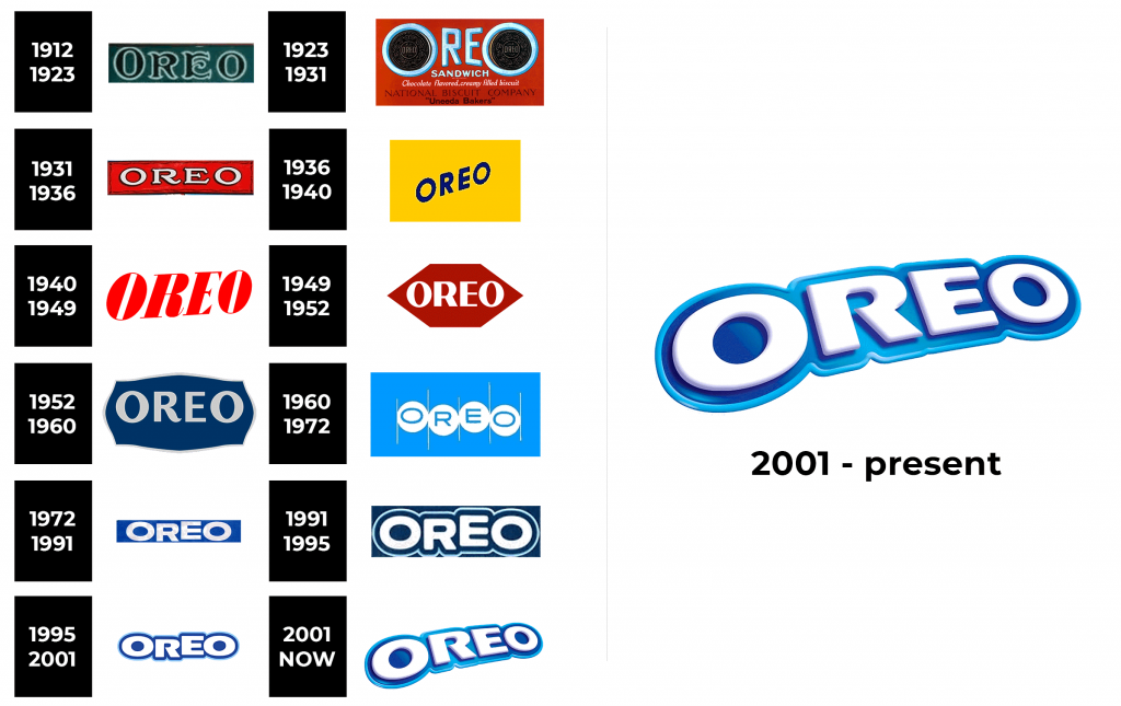
Oreo is one of the most iconic brands with the most logo redesigns in history. More than 10 different versions of the logo have been created.
1912 – 1923
The first Oreo logo was introduced in 1912 and remained with the brand for almost ten years. It was an elegant and ornate black inscription, executed in capital letters with an enlarged first letter “O”. The letters had a clear white outline and were placed on a calm dark blue background. The combination of colors of the original brand logo looked as luxurious as possible.
1923 – 1931
Changes in 1923 introduced a completely new logo concept. The background was now painted red, the first and last letters replaced by two round cookies, circled in white and blue. The additional text was written on four levels using four different styles: blue, white and black.
1931 – 1936
The 1931 logo was very similar to the original version, but the colors were very different. It was a stylish white inscription with a black outline, placed on a horizontal rectangle with a red background and black vignettes around the perimeter.
1936 – 1940
A new color palette was introduced in 1936. A blurry blue inscription was placed diagonally on a bright yellow background.
1940 – 1949
The blurred contours remained the main decorative element of the Oreo logo after its redesign in 1940. The updated trademark consisted of a red inscription placed on a white background. The inscription is made in Extra Bold font with thin oblong serifs.
1949 – 1952
The new 1949 design featured a burgundy rhombus on a blue background. The inscription “Oreo” was made in capital letters of a modern and stylish sans-serif font in white in the middle of the rhombus.
1952 – 1960
The next logo was designed in 1952. The letter “R” with a curved elongated tail was depicted on the light gray elegant sans-serif inscription. The verbal sign is enclosed in a smooth ornate frame of the same color and placed on a calm blue background.
1960 – 1972
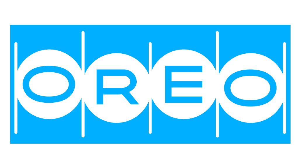
The logo, introduced in 1960, consisted of a bright blue background with four white circles. Each of them had one of the capital letters “Oreo”. The elements were separated by very thin white vertical lines.
1972 – 1991
The next emblem was created in 1972 and consisted of white bold letters on a blue background. The main thing that made this simple logo stand out was the uneven arrangement of the text.
1991 – 1995
The 1991 inscription was framed in a double contour: the wide one had the same dark blue shade as the background of the coat of arms, and the outer one blue was thinner.
1995 – 2001
Then in 1995 the contours of the logo were modernized. Modern bold sans-serif font began to look more distinct and confident, especially on a white background.
2001 – now
The logo 2001 remains with us now. The brand has redesigned its three-color trademark into a three-dimensional icon. Now it has become multi-layered and has acquired volume and dynamics. This redesign was carried out after the acquisition of the brand by Kraft Foods while preserving the uniqueness and authenticity of the label.
Font and Color
The main colors of the logo are white and blue. White color sets off blue well. The meaning of the blue color in the logo: it is conservative, looks clean, neat, calms and inspires confidence. Blue does not cause rejection. It is suitable because the brand positions itself as a reliable partner who can be trusted.


