Oppo is famous all over the world for its flagships, unique smartphone design, successful marketing, and cutting-edge technology. The brand is investing a lot of money in promoting its products and it is paying off. Advanced technologies and a certain uniqueness allow the brand to develop. The range of gadgets is constantly growing. The company presents new and improved models, trying to increase the market share. A characteristic feature of all models is a high-quality front camera, even on budget models. This is the hallmark of Oppo phones.
Meaning and History
![]()
Oppo became a wholly owned subsidiary of BBK Electronics, a consumer electronics giant founded by Duan Yongping in 1995. Oppo was created back in 2001, but the official date of registration of the company is 2004 since this is when two Oppo branches were created at once. The first is in China, with production facilities also located here. Oppo’s second division is located in Mountain View, California. Initially, the forces of the Chinese division were assigned to the creation of MP3 and MP4 players. The company entered the communications market in 2008. The first model was called A103 – a regular button phone. Oppo’s subsidiary, OnePlus, was created in 2013. This Chinese brand is still successfully operating and developing, offering its smartphones. In the same year, Oppo began to expand the horizons of its work, officially entering the markets of the USA, England, Hong Kong, Taiwan, Australia, Vietnam, and Indonesia.
What is Oppo?
Oppo is a Chinese smartphone manufacturer. It is part of the BBK group, which also manages the OnePlus and Vivo brands. In addition to China, the company’s devices are sold in more than 40 countries around the world. They are used by about 200 million people.
2004 – 2013
![]()
The logo features only the name of the company in black. This minimalistic, clean design gives it a timeless and formal look. The font used for the name looks like it was inspired by a font similar to Street Corner HyperExtended or Worship-ExtraexpandedBold. The designer slightly thinned the strokes on the left side and cut the circle creating the “p”. All the letters used the same oval shape, which created a feeling of cohesiveness and perfection.
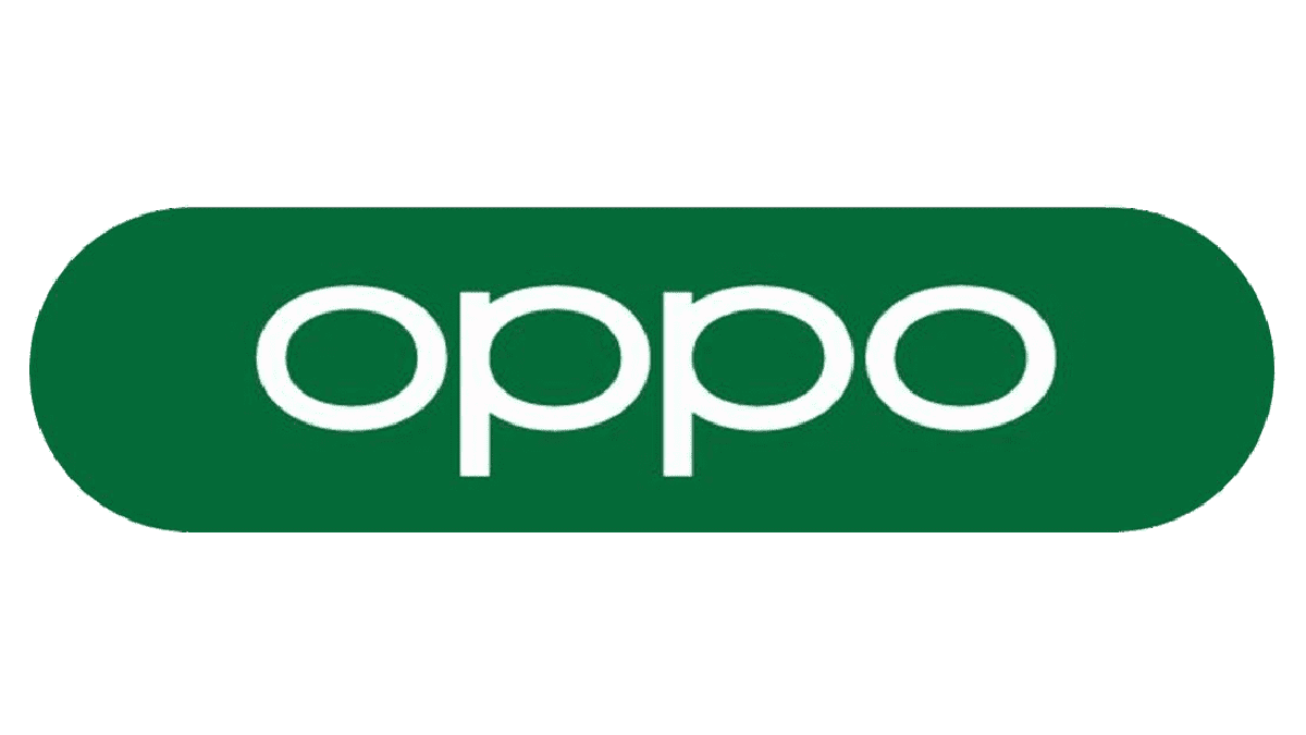
2013 – 2019
![]()
The company has slightly adjusted the logo in a little less than ten years after the last was designed. The most noticeable change was the updated color. It was now a pleasant shade of green. The company likely wanted to reflect its environmentally-friendly approach to business. The strokes no longer looked as fine as in the original version, which made the company look more solid.
2019 – Today
![]()
The new logo was designed by the well-established Pentagram agency. It was not long before the company returned to the black color for its logo, although one can also see it done in a darker green. The color was not the only element that changed this time. Although the company continued to use all lowercase letters for its logo and even chose a font that had oval-shaped letters, there is a slightly different feel to it. First of all, the strokes now have the same thickness. In addition, the letters “p” no longer have a slit at the top. This version preserved the original personality while enhancing the strong and stable position of the company.
Font and Color
The black color, which the company used for some of its logo versions, gave the brand a serious and professional appearance. It also used several shades of green. The latter gives the brand a fresh appearance and is more youth-oriented. Moreover, green is typically associated with the environment and makes the company look good in the eyes of its users.
The company stayed pretty consistent when it comes to font choices. Although each logo featured a different font, all of them were connected by the oval shape of the letters. The fact that the logos used only lowercase letters each time enhanced the brand recognition.