OnlyFans Logo
Tags: social network | United Kingdom | web portal
Blogging has become the norm in modern society. Now, every second person creates accounts on various entertainment channels, such as YouTube, TikTok, and other popular social networks, and tries to monetize their content in every possible way. OnlyFans works much like Instagram and TikTok — some users create content and others watch it. The main difference is that you always have to pay for viewing. OnlyFans takes care of the technical part and processing payments, while the creators can focus on making content and finding their audience. This is a platform with a focus on adult content, though. Of course, the creators of the platform position their brainchild as a resource for all creators, but it is not hard to guess who has the most subscribers.
Meaning and History
OnlyFans is a young social network. It was created in 2016 by the English entrepreneur and former banker Tim Stockley. This was not Stokeley’s first project – he previously launched Customs4U.com, where users could pay porn stars for exclusive content. This project, though, was not as successful as OnlyFans. In 2018, Leonid Radvinskyi, an American of Ukrainian origin, bought 75% of OnlyFans. Partially due to the new ownership, but mainly thanks to the Covid-19 pandemic, the number of users grew exponentially. In 2020, OnlyFans users paid more than $2 billion for the service.
What is OnlyFans?
OnlyFans is an application with photo and video content (often intimate/erotic), for which you need to pay for a subscription. During the pandemic, this platform for selling content became very popular. OnlyFans is available in many regions, including the UK, USA, Australia, Canada, India, Dominican Republic, Mexico, and Venezuela, but in some countries, it is prohibited.
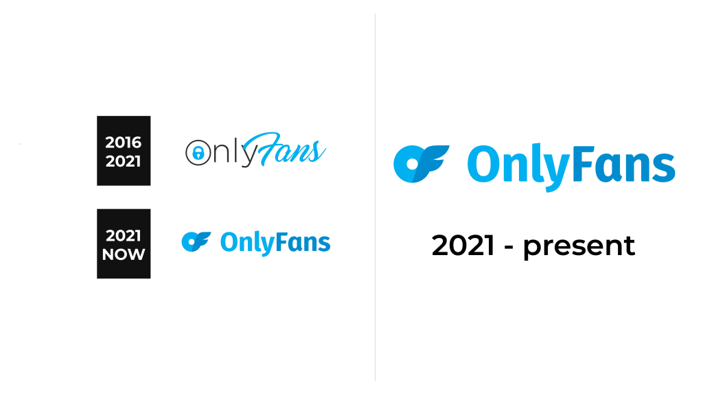
2016 – 2021
The first logo of the platform consisted mainly of its name. The “Only” portion was printed in polished, sans-serif font of black color. A small blue lock inside the “O” hinted at the fact that the content will be locked until you pay for it. The “Fans” half was done in a fancier, graceful font a light blue color that match the color of the lock. Maybe, this was another hint that only true fans have the key to the amazing content found on the platform.
2021 – Today
The new logo was simpler and did not tell anything about whom the logo belonged. Given the growing popularity of the platform during the pandemic, there probably was no need for this. At the same time, the world had fewer restrictions and individuals were able to entertain themselves in other ways besides paying for OnlyFans content. Thus, it was important for the service to bring back the attention to the platform, so creating a new logo was just part of this process. For the name, they chose a simple, sans-serif, yet bold font with diagonal cuts. Similarly to the original version, the two words were separated by color. There was no lock in this logo, but a new element was added on the left. It looked like a circle with wings and was actually a creative way to present the initials of the service’s name.
Font and Color
The service originally chose a black and sky blue color palette with white for the background. Such colors did not restrict when it comes to the content or direction the platform could go as they are classic choices used across many industries. Later, they moved to a monochrome color palette featuring two shades of blue. The logo introduced in 2021 uses a smooth, basic, sans-serif font that resembles Gardenia Extra Bold. Originally, they used two different fonts – one that looked like Ano Half, while the other was a very elegant, cursive typeface that resembled Clarkson Script Regular by Adam Fathony.


