This is a huge chain of family restaurants where locals celebrate birthdays and meet with relatives and friends. The menu is Italian in the American style: traditional portions are larger, and dishes are fattier and sweeter than in Italy. You get unlimited refills on soup, pasta, and those baskets of crave-worthy breadsticks. Many of the meals are prepared by hand and are made fresh daily. The interior is stylized as an Italian house: there are heavy wooden chairs, plants in painted pots, and photographs of Italian landscapes hanging on the walls.
Meaning and History
![]()
Olive Garden was launched back in 1982 by the General Mills company. In a matter of several years, these Italian-themed eateries could be seen way beyond its birthplace in Orlando. After all, Olive Garden was created with the intention of being a major chain. The chain was later transferred under the ownership of Darden Restaurants Inc., which was created by General Mills. Nowadays, Olive Garden can be enjoyed in Brazil, Canada, the United Arab Emirates, Mexico, and other international locations. No wonder it is the largest Italian-themed full-service chain restaurant in America. Despite a struggle during the COVID-19 pandemic, the restaurant reported that it was getting great profits in 2021.
What is Olive Garden?
Olive Garden is an American restaurant chain specializing in Italian-American cuisine. There is a wide selection of classic dishes such as lasagna, baked eggplant, and pasta, and you can also enjoy a family-style dinner with a selection of wines to choose from.
1982 – 1989
![]()
The inscription, which makes up the whole logo, features an elegant, cursive font. The name is printed in two lines that slightly arch and go well with the handwritten logo style. The dark green color not only makes the logo look sophisticated but also hints at the natural and healthy dishes one can enjoy at the Olive Garden restaurant. Although there are no other elements, the logo looks quite impressive and grand.
1989 – 1998
![]()
Besides introducing a black version of its logo, the company added another line. It said “Italian Restaurant” in a smaller serif font. The font choice, as well as all uppercase letters, create a nice contrast to the stylish inscription above. The logo preserved its unique appearance, while the additional information specified the direction of the restaurant.
1998 – 2014
![]()
The logo acquired a new look in 1998. The most prominent update was the addition of a drawing of a grape bunch with curved lines and leaves in the upper right corner. The article was removed from the name, which was now printed in two lines and had a more balanced look. The inscription here has a textured green and black look with a thin black shadow. In addition, the designers rounded the stroke ends and slightly adjusted the font in other ways to make it match the illustration on the right. The tagline was printed in purple to match the grape color and no longer had serifs.
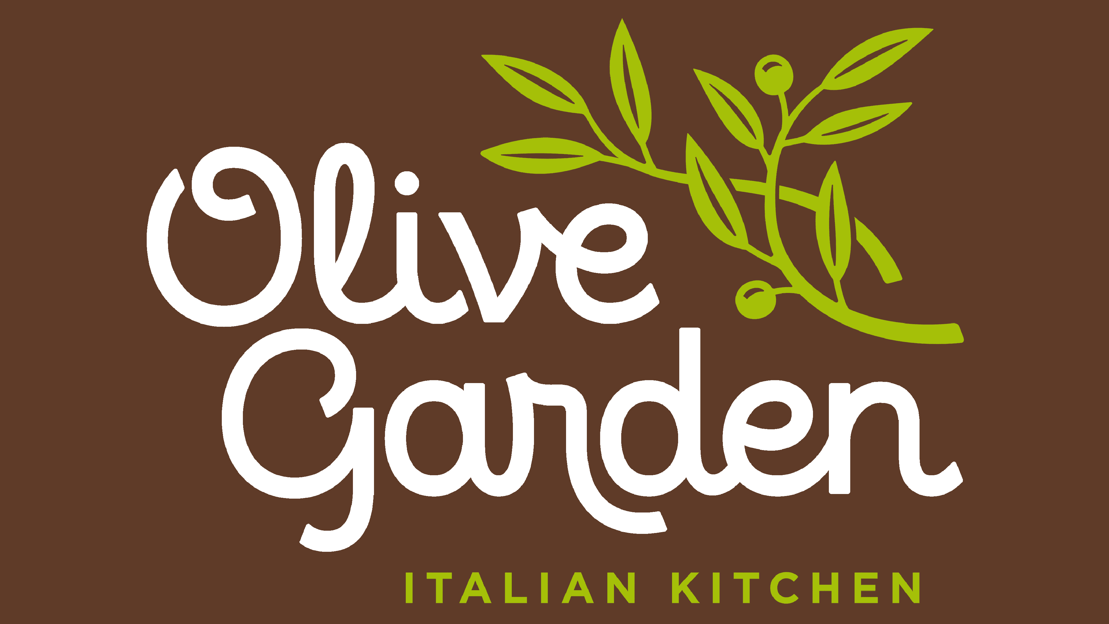
2014 – Today
![]()
Although there are still multiple details in the logo, it somehow looks more minimalistic and modern. The grapevine is replaced by a few olive branches that are done in a light green color. They surely seem more appropriate than the grape vine given the name of the chain. The branches were contrasted by a gray inscription with a tint of brown to give it that earthy feel. The tagline here says: “Italian Kitchen” in a sans-serif font of light green to match the color of the branch.
Font and Color
Until 2014, the Olive Garden logo featured the same font with a few modifications made in 1998. It was a handwritten, cursive font with varying thicknesses of strokes that enhanced the custom look of the inscription. The latest logo features a font that closely resembles the Eldwin sans-serif font by The Northern Block.
The color palette is probably even more linked to the brand than the font. From the very start, they chose green as their signature color to symbolize the freshness and healthiness of the meals. A few years later, they also started using a black version. For a little over fifteen years, a basic green color palette was accompanied by purple, which was used to draw grapes and tagline, as well as a splash of red. Lately, the green became a secondary color and got much lighter. The name, on the other hand, was printed using a gray color with a brown undertone.