Nickelodeon, the legendary TV channel known for its wide range of children and teen shows, with a focus on animation, is a staple of entertainment. While its heyday is often associated with the 1990s when it is immensely popular among kids in America and beyond, its history traces back further.
Meaning and History
![]()
Nickelodeon’s roots can be traced back to the show called “Pinwheel,” which premiered in 1977. The show gains significant popularity, leading to the renaming of the channel that airs it to “Pinwheel” as well. This success ultimately paves the way for Pinwheel to evolve into a fully-fledged TV channel. The name “Nickelodeon” itself is inspired by “nickelodeons,” which are inexpensive movie theaters from an earlier era.
What is Nickelodeon?
Nickelodeon, a cable channel catering to children’s entertainment, was founded in the United States in 1979. It holds the distinction of being the inaugural cable channel solely dedicated to children’s content. Over the years, Nickelodeon has expanded into a global corporation, offering its programs and cartoons in both English and Spanish languages, making it accessible to a wide and diverse audience worldwide.
1977 – 1979
![]()
The initial Pinwheel logo features a straightforward black inscription, but with a playful twist. The letters are designed to appear childlike, cartoony, and whimsical. There are no straight lines or sharp angles; instead, everything has a playful and wavy quality. This design influences subsequent logo iterations for Nickelodeon.
1979 – 1980
![]()
Nickelodeon’s first logo might surprise some, as it diverges from the playful style of Pinwheel. The letters are black, bold, and blocky, resembling newspaper headlines. Beneath the main text, there is a simple serif that reads “The Young People’s satellite network.” Additionally, a black-and-white figure is randomly peering into the letter ‘N.’ Although they intend to redesign the logo with a more comical scene, time constraints lead to this version.
1980 – 1981
![]()
In this iteration, there is a return to some inspiration from the Pinwheel experience. The logo consists of the channel name in black, with thinner letters compared to the previous version. The letters take on a more fluid serif style with softer, more flowing components. However, this design still doesn’t fully align with the channel’s purpose and is eventually replaced.
1981 – 1984
![]()
The 1981 design embraces a more teen-oriented style. The channel name is depicted with enlarged, balloon-like letters in various bright colors. The color gradient transitions from yellow to purple to green, moving from left to right. Occasionally, a polished metal ball is placed behind the logo, although it isn’t consistently used.
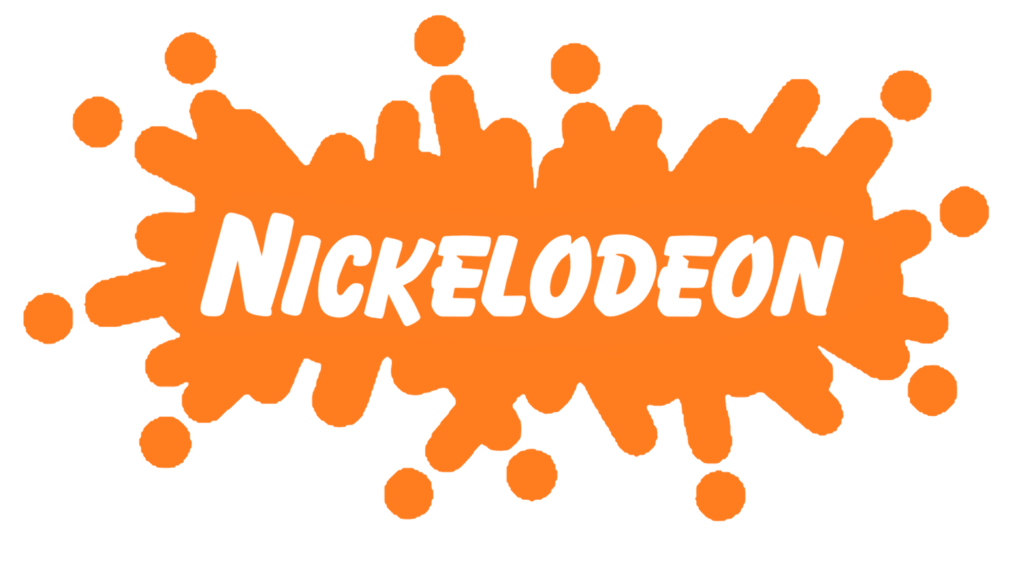
1984 – 2009
![]()
The familiar Nickelodeon style emerges in 1984, featuring orange letters that appear to be painted with strokes. The letters have rough edges, giving them a handcrafted feel, yet they maintain a soft and consistent thickness. Interestingly, all the letters are in uppercase, with the first letter slightly larger.
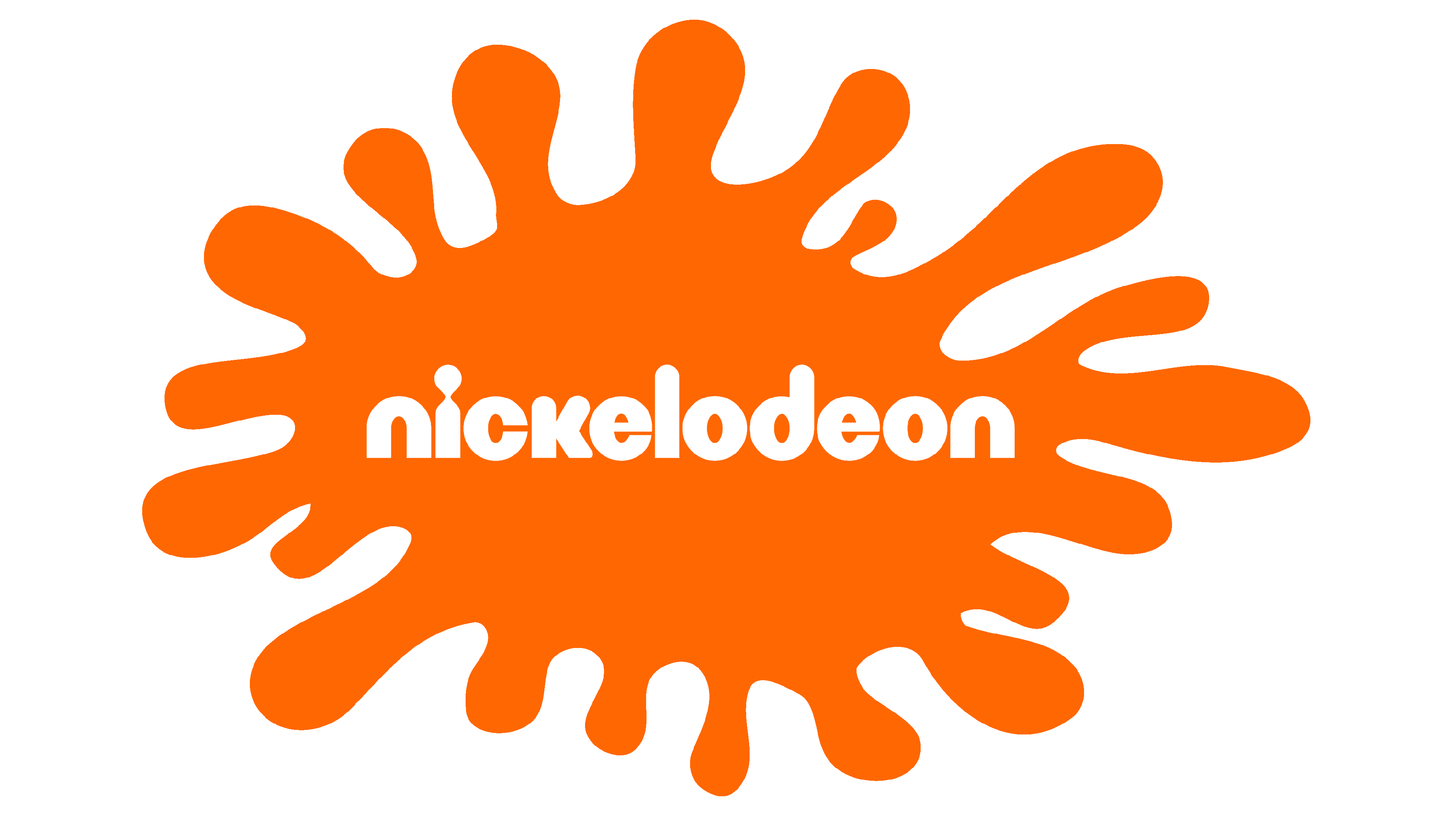
2009 – 2023
![]()
In 2009, Nickelodeon undergoes some changes while keeping the core concept intact. The logo continues to feature orange letters, but this time, they are rendered as balloon-like shapes rather than painted strokes. The letters retain their soft, playful quality, devoid of sharp angles. Notably, all the letters, including the first one, become lowercase in this version.
2023 – Today
![]()
Bright and captivating, this logo dazzles in a bold shade of orange, set against a clean white canvas. The brand name, “nickelodeon,” unfurls in a jovial, curved typeface, embodying childlike enthusiasm and zest. Enveloping the text is a fluid, abstract splash of orange, reminiscent of animated paint or a delightful burst of energy. Subtle swirls and curves stem from this splash, adding a layer of motion and unpredictability. Together, these elements convey a sense of wonder, adventure, and the unrestrained creativity that the channel promises its audience.
Color
Since 1984, the corporate wordmark has showcased a distinctive orange-and-white color scheme.
Font
The wordmark of Nickelodeon uses a distinctive lowercase typography style with very bold lines and small gaps in between.