Newcastle United is a highly accomplished football club that has been a consistent participant in the Premier League, with only a brief interruption. Established in 1892, the club forged its legendary rivalry with Sunderland six years following its inception. The primary ownership of this sports club rests with the Public Investment Fund of Saudi Arabia.
Meaning and History
![]()
From its foundation in 1892 until 1976, Newcastle United proudly wore the city’s coat of arms as the logo but it appeared in the matches only in 1969. This coat of arms was an image of three towers, symbolizing the fortress founded by Robert Courtges, son of William the Conqueror.
This fortress served as a bulwark against Norman invasions and had historical weight. The emblem is accompanied by sea horses, an indication of the city’s deep connection to the sea. The inscription “Fortiter Defendit Triumphans” below the emblem echoes the historical clashes between English and Scandinavian tribes.
The Newcastle United emblem perpetuates the heritage of the Newcastle-upon-Tyne coat of arms. Although the team’s logo has undergone three changes since the mid-1970s, it retained a connection to the city’s defining elements – the harbor and castle – which are of great importance to its residents.
What is Newcastle United?
Newcastle United is a soccer club that maintained a formidable presence in the British Premier League since its inception with little interruption. Founded in 1892, the club has cemented its reputation with iconic events during their matches, numerous domestic and international awards, and UEFA trophies. It is worth noting that the owner of this venerable sporting organization is the Saudi Arabian Public Investment Fund.
1969 – 1976
![]()
The inaugural emblem of Newcastle United made its official debut in 1969, coinciding with the Inter-Cities Cup Final. This emblem prominently features the arms of Newcastle upon Tyne. In its center, a red shield houses three towers, while a fourth tower graces the top of a knight’s helmet. These towers symbolize the renowned Norman castle, New Castle.
Two seahorses take their place in the emblem, representing the city’s maritime identity and port. A lion, holding the flag adorned with the cross of St. George, serves as a reminder of the city’s valor and contributions during the Civil War. The emblem’s lower portion is decorated with a ribbon displaying the motto “Fortiter Defendit Triumphans,” commemorating the historic clashes between Scandinavian and English tribes.
1976 – 1983
![]()
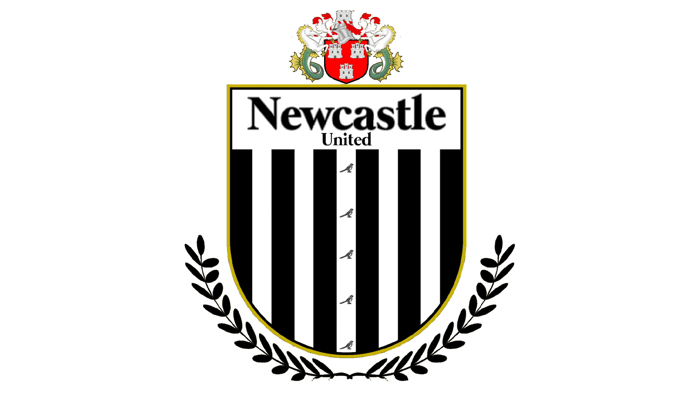
The modernized emblem has acquired a new logo in the form of a ring, featuring the club’s name. This emblem includes essential symbols of the city: the iconic Norman castle and the flowing Tyne River. A magpie appeared in it, taking center stage, the rationale for which is still controversial. Some associate it with the trademark black and white colors of the team, as well as with the corresponding nickname. This logo was in use for a dozen years. Others attribute it to the abundance of crows that nested around St. James’ Park, the club’s home stadium, despite the fact that the stadium was built before the club was founded.
1983 – 1988
![]()
In 1983, a fresh emblem emerged for Newcastle United, presenting a stylized rendition of the abbreviation “NUFC” enclosed within a circular shape. The magpie, a longstanding symbol, remained as a consistent element within this design.
1988 – today
![]()
In 1988, Newcastle adopted its most recent emblem, returning to its origins by refining the original coat of arms of Newcastle upon Tyne. This version incorporated a shield adorned with black and white stripes reminiscent of the team’s jerseys. The turret atop the shield remained unaltered.
A royal lion bearing the flag of St. George stood as a symbol of the city’s resilience during 14th-century assaults and sieges by Scottish forces. The two sea horses were saved within the emblem, while the “brave defenders” inscription was replaced with the club’s name. While the magpie was absent from the modern Newcastle logo, the players’ moniker remained ingrained in collective memory.
Font
An integral aspect of the logo is the “NEWCASTLE UNITED” inscription placed on a ribbon below the shield. To enhance its prominence, designers opted for a timeless serif font with varying stroke widths. This font, recognized as Times Bold, boasts an intriguing interplay of line thicknesses that infuses the letters with a dynamic quality.
Color
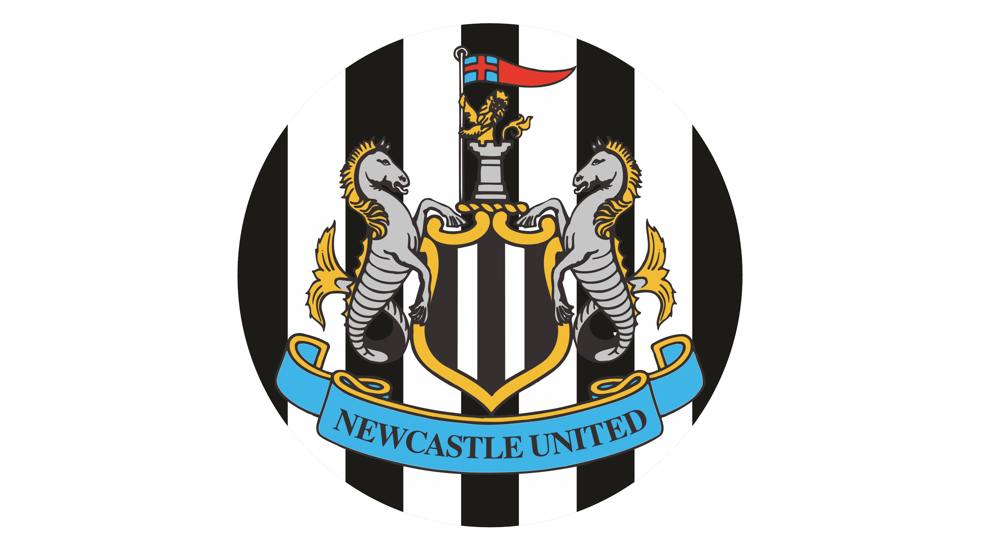
The shield is graced with vertical stripes in black and white, echoing the pattern from the club’s outfits. The shield is golden, harmonizing seamlessly with various other elements of the emblem. The lion, the manes of the seahorses, and the edging of the ribbon are all in the same luxurious gold tone.
The flag, which displays St. George’s cross, is embellished with red at some points. The lower ribbon takes on a deep and captivating blue shade, its inscription elegantly rendered in stark black. The seahorses, characterized by their fish-like tails, as well as the towers and the flagpole, exude a gray hue, adding to the emblem’s overall sophistication.