Netflix is an American streaming service that distributes movies, shows, and cartoons. It makes revenue via subscription, required to view the platform. There are four types of subscriptions, enabling various features to improve the customer experience. The company appeared in 1997; its streaming service appeared ten years later.
Meaning and History
![]()
The name ‘Netflix’ is drafted from the words ‘internet’ and ‘flicks, which means movies. It represents their mission to deliver a wide range of entertainment content directly to viewers’ screens.
Initially, people could enable a subscription by phone, internet, or mail, and have the DVD movies brought right to their doorsteps. Throughout the 2000s, the company understood the growing potential of streaming solutions.
It resulted in the Netflix streaming service launched in 2007. It was an improvement of their DVD service: they suggested its users watch the films right on their computers without waiting for days until they arrive. The money-making strategy stood on subscriptions too.
Slowly, Netflix shifted the focus from DVD to streaming, adding more films to their internet website and signing partnership agreements with cinema production companies. Within 15 years, Netflix has evolved into an international streaming service, offering movies and shows in various genres from documentaries to science fiction.
What is Netflix?
Netflix is an American streaming service, known internationally. It offers a large library of movies, shows, cartoons, and documentaries in various languages. The content here is available after the user submits one of four paid subscriptions.
1997 – 2000
![]()
The original logotype of Netflix was a simple name caption, executed in a capitalized typeface with prominent serifs. The characters ‘F’ and ‘N’ were slightly bigger than the others. The whole wordmark was divided in two by a stylized film tape, colored gradient black and violet. It encircled the first part of the word ‘Net’.
2000 – 2001
![]()
For a year, the company’s logo was a black oval on which an uppercase nameplate found its place. Some characters, however, were lowercase (‘e’ and ‘i’). Above the ‘i’ was a rectangle reminding a TV box or something similar. To the left and right of the oval, they drew yellow brackets.
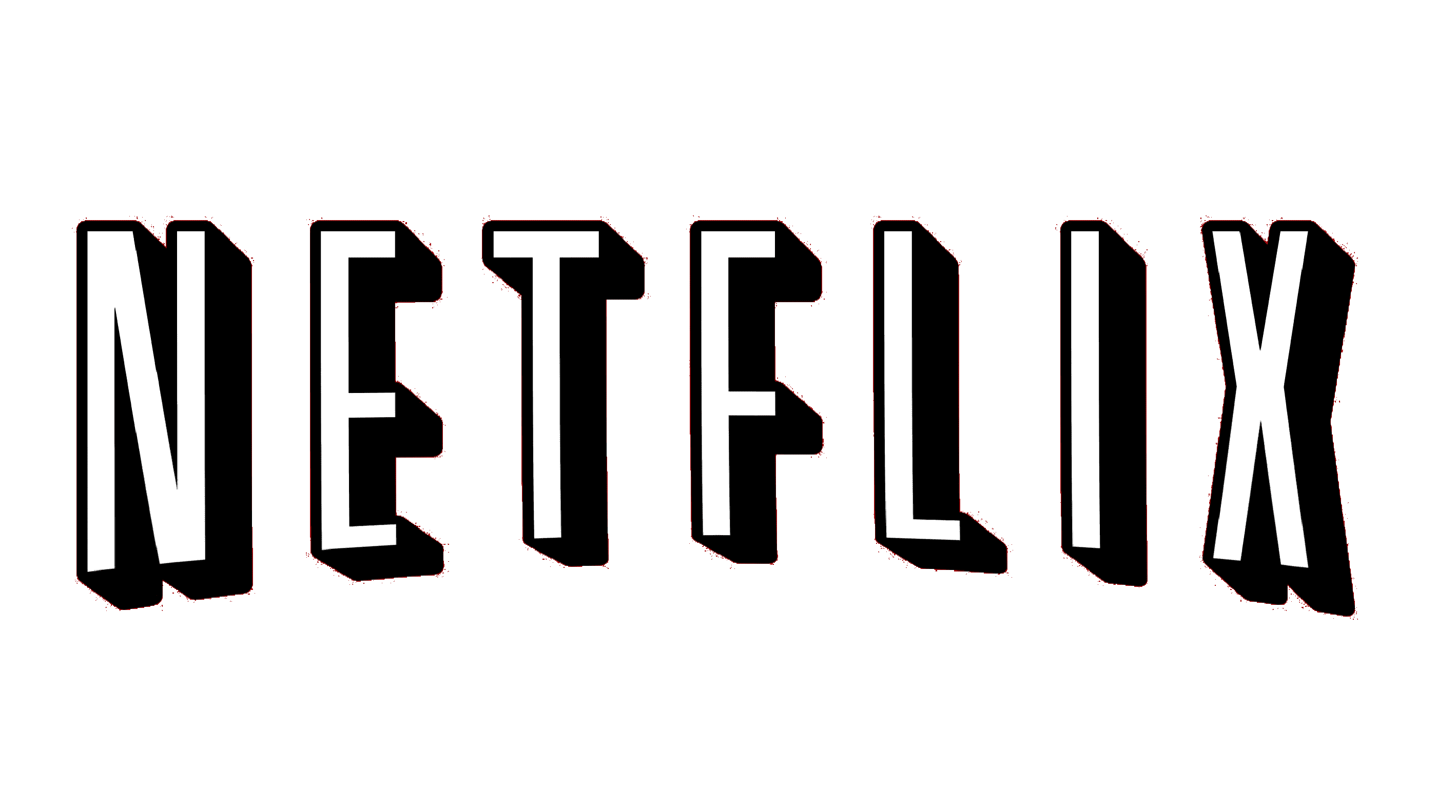
2001 – 2014
![]()
The next logo was used by Netflix for 13 years, representing both their DVD service and the streaming service. It was a 3D name caption, executed in a capitalized angular typeface. The front sides of the letters were white, and each of them cast a shadow. The whole name caption was placed on a dark red background.
2014 – today
![]()
In 2014, the Netflix brand designers made a significant redesign of the logotype. It became a wordmark with all letters executed in a custom uppercase script.
2016 – today
![]()
Font
The Netflix logo features a custom typeface known as “Netflix Sans”. It is a modern sans-serif typeface with clean lines and abrupt edges. The letters in the name are bold and have a slightly elongated form, giving them a distinctive and recognizable appearance.
Color
The color choice for the Netflix logo is a vibrant red, specifically known under the name “Netflix Red.” This bold and captivating hue is instantly recognizable and has become synonymous with the brand.