It seems that now there is not a single person who has not heard about the Minecraft universe. Even an ordinary layman who is not interested in games knows about Minecraft. Although many gamers are biased toward this block sandbox, the multi-million fan audience makes it clear that the game deserves all this hype and popularity. If you are one of the few people not familiar with this game, Minecraft is a popular computer game, the purpose of which is to extract natural resources, build your own worlds from these resources, and protect them from monsters.
Meaning and History
![]()
It seems like Minecraft has been around for a very long time. Yet, this is only because it has gained immense popularity around the world. The game only came out in 2010. Markus Persson created it after one of his favorite games ceased to exist. The author of that project published the source code, which Markus took as the basis for his game. By the way, at first, the game was called Cave Game. Then, the developer discussed the name of the project with other users and decided to change it to Minecraft. The popularity of the game began to grow dramatically even before the official release, which took place on November 18, 2011. In 2014, Microsoft bought Mojang, the company behind the game. Although this fact did not affect the game in any way, the event itself remains significant.
What is Minecraft?
Minecraft is a computer game in which entire worlds are created from blocks that look like giant pixels. This is not a new hobby for teenagers: the project has existed since 2009, and the number of licenses sold has long exceeded 200 million. The Minecraft gameplay is non-linear: tasks can be completed in any order, and there is simply no “correct” passage or a specific single goal.
2009 – 2011
![]()
The designers were inspired by the Minecraft game itself when creating this emblem. The name of the game was printed in all uppercase letters. Each character had a geometric shape since they were formed from paving stones. To add dynamics and more interest to the logo, the designers added a perspective making it look like the letters were slightly tilted to the back. This effect is enhanced by a shadow behind the inscription. The whole logo is done in several shades of gray.
2011 – 2015
![]()
The paving stones were replaced by bricks with cracks. This was not the only modification. The company also made the letters bolder and instead of adding a shadow, made it look like the letters had a three-dimensional shape. This last change was a perfect reflection of the game’s features and concept in general. The color palette also got warmer with a light beige replacing the gray.
2013 – 2021
![]()
Although the designers have redrawn the brick pattern on the letters, the most noticeable change was the overall appearance of the logo. The characters now had a slightly wider black outline, which made the edge look cleaner and reflected the improvements in the game. In addition, the top of the letter looked flat rather than having a slightly rounded edge. Otherwise, the logo looked very much like the updated 2011 version.
2021 – Today
![]()
This game emblem has the same inscription and shape of the letters. The only thing that the company has changed was the shadow at the bottom. The letters look lighter and their three-dimensional shape is more prominent. As with the previous modifications, the shade of the beige color was also slightly adjusted. In general, this logo closely resembles the emblem introduced 10 years earlier.
Font and Color
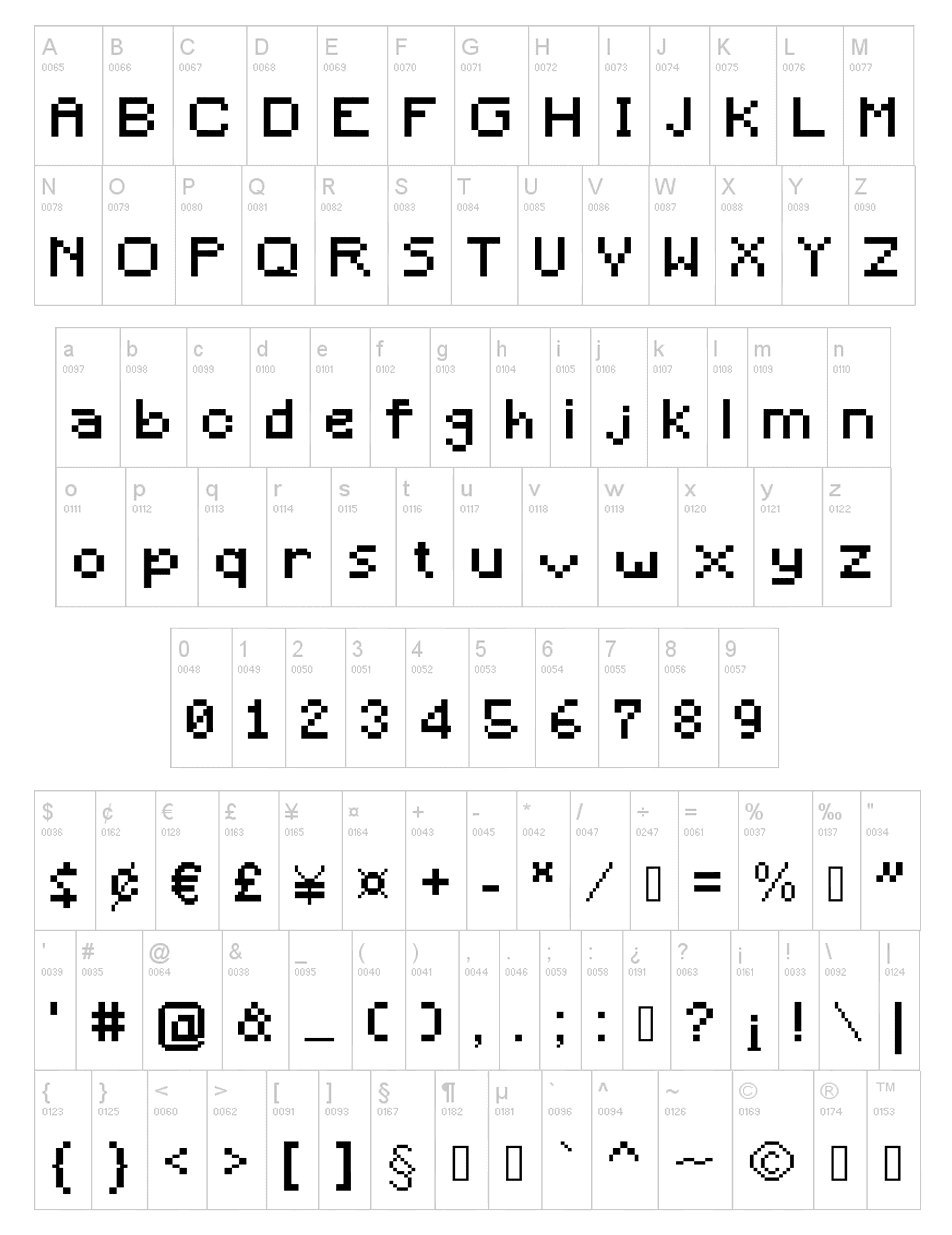
A bold, geometric font has always been used by the company for Minecraft game. A unique feature of the logo was the addition of a creeper face. It is a very appropriate choice for a game that consists of three-dimensional blocks. Although the font has been custom designed, a similar font has been created by MadPixel and is called Mine Crafter. The company used natural brick colors for its logo with an addition of black for a shadow and three-dimensional effect.