Founded in 1962, Menards is a well-known American home improvement store chain. Covering 15 U.S. states with a network of 335 stores, it ranks a respectable third among the largest home improvement retailers, behind only Home Depot and Lowe’s. Menards offers a wide range of lumber, hardware, paint supplies, and more to meet a variety of home improvement needs.
Meaning and History
Established in 1958, the company began with agricultural construction. Founder John Menard gathered a team for animal hangars, financing his education. This suburban work highlighted lumber demand. In 1960, Menard Cashway Lumber Company formed a post-graduation focus. The year 1964 saw the introduction of a sawmill and store, expanding to 12 centers, shaping his thriving business chain.
What is Menards?
Menards, founded in 1962, is a well-known American home improvement store chain with 335 stores in 15 states. Ranking third in home goods sales, it competes with industry giants such as Home Depot and Lowe’s. Menards specializes in offering a wide range of merchandise with an emphasis on lumber, hardware and paint products.
1960 – 1984

The original logo depicted the Menard Cashway Lumber sawmill and lumber store. At the top of the logo was “Menard”, and at the bottom was the cursive “Cashway Lumber,” indicating the availability of lumber for cash. A nearby green six-bladed propeller symbolized woodworking, resembling a saw blade or mill wheel, and the color green symbolized nature. Three lines – yellow, light brown and brown – border the logo, symbolizing different types of wood.
1984 – today
By 1984, the business had outgrown its previous logo due to expansion and shifts in product offerings. The company’s scope now encompassed tiles, metal products, nails, and wood items. This evolution led John to establish a new entity, Menards Inc., transforming his store into a prominent do-it-yourself destination during that era.
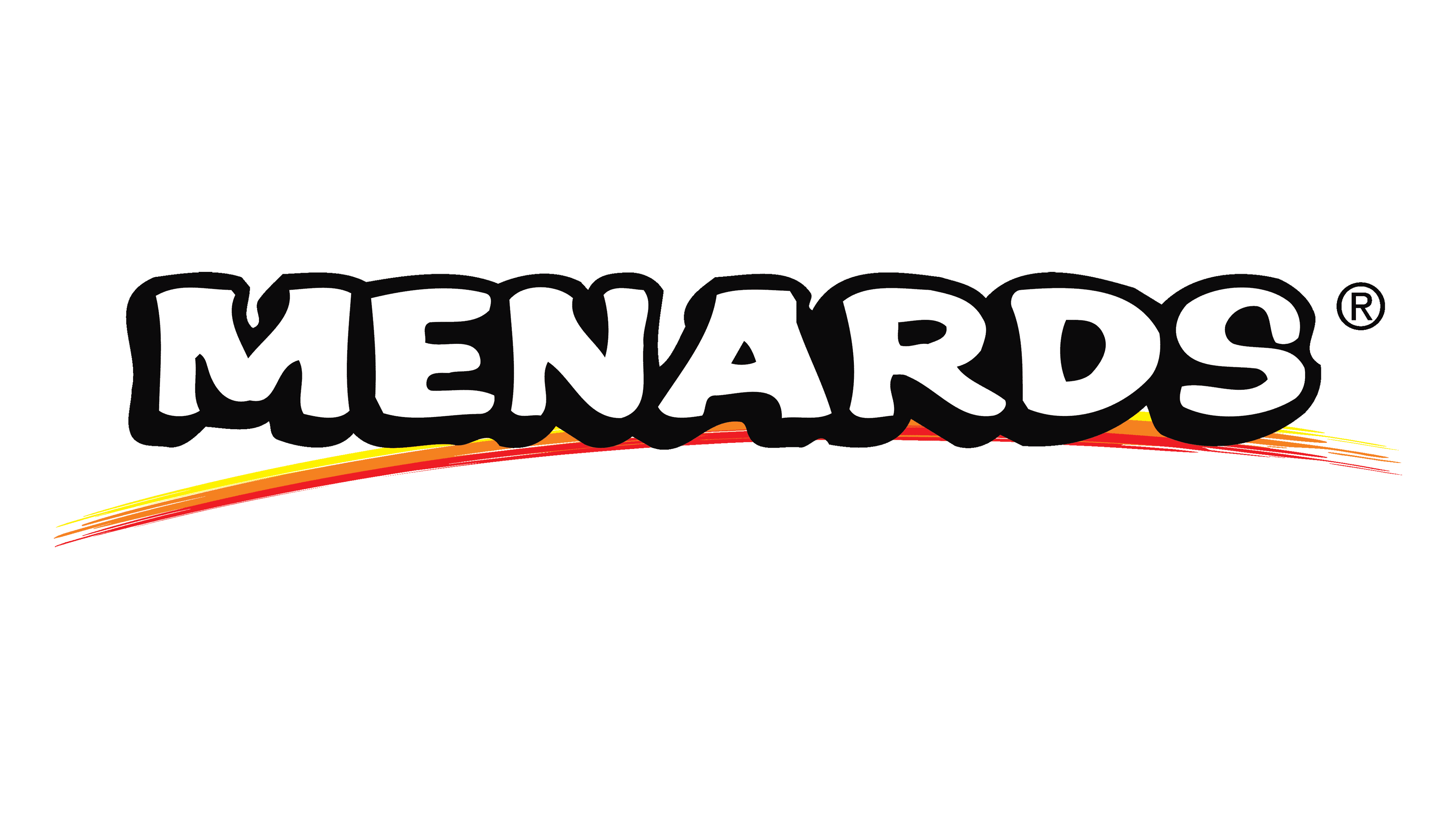
Consequently, the logo was updated. A fresh visual element emerged with the prominent white “Menards” inscription. Given John’s collaboration with his brothers, the name adopted the apostrophe ‘s.
The reference to lumber was removed. The top and bottom three stripes now converged at the bottom, gently arching over the name. Comprising three strokes – red, yellow, and orange – arranged in the semblance of a rainbow, this design element symbolized the company’s ascent and flourishing phase.
1994
In 1994, after selling the construction division, the company focused solely on home improvement stores. This was followed by a rebranding exercise that introduced a new logo that was not widely adopted.
The logo featured a green schematic house reminiscent of the company’s store buildings, emphasizing the wide range of home goods offered. The green color symbolized the renewal and prosperity of the updated homes. Inside the house, the white Menards name stood out, emphasized by a line with three sections: yellow, orange and red.
The white represented the updated brand concept, and the line symbolized the company’s roots in woodworking. The color transition reflected the move from a local business (yellow) to a thriving retailer (red).
Color
The logotype includes minimalistic hues: black for the inscription’s contouring, white for the characters, and red, orange and yellow for the bottom line.
Font
The typography style of the wordmark features extra bold letterforms with small geometric serifs and fat contours.


