Dick’s Sporting Goods is a retail chain that focuses on any equipment for athletics, sports, hikes, gym, and others. With 850+ locations worldwide, it offers a diverse array of goods for both sexes and all ages, which lets customers get a multisided shopping experience.
Meaning and History
![]()
The business started in 1948 when 18-year-old Richard “Dick” Stack founded a small store in Binghamton, New York. The business grew slowly but steadily. The second store appeared three decades later — in 1984. In that year, the founder retired and gave his business to his son, Evard. It was a family business, and both the father and son involved their relatives in the operation.
Edvard would later expand his family’s store across the United States and the United States, opening 854 locations in almost all states. He also led the company to its initial public offering in 2002. Today, Edvard is the executive chairman and one of the key people in the company.
Notably, the logotype has come through three renditions throughout its history — in 1956, 1980s, and 1999. This piece explores how they changed over time.
What is Dick’s Sporting Goods?
Dick’s Sporting Goods is a US-wide chain of stores specializing in equipment for athletics, gym, and sports. They offer a countless collection of products in their 850+ locations across the US.
1948 – 1958
![]()
The foremost logotype wasn’t the logotype in its direct meaning — rather it was a signboard featuring the founder’s nickname in big capitalized characters. The word ‘Dick’s’ was written on a verеical part of the signboard in contours. Adjacent to the lower part of this bar was a block with the lettering ‘Army & Navy’, reflecting the brand’s initial orientation towards military men.
1958 – 1994
![]()
The mid-50s saw the company’s rebranding. The name was changed to ‘Dick’s Clothing and Sporting Goods’, and the new logotype emerged as the main for the company. It was a text-based logo that featured the diagonally oriented word ‘Dick’s’ above the two-level inscription ‘clothing & sporting goods’ in lowercase. There was no backdrop or graphical elements, due to which the nameplate was minimalist and legible.
1994 – 1999
![]()
Upon Richard Stack’s retirement, his son took control of the business. He would later start expanding the business and changed its graphic identity. The new logotype would include a dark green rectangular backdrop, which housed the word ‘Dick’s’ in massive capitals with sharp corners.
The part ‘Clothing & Sporting Goods’ below was in a simple sans-serif typeface. The brand designers also added a small image resembling the ‘ sign. It was like several different sports balls going up in the air.
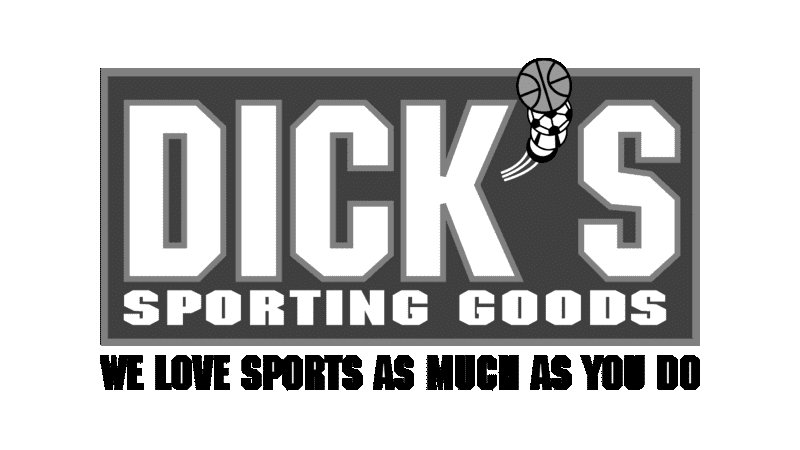
1999 – today
![]()
The latter logotype features almost the same elements as its predecessor, though with some modifications. The texting now includes ‘Dick’s Sporting Goods’ without the word ‘Clothing’. The inscription started using the same serif-free typeface with massive letters and straight angles.
A new caption appeared above — ‘Sporting Season Starts At’ in all capitals. The backdrop adopted a gradient dark green to white pattern and a frame with similar shades. The apostrophe remained untouched.
Font
The font used for the lettering exhibits a resemblance to Machine Medium, a creation by the accomplished designers Tom Carnase and Ronne Bonder. A free alternative to this font is known as the NFL Dolphins. Upon careful observation of the overall letter forms, this is a heavy and blunt script with long, weighty capitals and small gaps in between.
Color
The creators of the logo opted for a distinctive combination of colors, skillfully merging multiple shades of green into a gradient, transitioning from a vivid hue to a deeper one. They also introduced accents of orange, black, yellow, and white to embellish the balls and lettering, further enhancing the visual appeal.