7-Eleven Logo
Tags: drinks | international chain | prepared foods | stores
7-Eleven is a globally recognized line of stores with a presence in multiple countries. Renowned for its extended operating hours, from 7:00 am to 11:00 pm, 7-Eleven offers a diverse assortment of goods and services to cater to consumers’ needs. From snacks and beverages to groceries and ready-to-eat meals, the stores provide a convenient shopping experience.
Meaning and history
The name “7-Eleven” holds significance as it represents the extended operating hours of convenience stores. The stores originally worked from 7:00 am to 11:00 pm, providing customers with extended convenience beyond traditional business hours.
The history of the 7-Eleven name dates back to 1927 when it was founded in Dallas, Texas, USA. The company initially existed under the name “Tote’m,” referring to consumers’ ability to tote away their acquisitions. In 1946, the shops adopted the nameplate “7-Eleven” to reflect their extended hours of operation.
Over the years, 7-Eleven expanded its presence globally through franchising, becoming an iconic brand in the convenience retail industry. It introduced innovative concepts such as self-service and 24/7 operation, revolutionizing the way people shop for everyday essentials.
Today, 7-Eleven is a well-established international brand with thousands of stores across various countries. It continues to evolve by embracing technology, offering diverse product selections, and providing convenience to customers around the world. The name “7-Eleven” has become synonymous with accessibility, flexibility, and the convenience of finding what you need, whenever you need it.
What is 7-Eleven?
7-Eleven is an internationally renowned group of convenience stores that operates in numerous countries worldwide. With its extended operating hours from 7:00 am to 11:00 pm, 7-Eleven is known for providing customers with convenient access to a wide range of products and services. From snacks and beverages to groceries and ready-to-eat meals, the stores offer a diverse selection to meet the needs of their customers.
1927 – 1945
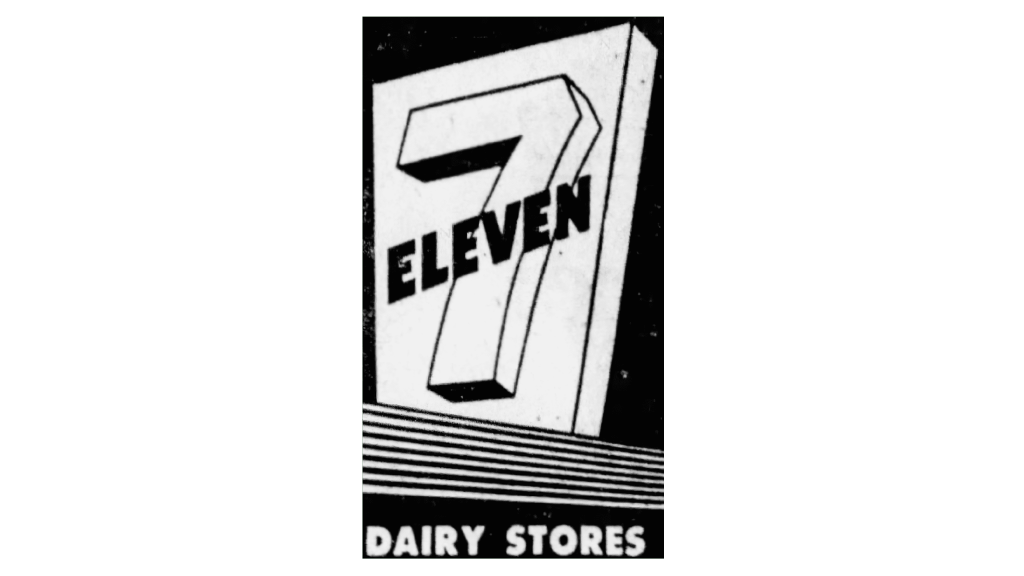
During the first decades, it used a large totem made of wood as its emblem. It also served as the initial letter, making the whole signboard immediately recognizable among others.
1945 – 1950
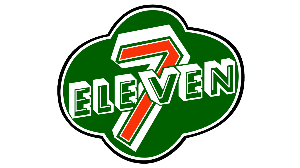
The iconic title “7-11” originated from the idea of extending store hours from 7 am to 11 pm. This change was prominently displayed on signboards to inform customers of the new operating times. These banners displayed a deep green cloud, contoured black and white. The 3D word ‘Eleven’ and digit 7 were seated prominently at the center.
1950 – 1956
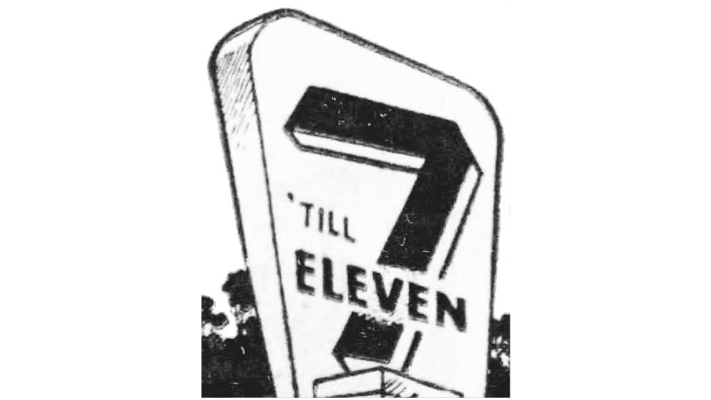
In 1946, 7-Eleven introduced a new logo following the name change. This distinctive logo featured a white trapezoid creating a visually striking composition. The bold “7” and capitalized “Eleven” were diagonally overlaid on the shape, adding a sense of dynamism and energy to the design.
1956 – 1958
From 1956 to 1958, the 7-Eleven badge had a design with subtle modifications. The iconic “7” was made bigger, while its contour was delicately slimmed down, resulting in a lighter and more spacious appearance. The lettering that intersected the digit was straightened, shedding half of its bulky shadow, creating a cleaner and more refined design.
1958 – 1960
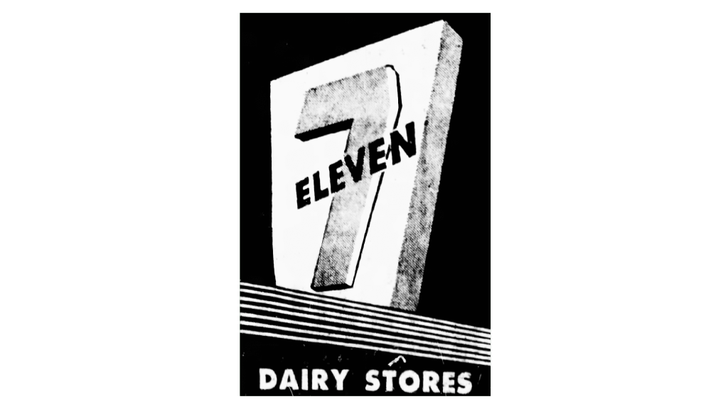
In 1958, a significant redesign brought about a more streamlined and minimalist version of the 7-Eleven badge. The visual elements were pared down to include only the iconic “7” and “Eleven” lettering, which were elegantly arranged in a diagonal configuration. The outlines of both components were refined and strengthened, resulting in a more polished and serious appearance. To add visual depth, the digit was rendered in a gradient gray, lending a feeling of dimension to the overall design.
1960 – 1963
Later, the 7-Eleven badge was transformed. The coloring was streamlined, leaving behind a timeless combination of black and white. The shapes of the characters were altered, enhancing the overall clarity and legibility of the design. The digit itself was carefully remade, embracing a contemporary and concise aesthetic. This bold yet refined logo perfectly encapsulated the brand’s evolving identity.
1963 – 1968
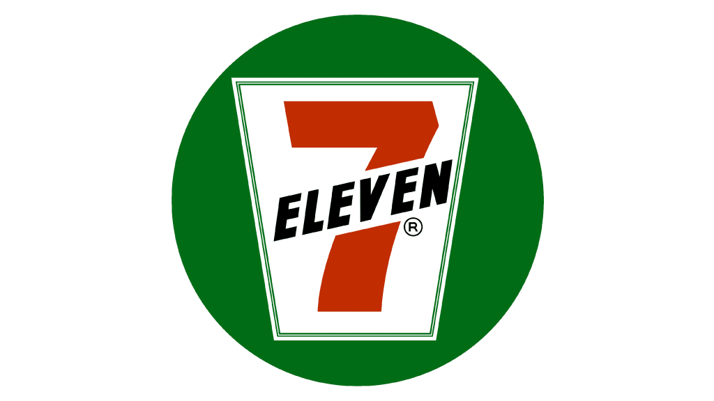
In 1963, the 7-Eleven symbol changed its look. The introduction of a white banner became a defining element, prominently displaying a vibrant red “7” and sleek black “Eleven.” These striking characters were positioned on a solid green circle. The trapeze shape was made straight and angular s, complemented by a thin outline that enhanced the overall composition. The result was a logo characterized by a powerful and crisp color contrast, leaving a lasting impression.
1969 – 1975
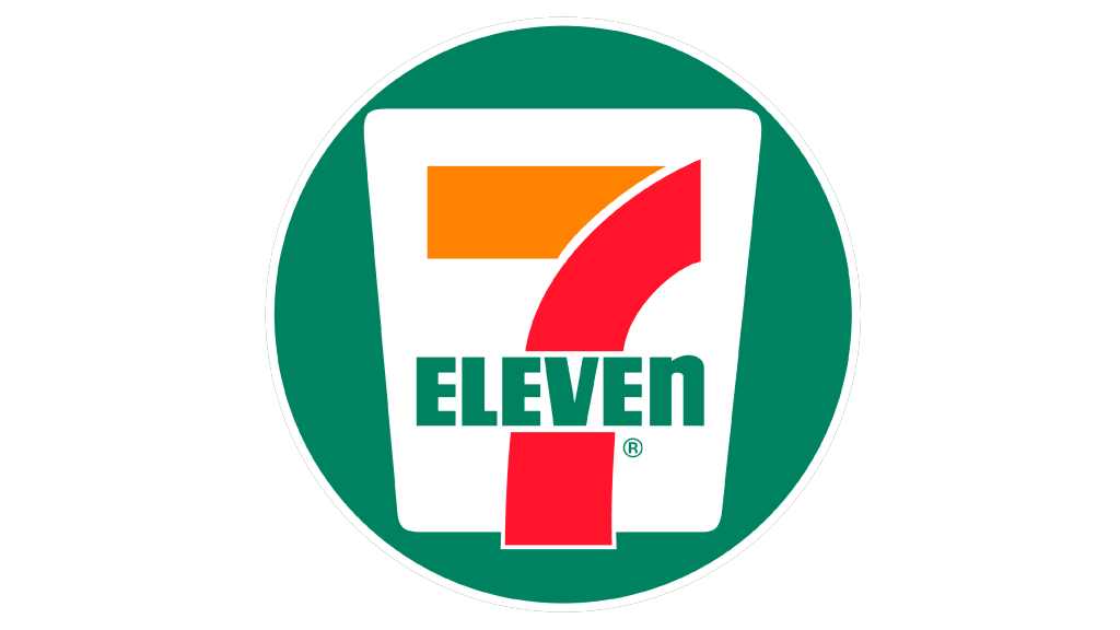
The 1969 version showed the trapezoid shape adorned with circled edges. The 7 had vibrant shades of red and orange, with a subtly arched vertical line. The wording displayed horizontally featured a calming green hue that further enhanced the overall visual harmony. Notably, the character, “N” was converted to lowercase.
1975 – 1986
In 1975, the graphic originality of 7-Eleven was reinvented with a new form and a lighter chromatic code. The circular backdrop gave way to a rectangular one, offering a fresh canvas for the brand’s logo. The trapezoid, positioned centrally below, injected playful energy into the design.
1986 – 1989
The 1986 logo showed darkened coloring, adding a touch of sophistication to the logo. The white trapezoid was made more obvious to make a balanced composition. While the overall design remained consistent, the outlines of the symbols were slightly refined, breathing new life into the logo.
1989 – 2021
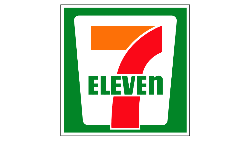
Their symbol presented in 1989 blends elements from its earlier iterations. It showcases a rectangular backdrop, with a white trapeze figure positioned centrally. Overlapping it is a thick red and orange number complemented by the green “Eleven” caption.
2013 – today
In 2013, 7-Eleven was redrawn. The red and orange number was positioned on a vibrant green background. The logo also featured a complete overhaul of the wordmark, which now showcased lowercase characters in a sans-serif typeface, all rendered in white.
2021 – today
In the 2021 redesign, 7-Eleven embraced its traditional concept by revisiting the logo used in the 1990s. The green board disappeared, allowing the thick number and lettering to stand out. The logotype has a transparent backdrop, while the green in the name caption has been deepened, adding a touch of elegance to the overall composition.
Font
The characters in their name caption feature a thick script without serifs and straightened lines, reminiscent of the Filmotype Manchester typeface, but with a lowercase ‘n’.
Color
Their color combination includes dark green (#2DBE60) and a bright orange (#F94818).
