Costco, an esteemed American retail chain operating on a membership-based system, originated in 1976 in San Diego, California. It has since evolved into a comprehensive shopping destination offering a wide range of products, including groceries, electronics, clothing, and more. Costco’s reputation is built on its ability to offer cost-effective bulk goods, making it a favored choice for budget-conscious consumers seeking both everyday essentials and occasional indulgences.
Meaning and History
Costco’s unique retail model centers on selling products in bulk to members, driving rapid growth. This membership-driven approach fosters customer loyalty and ensures a steady revenue stream. The company has expanded globally, with locations in Canada, the UK, and Japan.
Over the years, Costco’s brand identity has evolved to underscore its commitment to quality, affordability, and customer satisfaction. The current logo prominently features the “Costco Wholesale” text in blue and red, delivering a distinct visual appeal. The brand’s reputation for delivering top-tier products and exceptional customer service has solidified its position in the retail industry, earning trust among shoppers worldwide.
What is Costco?
Costco, a US-based retail store chain also operating in Canada, the UK, and Japan, is renowned for its innovative subscription-based business model. Customers must hold memberships to purchase at its locations, with products often sold in large quantities and bulk.
1976 – 1993
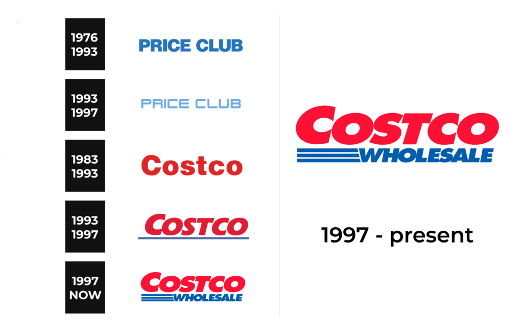
Costco’s roots trace back to the 1976 establishment of the Price Club warehouse chain. Its precursor displayed a straightforward logo: “PRICE CLUB” in black against a white backdrop.
1993 – 1997
In 1993, the American warehouse chain Price Club introduced a new logo that continued to be used for several years following its merger with Costco. While both brands operated independently under the same corporate umbrella, this fresh design featured a wordmark with the store’s name. The block-style lettering in a soft blue hue gave it a neon sign-like feel. Uppercase lettering created a balanced visual appeal.
1983 – 1993
Costco as a company came into being in 1983, featuring its name within the trademark in dark red.
1993 – 1997
Following the merger with Price Club, the chain of stores operated autonomously for a period, resulting in a logo with an italicized font, light red lettering, and a horizontal blue stripe at the bottom.
1997 – Today
In 1997, PriceCostco transitioned into Costco Wholesale Corporation and unveiled a new logo. The designers retained the iconic brand identity, preserving the red lettering and adding a blue “WHOLESALE” with three concise horizontal lines.
Font
The logo creators utilized the Futura Extra Bold Oblique font, elongating the letters slightly and tilting them to the right.
Color
Costco’s distinctive brand identity primarily revolves around its eye-catching two-color palette of red and blue.
