Medtronic is an international technological firm, established in 1949 and headquartered in Dublin, Ireland. It specializes in devices, software, and other products for the healthcare industry. They provide their patients with a spectrum of solutions that help improve their life and cure heart diseases, diabetes, and chronic pains. Additionally, they invest in research and educational activities.
Meaning and history
The term ‘Medtronic’ is assembled of two words, ‘medical’ and ‘electronics’, reflecting the brand’s focus on developing innovative solutions for high-quality devices for medical treatment.
The company appeared in 1949, in a garage of one of the Minneapolis houses thanks to two entrepreneurs Earl Bakken and Palmer Hehrmundslie. Their first product was a battery-powered device for pacemakers, which led their venture to initial success.
Throughout the decades to come, Medtronic has developed a line of products, including insulin pumps, pacemakers, etc. Their products have supported millions in their medical treatment procedures and improved their lives.
Nowadays, Medtronic plays a leading role in the medical engineering industry, with a presence around the whole world. They continue manufacturing healthcare solutions, such as delivery systems for diabetics, or software designed for hospitals.
What is Medtronic?
Medtronic is a global technology company that manufactures software and devices for hospitals and patients. Their products include cure delivery systems for diabetics, pacemakers, insulin pumps, and others. Since its launch in 1949, Medtronic has grown to become a major player in the global market, with over 100K employees.
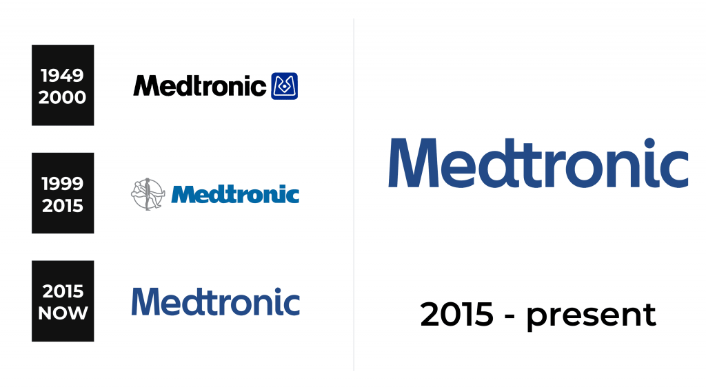
1949 – 2000
Medtronic’s earlier logotype depicted a black nameplate with a thick typeface without serifs. To the right of the name, there was a blue & black emblem, looking like a square with white contours inside. They were stylized like the letter ‘M’ with its lower tips connected by a horizontal line. The place where two diagonal bars were supposed to meet looked like a rhombus with a small dot inside.
1999 – 2015
Their second logotype was a combination of a wordmark and an emblem. It featured a black inscription in a thick script without serifs. Most of the letters were joined by streamlined patterns. The emblem depicted a circle with a silhouette inside it. The man was drawn in three positions: standing and tilted at two different angles. The man in the standing position was completely gray, while the two other positions were white with a gray contour.
2015 – today
In 2015, the logotype of Medtronic was revamped by adding a new typeface and removing the emblem. The inscription is now executed in a less bold typeface without serifs.
Font
This typeface doesn’t feature the letters connected so much as in the 1999 version. Now, only the characters ‘d’ and ‘t’ are joined to form one symbol. The additional details of this font include the rounded lower tip of the letter ‘i’.
Color
Blue is an integral component of the brand identity of all healthcare and technology companies nowadays. It has much to deal with that this color is often associated with trust, reliability, and safety.


