Bayer AG, established in 1863 by Friedrich Bayer and Johann Friedrich Weskott in Germany, began as a synthetic dye manufacturer but rapidly ventured into pharmaceuticals, notably introducing aspirin in 1897. This innovation marked Bayer’s early commitment to healthcare, setting the stage for its evolution into a global pharmaceutical giant.
Meaning and History
Throughout the late 19th and early 20th centuries, Bayer expanded into various sectors, including agricultural chemicals and polymers, significantly shaping its portfolio and influence in both the chemical and healthcare industries. During the tumultuous years of the World Wars, Bayer, embedded within the larger conglomerate IG Farben, was entwined with the war efforts and faced post-war dismantling and reformation.
The mid-20th century was a period of reconstruction and moral reckoning, leading to Bayer’s re-establishment in 1951. The company embarked on a journey of redemption and growth, focusing on innovative healthcare solutions and expanding its agricultural division. This period was marked by significant milestones, including major acquisitions that bolstered its market position and diversified its offerings.
Recently Bayer has continued to be a prominent player in the healthcare and agricultural sectors, committed to advancing human and animal health and nutrition. Its acquisition of Monsanto and other strategic moves have solidified its standing but also brought challenges and controversies. Despite the complexities and ethical debates surrounding the pharmaceutical and agricultural industries, Bayer’s enduring legacy is one of innovation, adaptation, and global influence, driven by a mission to improve life through science.
What is Bayer?
Bayer is a global pharmaceutical, biotechnological, and agricultural chemical corporation originating from Germany. They sell various products, from pills and cosmetics to industrial gas. They have been a leading part of the German chemical industry throughout the entire 20th century, playing a role in the country’s transformation into a world supplier in this industry.
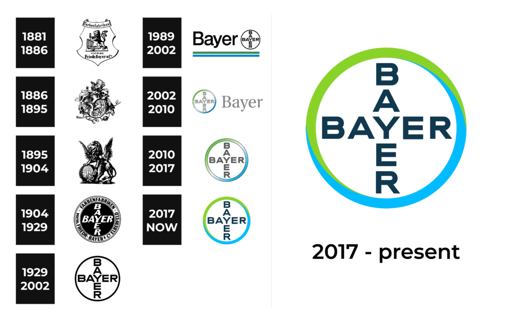
1881 – 1886
Bayer’s visual identity begins with an emblem of complexity, showcasing a shield adorned with a stylized lion and a grid on which Saint Lawrence was executed, paying a nod of respect to the place of the company’s hub at the time – Elberfeld. A banner wraps around the emblem, revealing the company’s original name, ‘farbenfabriken vorm. Friedr. Bayer & Co.’, and its initial focus on dye production.
1886 – 1895
In its second phase, Bayer’s emblem retains its noble essence with an eagle gripping a sphere amidst a backdrop of heraldic artistry, a nod to the era’s fondness for strength and excellence through animal symbolism.
1895 – 1904
Mythology comes to the fore in the form of a griffin symbolizing protection and vigilance. The animal perched on top of the globe with a snake in its claws alludes to Bayer’s expanding global reach, with the snake that stands for the medical purpose of many of their products.
1904 – 1929
Abandoning the previous ornate design, they start using the round image from 1904. The name caption features two words ‘Bayer’, intertwined in a cross pattern. By adding this crest, the company designers prioritize and clarity as well as brand recognition.
1929 – 2002
Essence and simplicity take center stage with a circular frame framing the ‘Bayer’ cross, ensuring memorability and adaptability for a myriad of uses, highlighting the company’s modern identity.
1989 – 2002
Experimentation marks this period with Bayer opting for a text-based logo. The wordmark in a sans-serif font is underscored by green and blue lines, paralleled by the circular emblem from the previous logotype.
2002 – 2010
Bayer’s emblem receives a contemporary touch, adopting a gradient of blues and greens for its frame. The central cross has gained a 3D effect, giving a metallic look and powerful feel.
2010 – 2017
The next logo shows the same border containing the inscription, made without 3D effect. Still reflecting the seriousness and professionalism, it becomes much simpler.
2017 – today
Brighter colors define the most recent design: they decided to get rid of the gradient, so now green and blue are sharply separated, perhaps to symbolize transparency and purity. The return to a flat design for the Bayer logo ensures its effectiveness in a variety of environments, from digital to print.
Font
Throughout its history, Bayer’s typographic journey reflects a shift from intricate, traditional typefaces to more streamlined, modern fonts. The initial logo iterations, starting from 1881, exhibit a serif font that speaks to the era’s preference for ornamental and complex design, aligning with the emblematic shields and creatures of their respective times.
From 1904 onwards, the typeface evolves into a bolder, sans-serif design, indicative of the industrial and scientific progress of the company. This evolution culminates in a contemporary sans-serif typeface with thick characters that prioritize clarity and readability, a characteristic maintained in the logo’s most recent iterations. Such a transformation mirrors the company’s transition from a 19th-century dye manufacturer to a 21st-century global life sciences and pharmaceutical giant.
Color
The color palette used in the Bayer logo has undergone significant changes, moving from black and white to a more diverse one. The earliest logos do not feature any bright colors, relying instead on the detail and intricacy of the design to convey the brand’s message. Starting in 1989, the coloring becomes a defining element of Bayer’s identity, with the introduction of blue and green hues.
These colors, often associated with health, safety, and the natural world, reflect the company’s commitment to life sciences and the environment. In the 2017 logo, the circular frame is colored both green and blue, bordered to enhance contrast and suggest clarity and precision, which are key attributes of Bayer’s brand values.


