Marriott is an international holder of hotels, motels, and resort facilities, built across the world. They offer various levels of service in their 8,5K locations, suitable both for worldwide recognized guests and ordinary people with different income levels. The business was founded in 1927, and now its head office is located in Bethesda, Maryland.
Meaning and history
![]()
The firm’s name derives from the two people who founded it – John and Alice Marriott. The foundation traces back to 1927 when the two set up a root beer stand in Washington, D.C. Later on, their business prospered, and they opened a line of restaurants known as Hot Shoppes.
The year 1957 saw the construction of the Marriot’s earliest hotel, Twin Bridges, in Arlington, Virginia. The company continued to grow and expand throughout the 1960s and 1970s, eventually becoming one of the most considerable hotel lines globally.
Marriott International is a globally renowned hospitality brand, boasting over 7,600 properties in over 130 nations, each one promising guest an unforgettable stay.
With a diverse collection of brands, from the luxurious Ritz-Carlton to the vibrant Sheraton, Marriott’s commitment to exceptional service and forward-thinking innovation is unparalleled in the industry.
What is Marriott?
Marriott is a Maryland-based international company that operates a number of hospitality locations under various brands around the world. They offer hotels and resort facilities of luxurious level, along with more affordable ones. Today, Marriott has about 8,000 locations in 130 countries.
1957 – 1993
![]()
Marriott’s initial symbol from the 60s was an eye-catching combination of red and black with a hint of gothic flavor. The signature bold red font in all caps was accompanied by a sleek emblem to the left, featuring a black crown with four tips atop a tall and slender letter “M” crafted from two triangular shapes. This timeless design stayed with Marriott for over two decades, becoming an iconic symbol of their brand.
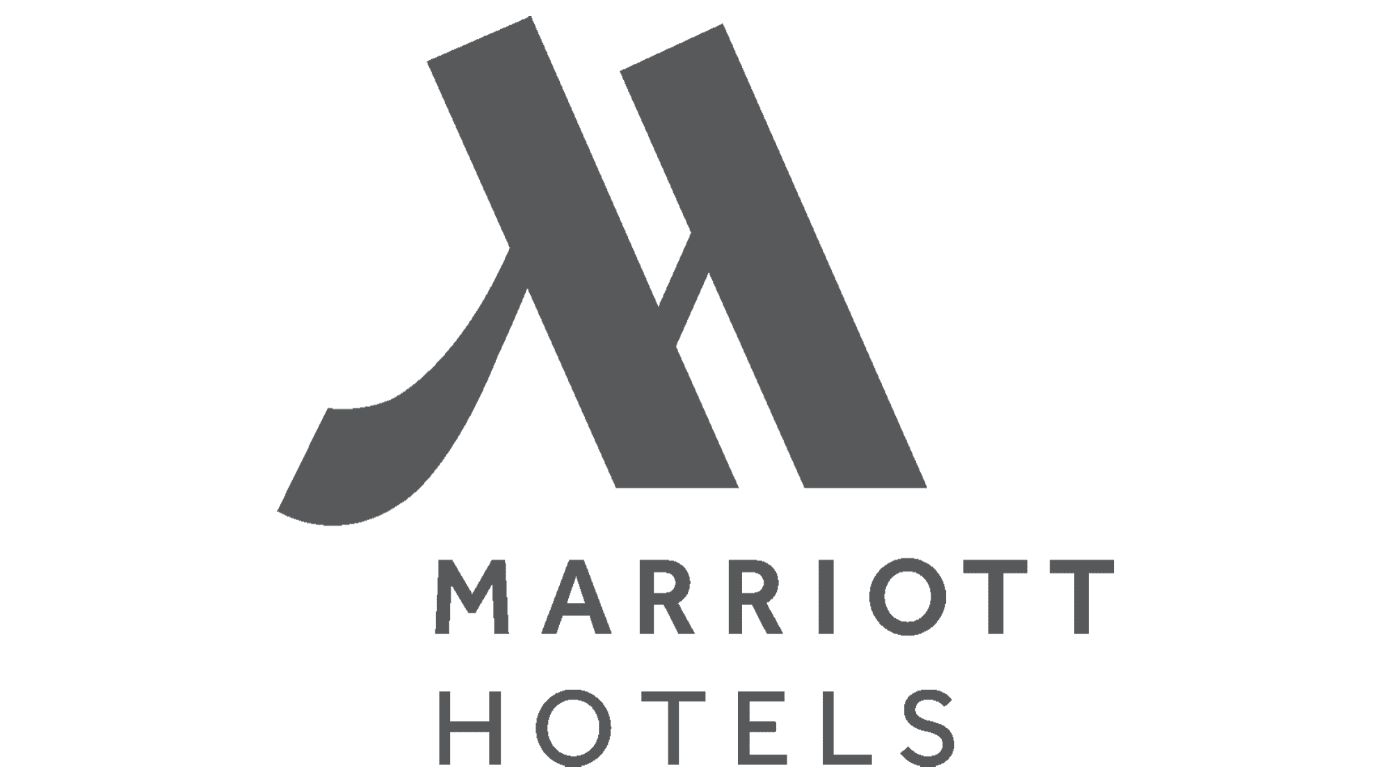
1988 – 2013
![]()
The latter logotype was a red wordmark that featured a custom fancy typeface with slightly rounded and sharpened tips of the bold letter lines. The character “M” is the main focus, with its mirrored lambda-like shape forming a striking visual element.
The part “Hotels. Resorts. Suites.” is utilized in a clean font without serifs, which adds up to the overall elegance of the design.
The image above depicts a red circle with a white character that follows the shape of the ‘M’, except for a thin diagonal bar that is missing, creating an intriguing and memorable design.
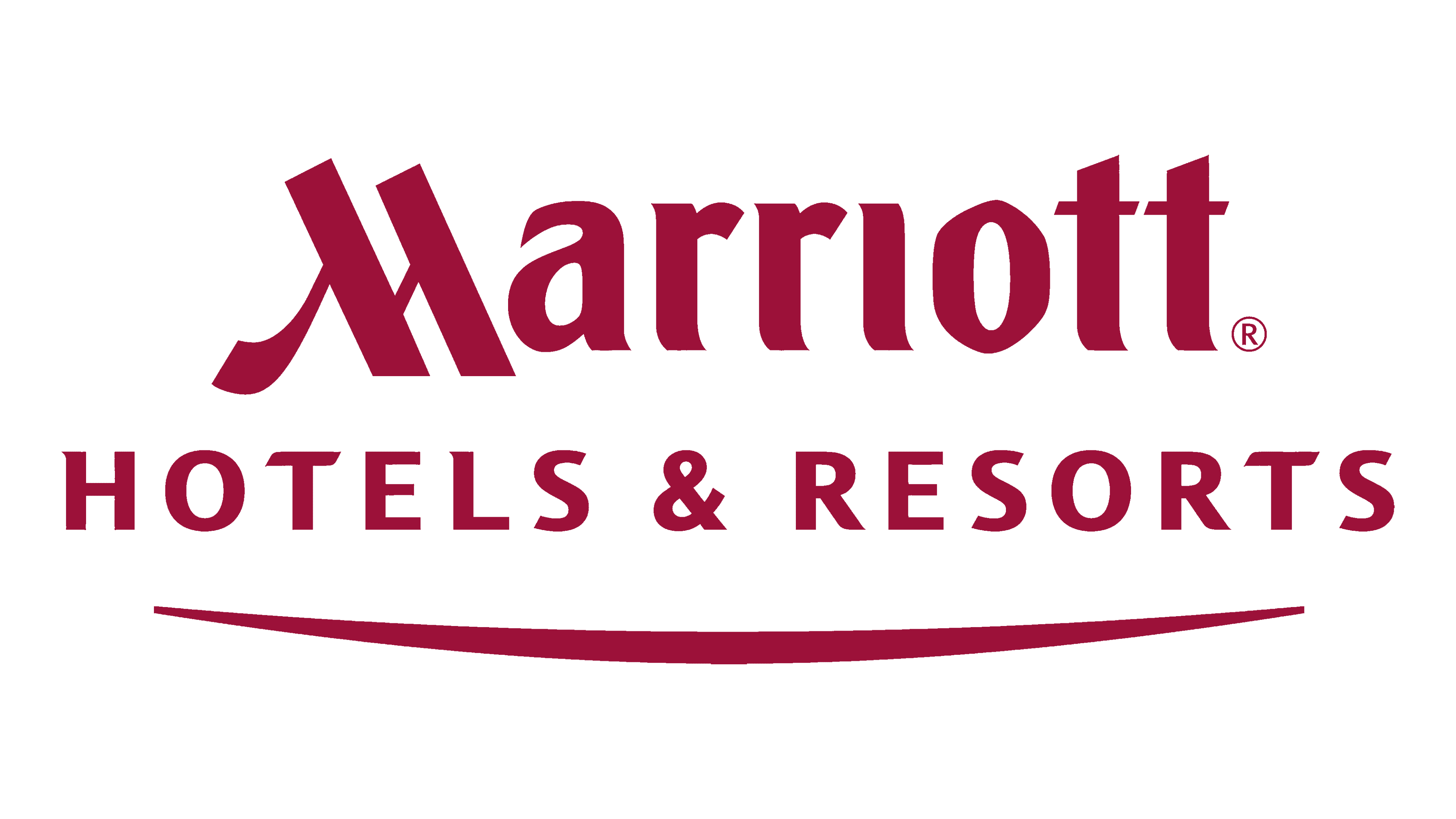
2013 – today
![]()
Marriott’s revamped logo, revealed in 2013, features a sophisticated and modern design. The custom script of the wording has slightly rounded edges and subtle flourishes, adding a touch of elegance and refinement. The iconic “M” emblem has been updated with a sleek and minimalist look, retaining its recognizable shape and crimson color.
Font
The company’s wordmark is executed in a legible script featuring thick lines and slightly rounded edges. All letters except for the initial M are lowercase.
Color
The firm’s chromatic code includes white and deep red which is ideal for the hospitality and resort business of Marriott.