Marlboro Logo
Tags: cigarettes | tobacco
Marlboro is one of the world’s best-known and best-selling cigarette brands, marketed by Philip Morris USA in the United States and Philip Morris International in other countries.
Meaning and History
![]()
Its inception dates back to 1924, originally targeted as a women’s cigarette with the slogan ‘Mild As May.’ However, the brand underwent a significant transformation in the 1950s to reposition itself in the market. This strategic pivot was driven by the desire to broaden its appeal beyond a female audience and to respond to growing health concerns about smoking. The introduction of the Marlboro Man in advertising campaigns, portraying rugged masculinity, marked a pivotal shift. This rebranding propelled Marlboro from a marginal product into a symbol of masculinity and the American frontier spirit, leading to its dominance in the global cigarette market.
The brand’s iconic imagery, especially the Marlboro Man, became synonymous with the American lifestyle of freedom and adventure, significantly influencing advertising and branding strategies across industries. Beyond its advertisements, Marlboro has been innovative in product design, notably with the introduction of the flip-top box in 1955, which added convenience and further distinguished the brand from competitors.
Over the years, Marlboro has maintained its market leadership through continuous innovation and adaptation to changing consumer preferences and regulatory environments. Despite the global decline in smoking rates and increasing regulations on tobacco advertising, Marlboro has remained resilient, continuing to hold a significant share of the worldwide cigarette market.
Throughout its history, Marlboro has faced numerous challenges, including legal battles and public health campaigns against smoking. The brand has navigated these challenges by adjusting its marketing strategies and product offerings, including the introduction of filtered cigarettes and variations in nicotine content to appeal to a broader range of smokers.
Marlboro’s endurance and adaptability reflect its deep understanding of its consumer base and its ability to evolve in the face of changing societal norms and regulations. As debates around smoking continue, Marlboro remains a prominent player in the tobacco industry, illustrating the complex interplay between brand identity, consumer behavior, and public health.
What is Malboro?
Marlboro, recognized globally for its cigarettes, originated in 1924, primarily marketed towards women before undergoing a dramatic repositioning in the 1950s. This strategic shift, aiming to widen its consumer base and address health concerns, introduced the rugged Marlboro Man as its face, catapulting the brand to market leadership and associating it with American ruggedness and independence. Through memorable advertising and product innovation, like the flip-top box, Marlboro cemented its place in the cigarette industry and consumer culture, navigating the evolving landscape of smoking habits and regulations with agility.
1924 – 1955
![]()
The original Marlboro logo from this period features an ornate and elegant typeface with the words ‘Marlboro Cigarettes’ in an intricate frame. The curved lines of the font and the decorative frame emphasize the sophistication and premiumity that the brand aimed for in its early years.
1954
![]()
This image features a pack of Marlboro cigarettes from 1954, distinguished by its iconic red color. The brand name “Marlboro” is prominently displayed in the center in a large, black font, asserting its dominance. The words “Selectrate Filter” are written in smaller, red letters just above the brand name, while “Long Size” is printed in black below, indicating the cigarette’s length. A thin red banner stretches across the top of the pack, a design element characteristic of this particular packaging style from the mid-1950s.
1955 – 1959
![]()
During this transitional period, the logo integrates the iconic chevron design in red above the word ‘Marlboro’, which is printed in a tall, narrow, and sans-serif typeface. This design also includes the ‘Philip Morris & Co.’ crest, adding an element of regal and traditional significance to the branding.
1955 – 1961
![]()
The word “Marlboro” is rendered in a bespoke typeface called “Marlboro Bold,” specially created by the Leo Burnett advertising agency in 1954. This font plays a pivotal role in defining the brand’s visual identity. Its bold strokes and assertive presence flawlessly encapsulate the Marlboro spirit, exuding a sense of strength and masculinity.
The Marlboro logo itself exemplifies a minimalist design approach that yields maximum impact. Juxtaposed against a pristine white backdrop, the logo allows the typography to take center stage, crafting a contemporary and unforgettable visual experience. The simplicity of the design ensures that it transcends time and cultural barriers, remaining instantly recognizable and appealing to a global audience.
1959 – today
![]()
With this redesign, Marlboro adopts a radically different and minimalist approach. The logo consists of a red geometrical figure above the brand name in a bold, serif typeface, indicating a shift towards modernity and straightforwardness. The design is devoid of additional ornamentation, paying the maximum attention to the brand’s name to make a strong and memorable visual impact.
1961 – 1963
![]()
The Marlboro logo exemplifies a “wordmark” design, utilizing the brand name itself as the sole visual element. But this logo transcends a simple inscription. Crafted in a captivating black script typeface, the letters of “Marlboro” are beautifully connected, each flowing effortlessly into the next. This artistic decision creates a logo that embodies balance and harmony, projecting an aura of refinement and a rich brand legacy.
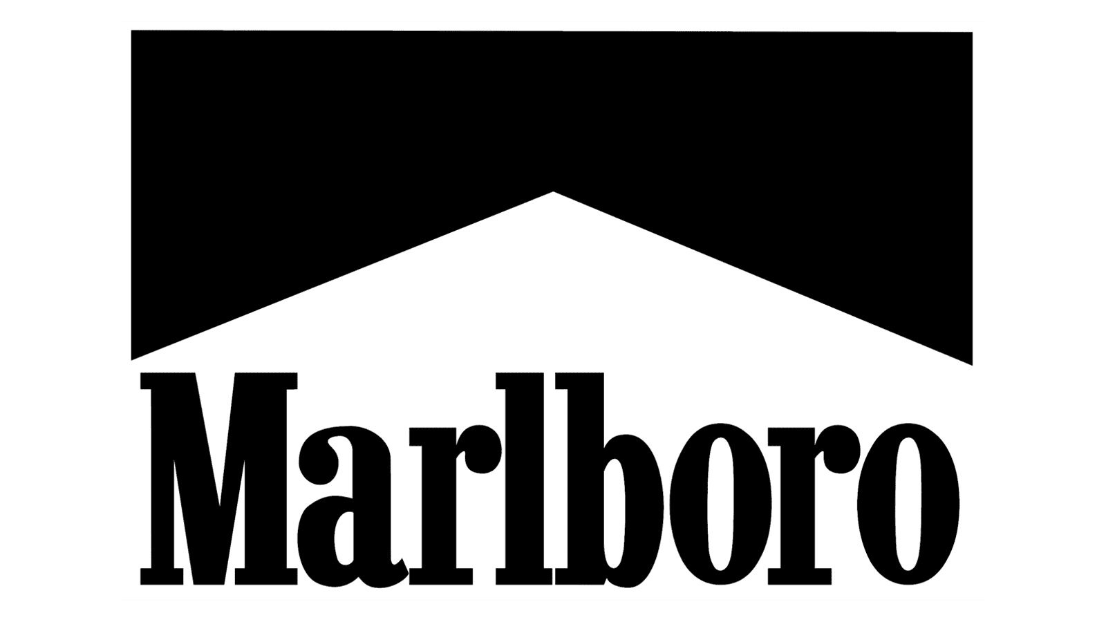
1977 – today
![]()
The Marlboro logo transcends trends, standing as a testament to the enduring power of simplicity. Its core elements are instantly recognizable: a bold red chevron and the brand name “Marlboro”.
The red chevron is more than just a geometric shape. It’s a dynamic symbol that evokes a sense of forward momentum, progress, and perhaps even a hint of adventure. This fiery red color also serves as the brand’s primary visual identifier. Red is associated with energy, strength, and a touch of passion, perfectly capturing the Marlboro spirit.
Black acts as a perfect counterpoint to the vibrant red. It provides balance and sophistication, while also symbolizing purity, freshness, and a sense of lightness. This color combination ensures optimal readability and creates a striking visual impact.
The font selection for the word “Marlboro” is equally purposeful. It’s a clean and simple typeface, yet with slightly elongated letters that add a touch of dynamism. This subtle design choice helps the logo stand out and contributes to its overall memorability.
In essence, the Marlboro logo is a masterpiece of visual communication. Every element is meticulously crafted to create a concise, memorable, and easily recognizable symbol that has become synonymous with the brand.
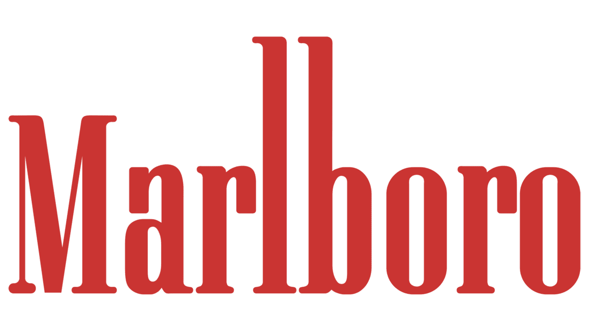
Font
Marlboro’s logos have transitioned from an intricate script to a more stripped-down, sans-serif font. The early script reflects the brand’s initial appeal to a sophisticated demographic, while the later sans-serif font resonates with a broader audience, aligning with mid-20th-century design trends that favored simplicity and impact. The latest font iteration communicates confidence and has become emblematic of Marlboro’s identity.
Color
Marlboro’s early logo does not present a specific scheme, but the later logos are defined by the bold use of red, which is now emblematic of the brand. The red color in the chevron is vibrant and attention-grabbing, signifying passion and strength. This red, along with the black used for the text and the white of the crest, creates a stark and commanding contrast, ensuring the brand’s visual identity is instantly recognizable across the globe.