Manchester City Logo
Tags: Premier League | sport team | United Kingdom
Manchester City, a prestigious soccer team from England, dominates the top level of English football, the Premier League. Revered for its storied past and devoted supporters, they have clinched numerous PL titles and coveted home and international awards. Their vibrant home matches take place at the remarkable Etihad Stadium, showcasing an unparalleled attacking prowess and a squad adorned with prodigious talents.
Meaning and history
![]()
Founded in 1880 as St. Mark’s (West Gorton), the club embarked on a storied heritage, weathering a multitude of name metamorphoses before settling on its present moniker in 1894. The nascent decades ushered a line of promotions and demotions that imbued their story.
Manchester City’s zenith flourished in the ’60s and ’70s, guided by Joe Mercer and Tony Book. They witnessed numerous championships in the First Division, FA Cup, and League Cup. However, the financial struggles and performance degradation led the MC to decay in the 90s.
The club regained its status in the early 21st century when Sheikh Mansour acquired Abu Dhabi United Group, which owned them. The wellspring of prodigious investment wrought a transformation, propelling Manchester City to the pantheon of worldwide-recognized teams.
Under the stewardship of Pep Guardiola, they attained previously ungraspable feats, seizing multiple Premier League awards, and FA Cups, and even being honored to contest in the UEFA Champions League finale, which cemented their exalted status as European football luminaries.
What is Manchester City?
Manchester City is an esteemed English team participating in the Football Premier League. With a rich history and passionate fans, they have secured multiple PL cups and prestigious honors. The Etihad Stadium hosts thrilling matches, displaying their unrivaled attacking prowess and exceptional roster.
1880 – 1894
![]()
The crest of St. Mark’s FC boasted a robust monochromatic circular insignia, distinguished by a wide frame with a dual white border. At the center of this insignia was a striking white Cross against a jet backdrop. The uppercase white caption “St. Mark’s West Gordon” in a title case script without serifs ornamented the perimeter. The caption ‘1880’ was located centrally and split in two; part ’18’ was on the left, while portion ’80’ laid on the right border of the frame.
1887 – 1894
![]()
During the late 1880s, Manchester’s football team embraced a distinctive logo featuring a captivating fusion of blue and white hues. The centerpiece of this symbol was a classically inspired shield, separated into four distinct zones. Each one housed a letter, namely “AAFC,” with the blue characters situated against white sections, while the white characters resided upon blue squares. This captivating crest adorned their identity for several years, leaving an indelible mark on its early history.
1894 – 2011
![]()
When Manchester City FC was formed, it adopted the city’s official sign. Their fresh logotype stayed with the club for more than a century as the primary or secondary one.
The crest depicted an eye-catching orange shield embellished with three vibrant yellow slanted stripes, while the highest section showcased a majestic clipper sailing somewhere. Surrounding the shield were two graceful beasts: a white deer, and a golden lion. Finally, a serene globe stood above in a captivating pale blue and pink code.
1960s – 1970
![]()
In the 1960s, Manchester City FC unveiled another variant of their graphics. The emblem showcased a striking white, orange, and yellow crest that contrasted against a light blue backdrop. Enclosed within a bold white-and-black founded contour, the crest was adorned with a captivating clipper, rendered in vibrant yellow. the inscription without serifs was written along the frame, adding a touch of refinement to the overall design.
1970 – 1972
![]()
The 1970 version of their logotype practically showed their old one with all details improved. The color was invigorated, with the framing adopting a lively bright blue hue, while the name caption became gold with a black contour. The ship, situated on a pristine white backdrop adorned with wavy yellow stripes, added a dynamic element to the composition.
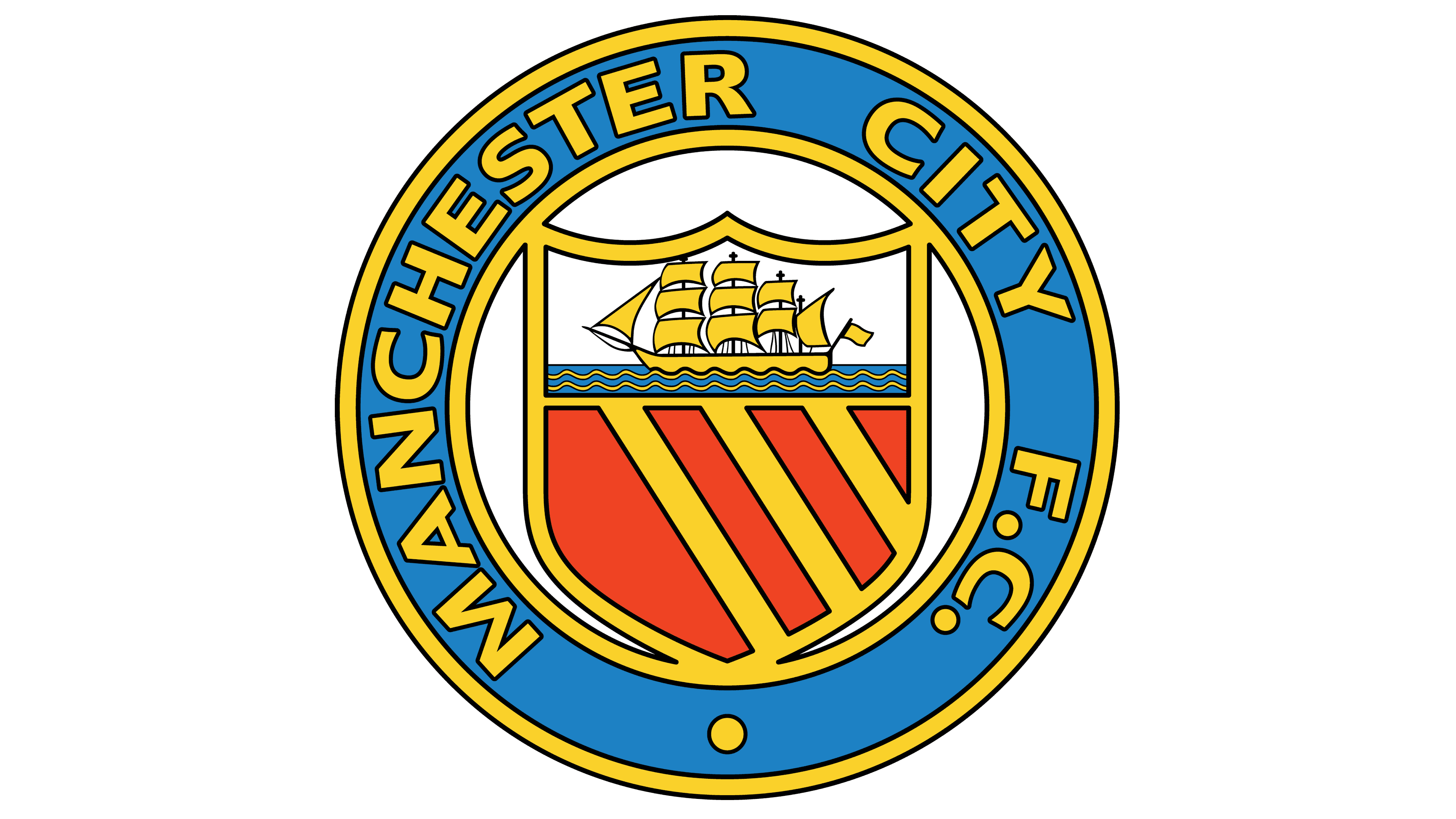
1972 – 1981
![]()
In 1972, the Manchester City branding division presented a reinvention of the team’s old emblem. The shield was divided into two halves. The bottom white one showed a red rose reminding a hexagon split into 5 triangles, while the upper one displayed a familiar boat recolored golden. This whole crest stood inside a pale blue circle, embedded in a thick white ring, contoured black from inside and outside. The ring read ‘Manchester City F.C.’ in extra bold characters.
1981 – 1997
![]()
Later, they would add a blue and white gradient to the upper area, and deepen the hues of its backdrop and the rose.
1997 – 2016
![]()
In 1997, Manchester City FC embarked on a new logo concept that would last nearly two decades and turn into legendary iconic symbols. The insignia displayed a golden eagle, with its majestic gaze shifted leftwards, proudly bearing a blue crest decorated with three striking white diagonals. Upper the bird, three gold stars gleamed, symbolizing their triumphs and glories. Below it, a ribbon showcased the slogan in black, cursive lettering: “Superbia In Proelio.”
The essence of the crest remained intact, with its signature elements of stripes and a clipper, now diverged by a wide line with the golden serif acronym “M.C.F.C.”. This captivating design epitomized the spirit and heritage of Manchester City, capturing the imagination of people and embedding itself as a cherished emblem in the club’s illustrious history.
2016 – today
![]()
In 2016, Manchester City revisited the iconic symbol from the 1990s, resurrecting its circular badge and the red rose. The shield, decorated with a dual-tone outline of blue and gold, showcased a clipper ship in a gradient gold hue, set against a backdrop of blue lines. Nestled in the lower part of the shield, a vibrant red rose bloomed, symbolizing the MC’s success.
The wording enveloped the ring in a regal shade of blue, rendered with a contemporary sans-serif typography. A nod to the club’s founding year, the light blue “1894” date note was seated in the ring. This heraldic masterpiece encapsulated Manchester City’s rich heritage, blending tradition with a touch of contemporary elegance.
Color
Manchester City’s main colors, often hailed as “sky blue,” have become synonymous with the team. The selection of this hue refers to 1892 or possibly before. Notably, their abroad uniform uses a distinct palette, showcasing shades of maroon or red and black. These vibrant hues accentuate the MC’s identity, creating a visual spectacle on the football field.
Font
The present iteration of the script for their nameplate features a sleek and minimalist design, employing clean and legible capitals without serifs.