Liverpool Football Club, called after its renowned town of origin, emerged in 1892 and currently contests in the esteemed Premier League. With a remarkable record of match triumphs and notable global successes, they have gained the moniker “Reds” owing to their vibrant colors.
Meaning and history
![]()
Set up in 1892, Liverpool FC swiftly made their reputation among English fans, winning their initial league tournament in 1901. Under the guidance of Bill Shankly, the club thrived in the 1960s and 1970s, winning multiple matches and glorious triumphs on the European stage.
The 1980s bore witness to Liverpool’s prosperity era, as manager Bob Paisley orchestrated a formidable team, conquering both home and European competitions with unwavering dominance. The Reds’ triumphs yielded numerous league trophies and an astounding tally of four European Cups, cementing their status as an indomitable force in the footballing sphere.
Recently, following the instruction of Jürgen Klopp, Liverpool has undergone a resounding revival. Klopp’s charismatic leadership and tactical understanding propelled LFC to unprecedented heights, culminating in their long-awaited league triumph in 2020.
What is Liverpool?
Liverpool Football Club is a prominent participant in the Premier League of England. It started in 1892 in the eponymous town, and from then it achieved numerous domestic and international awards which made it into a worldwide recognized football force. Since the foundation, their hub arena has been Anfield.
1892 – 1940s
![]()
The Reds’ inaugural emblem mimics the city’s cultural crest. The shield features two cormorants. The divine sculptures of Triton and Neptune surround them, referring to antique Greek legends. Overhead, the Latin tagline “Deus nobis haec otia fecit” symbolizes bestowed tranquility. Downward, a caption proudly declares “Liverpool Football Club.”
1940s – 1950
![]()
As WWII ended, the Reds’ graphical identity transformed. The shield features a cormorant at its core, surrounded by spherical orbs representing the game balls. The backdrop showcases vertical crimson and ivory striations, evoking a sense of dynamism. Encased within a rounded framing, the club’s appellation finds its place.
1950 – 1955
![]()
In the 1950 F.A. Cup finals, the Liverpool bird (a British counterpart of Phoenix) materialized on their jerseys for the first time. Its origin has to do with cormorants, as per popular belief. The team’s standpoint, however, attributes its origins to the ancient sigil of King John Lackland.
1955 – 1967
![]()
The 1955 design depicted a familiar red bird in a minimalist style. It stood on a podium, raising its wings and carrying some weed in its beak. Below it, they wrote the name acronym. The whole picture found its place in a big ellipse.
1967 – 1987
![]()
The latter design showed the bird and the acronym without a podium or ellipse. The bird’s appearance was renewed a bit: a distinctive stroke accompanied it.
1987 – 1992
![]()
The next emblem adopted the form of a championship trophy, ornamented with a bird picture inside a crest. The cup’s bottom of crimson geometric forms serves as a background for the nameplate, elegantly inscribed in its entirety.
1992 – 1993
![]()
Their memorial insignia showcased a large white shield with the script “Liverpool Football Club 100 Years”, whereas the portion ‘100 years’ stood inside a thick red stripe with blue outlines’ Nestled below, a crimson bird picture finds itself in a miniature crest, mimicking the big one’s shape. Above, the regal Shankly Gates Arch, a sign of unity, carries the tagline “You Will Never Walk Alone.” Beneath, a pristine ivory stripe depicts their career, spanning 1892 to 1992.
1993 – 1999
![]()
Throughout most of the 90s, Liverpool bore a logo with the well-known shield containing their name and a smallish shield demonstrating the city’s symbol. A ribbon that read ‘Est. 1892’ was beneath the crest. Above it, a stripe saying ‘you will never walk alone’ showed up. It was adorned with a pattern comparable to Shankly Gates Arch. The significant details of the symbol were two crosses on either flank. They burned with an everlasting flame, referring to the Hillsborough Disaster.
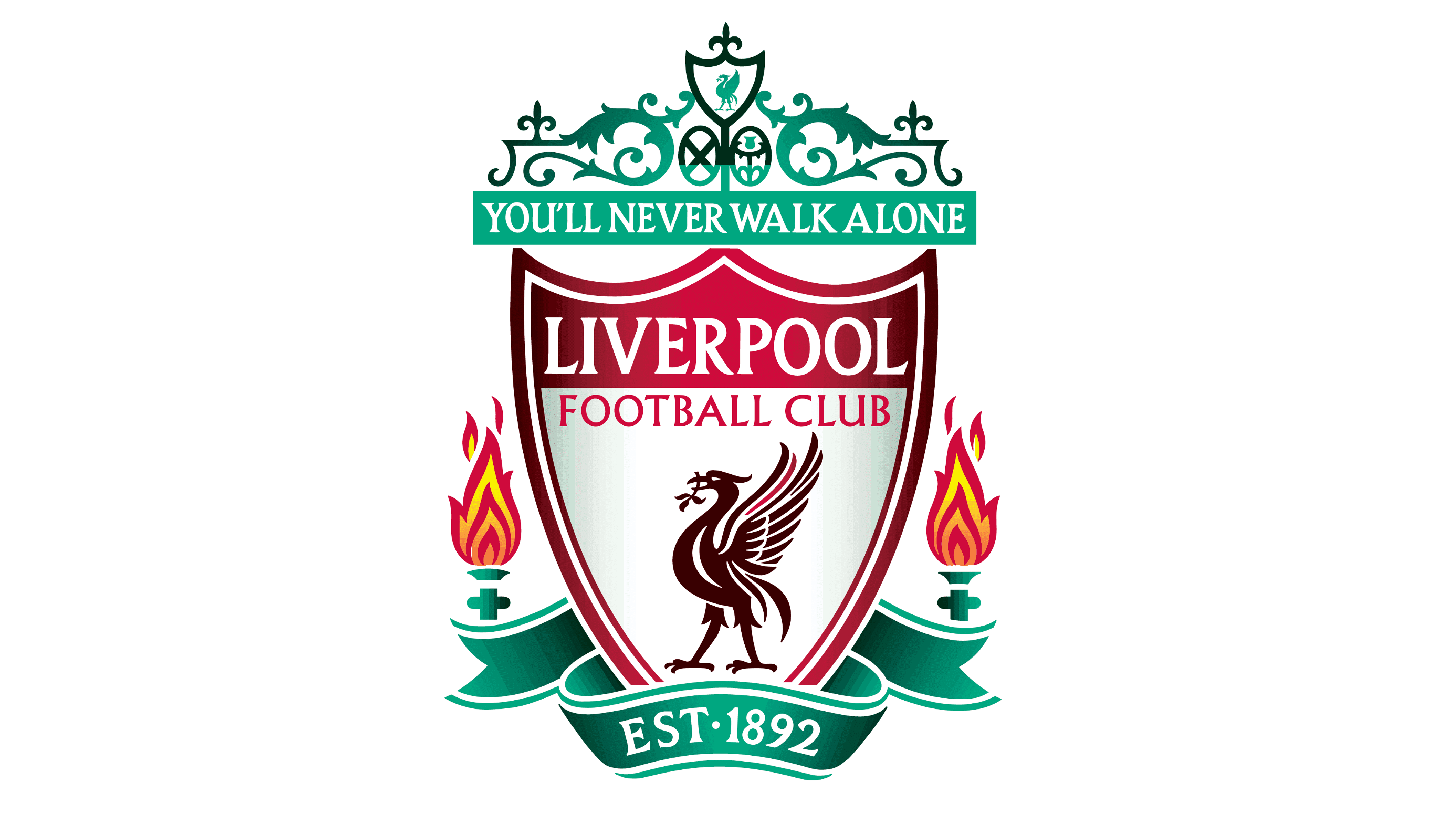
1999 – today
![]()
As the dawn of the new century emerged, the insignia underwent a metamorphosis. The coloring code changed, intertwining a gradient of verdant hues beautifying the arch, while a fiery deep red gradient decorated the shield alongside the distinctive white contour. Etched upon the stripe beneath, the wording “Est. 1892” represented their origins.
2017 – 2018
![]()
As the Reds celebrated their 125th anniversary came up, its brand designers made an exclusive logotype that showed the highly detailed Liverpool bird, surrounded by the captions ‘1892’ and ‘2017’ on either side. Below it, there was a two-level caption ‘L.F.C 125 years’. The whole logotype illustrated golden characters on a deep red backdrop.
Color
Their present chromatic choice, a captivating fusion of four hues, represents the essence of football’s brilliance. A splendid combination of Persian green, fiery red, and the beguiling Icterine compose the logo.
Font
The Liverpool Club’s official script features the title case semi-bold characters with sharpened tips and small serifs. There’s tiny inter-letter spacing, which adds status to the whole logo.