LG Logo
Tags: electronics | home appliances | mobile devices | south korea
LG is a multifaceted corporation with an international presence. It manufactures numerous customer products, from electronics and mobile devices to home appliances, conditioning systems, and chemicals. This is the fourth-largest company in its home country – South Korea.
Meaning and History
![]()
LG is a result of a merger agreement between two large corporations from South Korea – Lucky and Goldstar. The latter is the main predecessor of LG, as they positioned themselves as a leading customer electronics and telecom devices brand in the republic. Lucky was a significant brand in the country’s chemical industry, working both at home and abroad.
The agreement came into force in 1983, and the company Lucky-Goldstar was founded. With the new title, the brand shifted its main focus to innovative technologies while not forgetting about other directions like chemicals (plastics, rubber, ABS). Twelve years later, the next rebranding took place, as the company adopted the acronym ‘LG’ as the official name.
LG added TVs, smartphones, air conditioning systems, fridges, and other products to their portfolio. They developed the globe’s pioneering 60-inch Plasma and full LED 3D TV. Their smartphones meet all of the contemporary customers’ needs like good cameras, speed, and battery durability.
In 2021, LG decided to change its focus, moving its resources from smartphones to TVs and home appliances. Despite this change, LG continues to be a prominent and influential company in various industries, with a commitment to delivering innovative solutions to enhance people’s lives.
What is LG?
LG is a South Korean transnational that operates in numerous markets: consumer electronics, telecommunications, home appliances, chemicals, and others. The conglomerate was founded in 1983 as a result of merger agreement and is headquartered in Seoul.
1947 – 1964
![]()
LG’s precursor, Lucky, featured a symbol designed for Asian clients, incorporating hieroglyphs to represent the company’s full title. The logo contained a two-level inscription with the upper one enclosed in a red ellipse and the lower one displayed on a white backdrop.
1963 – 1978
![]()
Following a redesign, LG’s logo transformed. Instead of the ellipse, they drew a circled rectangle featuring the character “L” with a wavy ower bar. The company’s name was positioned alongside the new shape. The script utilized for the Asian symbols changed, adopting a sleek and minimalist style, a departure from the previous italicized design.
1978 – 1983
![]()
An addition to the insignia was the introduction of a blue quadrangle on the left side of the company’s title. The square had outwardly curved sides and soft angles, housing a four-petal flower executed in white contours. Each petal looked like a heart, adding a delicate and distinctive touch.
1983 – 1995
![]()
Prior to the agreement with Goldstar, Lucky utilized an insignia similar to 1964-1978 one, but with some modifications. The wave-shaped “L” now sported a two-tone crown, made out of five interconnected triangles, each having a big circle aside. The rectangular backdrop got sharp angles, and the previous red color was replaced with pale pink. However, the inscription remained the same, featuring Chinese symbols just as it appeared in the 1978-1983 logo.
1958 – 1964
![]()
In 1958, Goldstar appeared as a firm, specializing in the manufacturing of appliances and electronic devices. Under the GoldStar brand, a distinctive logo was created, featuring five merged triangles that formed a crown. Each triangle had a small circle at its top, with the two central rays in black and the remaining three in white. Below the icon, the company’s title was written in a cohesive handwritten style, reminiscent of Arabic script.
1964 – 1983
![]()
A new addition to the insignia was a black square, within which a white circle with a crown and the acronym “GS” was placed.
1983 – 1995
![]()
The last GoldStar logo before the merger depicted the familiar 1964 squarish image, that was rendered in red and white. The brand’s full name caption, also in red, was positioned to the right. The characters were written in a geometric typeface without serifs. They had minimal rounding and straight edges. Notably, the symbols “d” and “a” appeared quite similar in shape, while the “t” didn’t have the left segment of the central bar.
1995 – 2014
![]()
In 1995, a significant step was taken by the company’s leadership, as they decided to merge the existing brands and establish a new name – LG. The symbol for this new identity was carefully crafted as a monogram, with the small note “L” enclosed within the bigger letter “G.” Jointly, they created the focal point of the emblem, placed centrally on a vibrant red circle.
2005 – 2011
![]()
A minor restyling occurred in 2005, where the addition of the gray stand-alone acronym “LG” complemented the existing logo.
2011 – 2014
![]()
Another notable update occurred in 2011 when LG introduced a 3D edition of the sign featuring shades and highlights.
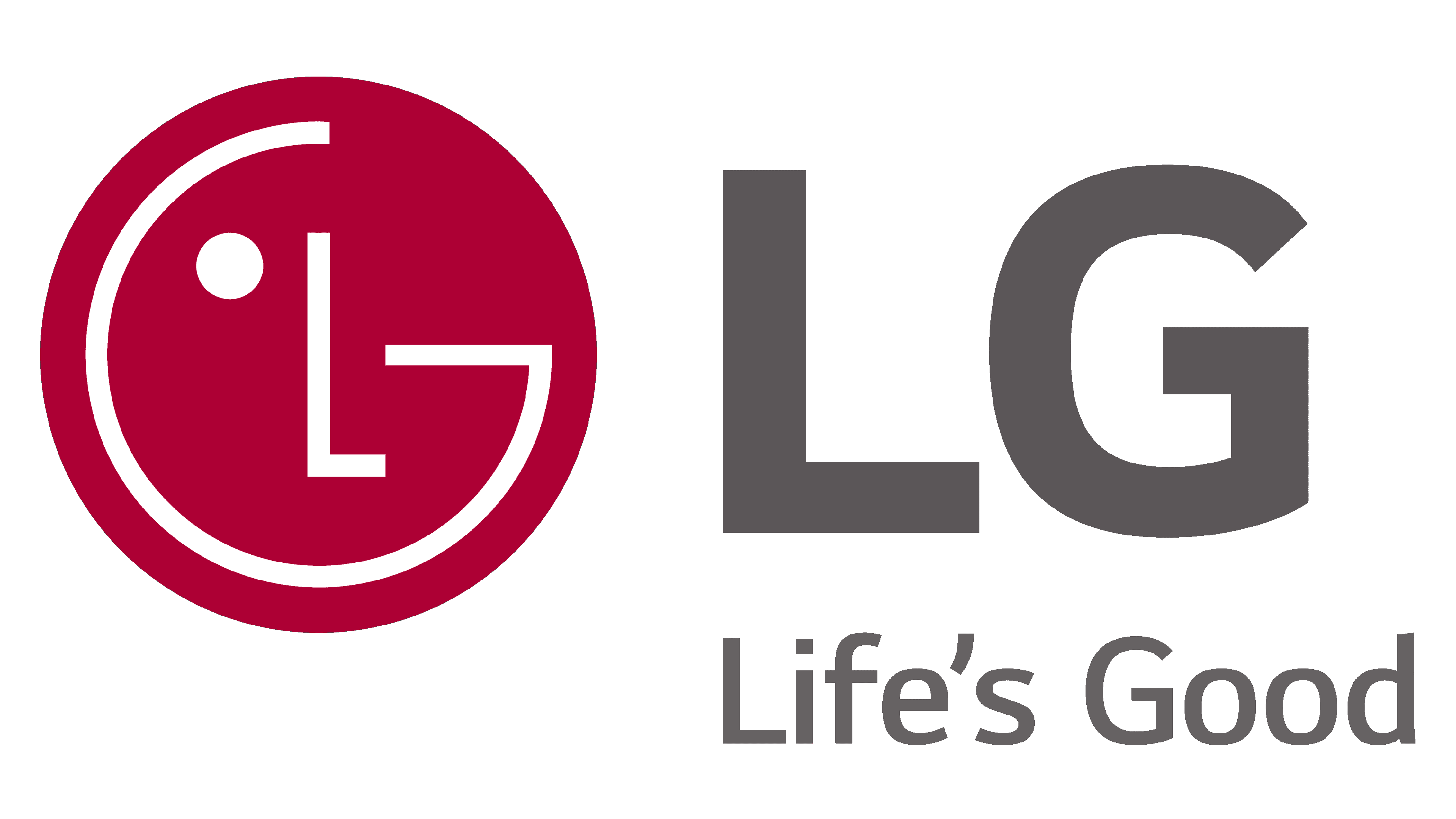
2014 – today
![]()
The latter LG insignia comes in two variations: 2D and 3D. While both variants hold equal significance, the 2D rendition is predominantly used in a digital environment as a brand symbol. The 3D iteration serves as a commercial symbol, primarily appearing on product packaging. The intention behind the 3D image is to captivate attention, leveraging visual impact to engage clients.
2023 – today
![]()
Recently, they adopted a simplified logotype that features the iconic monogram in white contours on a white square.
Font
The individual elements within the logo hold their symbolism: the letter “G” forms a distinctive smile, while the letter “L” with a dot represents a nose and an eye.
To create the logo, the designers opted for the widely recognized font, Helvetica Black. In 2014, a notable update occurred as the letter “G” transformed, shedding its familiar notch and adopting a more refined appearance. Additionally, the overall typography of the logo became thinner, enhancing its sleekness and modernity.
Color
The LG logo incorporates a chromatic choice of LG Red plus LG Gray. The primary hue is a deep red, signifying the firm’s goodwill and positive image. To ensure visual balance and harmony, a dark gray stands as a secondary shade. This gray tone helps the acronym blend seamlessly with the circle, preventing it from overpowering the overall insignia and maintaining a sense of visual equilibrium.