Intel is an American corporation that manufactures a wide range of electronic devices and computer components, including semiconductors, microprocessors, system logic sets (chipsets), etc. The company was founded by Robert Noyce and Gordon Moore in 1969. In July 2019, a division of Intel Corporation engaged in the production of systems for connecting smartphones to the Internet was acquired by Apple.
What is a curious fact about Intel?
The company develops computer vision and machine learning technologies based on sensing, data analysis, localization, mapping and driving policy for advanced driver assistance and autonomous driving systems. It serves original equipment manufacturers, original design manufacturers, industrial and communications equipment manufacturers, and cloud service providers.
Meaning and History
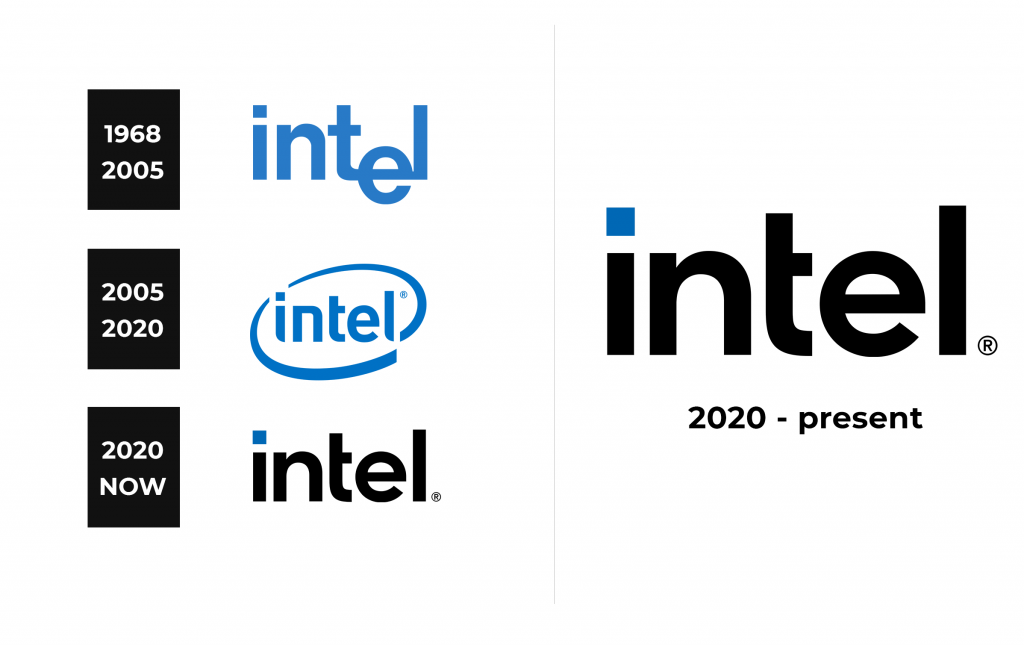
The history of the company logo is rather curious. The logo changed several times.
1968 – 2005
Intel had only two corporate logos since its founding in July 1968. Now there are three of them. The very first logo was invented by the creators of the company themselves: Robert Noyce and Gordon Moore. It was called the “dropped e” logo because the letter “e” was shifted relative to the others. This logo has been used for more than three decades.
2005 – 2020
At the international exhibition CES in 2006, Intel announced a new development strategy for the company and introduced a new corporate logo, which was used until 2020. The design has changed a lot: there was a rounding around the company name, and everything was written in the original Neo Sans Intel font.
2020 – now
In 2020, i.e. 14 years after the previous change, the last logo redesign took place. Intel’s website states that the logo was created with exquisite symmetry, balance and proportions, and it also preserves the legacy of the old versions, which makes it both familiar and new. It is noted separately that the prominent dot above the letter “i” symbolizes the potential and power of the company’s processors.
The company has also retained the corporate music logo, which can usually be heard in Intel advertisements. However, it clarifies that it now sounds in a more “modern version”.
Font and Color
The blue color is still present in the logo. However, in addition to the classic blue color, the company has introduced new options with an expanded color palette. The background of the logo can also be different, depending not only on the products, but also on their models. For example, the label of Iris video accelerators has a white background, and Optane memory is blue, as Pentium processors together with Celeron are.
The Core family logo is a couple of shades darker, and the Xeon logo is very dark blue, almost black. A deep black shade was given to the logo of the Intel laptop certification program called Evo. All of the above is not the only option for a combination of shades and brands of the company.


