Hot Wheels toys are some of the most famous die-cast mini cars in the world. Perhaps, every boy has a shiny metal car with a characteristic fiery logo. For more than half a century, boys and men all over the world have admired small cars. These toys, as if charged with adrenaline, surprise with design and possibilities, kindle the spirit of competition. The creators of Hot Wheels have set a bar of quality that no other manufacturer has yet been able to overcome. Their cars are chosen for collections and fun play.
Meaning and History

The creator of the brand is Elliot Handler, one of the co-founders of the American toy concern Mattel. The first models to go on sale in 1968 were the Custom Camaro and 15 others in 1:64 scale. In 1977, Mattel released a series of cars called “Hot Ones”. Five years later, the “Real Riders” series of cars, which featured real rubber tires that allowed the cars to ride even better on the tracks, have been released. Since then, the company has not only continued to release new series of cars but also expanded its range into different themes and lines.
What is Hot Wheels?
Hot Wheels toy cars are a cult phenomenon in the world of toys and cars. They have become something of a link between past and present, between childhood and adulthood. In addition to Hot Wheels cars, themed auto tracks (Shark Jaws, Dinosaur Attack, etc.) are released. They form roads of various lengths and configurations, with obstacles, forks, and rings.
1968 – 1969
![]()
The logo of the brand became not only familiar but instantly recognizable and associated with a respected brand. The iconic flame logo appeared right when the company was founded. This symbol went perfectly with the name of the company. Its name is printed in white using large letters that had uneven shapes. The first letters even looked like they were also part of the flame or maybe they simply got melted and carried away with the flame. The slogan, which was printed in a small black font right under the name, said “Hottest metal cars in the world”.
1969 – 1970
![]()
The designers preserved the bold personality of the company but made the logo more readable and scalable. The flame was redrawn to be less wide. The latter has been modified just slightly and no longer had a black outline. The slogan, which was now positioned under the fire, now said “Fastest metal cars in the world!” in small, red font to match the red fire. There was a new element added to the logo – a red circle in the lower right corner. It had a white “M” in the center and “Mattel Inc. Toymakers” printed around.
1970 – 1973
![]()
A minor change has been made a year after the last update. The company decided to remove the slogan. The red circle now simply had “Mattel” printed across, which made this portion of the logo more legible. The red color seems to be slightly darker and not drastically.
1973 – 1990
![]()
Although the brand is typically associated with a red flame, it used an orange flame for around seventeen years. The inscription was also changed and featured bolder strokes, which made the letters stand out against a lighter background. To match the stronger inscription, the flame was redrawn to be wider and symbolize the spreading admiration of the brand across the globe.
1990 – 2000
![]()
Although the previous logo stayed with the brand for quite some time, it decided to update it again. It brought back the red color and even added a white border that was outlined by a thin black line that made the round stamp part of the flame. For the first time in history, the lettering had yellow in addition to white. It was done as a gradient with white at the bottom and yellow at the top. Such a color palette was very appropriate for a flame and allowed the name to attract even more attention.
2000 – 2004
![]()
Although the logo has changed multiple times, it conveyed the same vision and values of the brand. It looks mesmerizing as it has a three-dimensional appearance and realistic flame. The company removed the round symbol it was using for so many years and left only a red flame with the brand’s name. The yellow color now took an even larger portion of the inscription, making it seem that it was lit by the fire or even burning. The font was kept the same but the letters now had a shadow that gave them an appearance of volume.
2004 – 2010
![]()
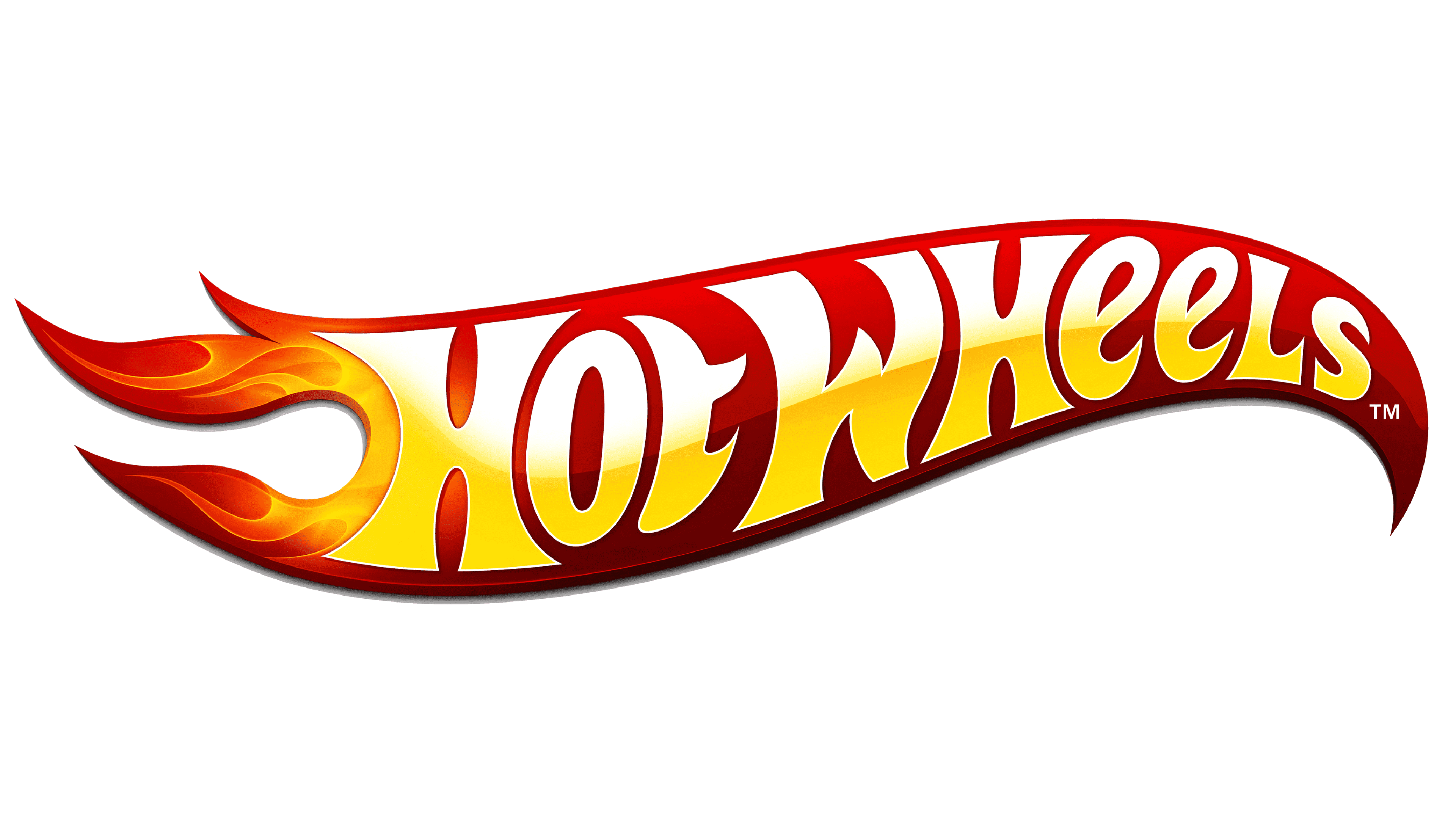
As with the previous updates, the flame has been redrawn. It became thinner and sharper. It also has more of that realistic fire to the left of the “H”. There is a little less yellow and more white in this version, but the darker, crimson-red background allows the letters to pop. Although you can find this hidden image in the other versions, it is most noticeable in this version. The last two letters in the word “Hot” as well as the negative space between the “H” and “W” create a quite realistic wheel (letter “O”) with a red tire that features a yellow highlight.
2010 – 2014
![]()
The company stayed consistent with its brand image and used the flaming symbol again. It was simplified to go with modern trends and there is no more three-dimensional appearance. Instead. The shape and color of the flame and the inscription seem to be inspired by the logo created back in 1969. The company, however, made the whole inscription a bright yellow color. It has been using the yellow for 20 years already and now simply decided to do away with all the gradients. Yellow seemed a very appropriate choice for Hot Wheels.
2014 – Today
![]()
It might seem that the logo has not changed at all in 2014. However, an attentive eye will notice that the designers have modified the flame shape right next to the “H”. The logo was also made smaller.
Font and Color
The red and yellow color palette reflect the strength, endurance, and speed of the cars made by the brand. The use of white and black gave the logo the highlights and shadows that it needed to create a lasting impression.
When it comes to the font, the company stayed pretty consistent. Although it has modified the inscription almost every time the logo was updated, the overall appearance was not affected. The letters had smooth, bold strokes that resembled the fire flame. It is close to a typeface created by Typodermic Fonts and known as Heavy Heaps.