Google Photos is an Internet instrument, developed by Google Corporation in 2015. It allows users to store their photographs, images or pictures, as well as post them in social media. The software machinery examines the photo and detects the subjects on it, including landmarks, people, and items. Google Photos has several paid tariffs. They offer different features, such as storage size and photo resolution increasing. The operations with photos in GP are carried via cloud technologies and artificial intelligence services. In the 2020, GP contained about 4 trillion files.
Meaning and history
Google Photos originates from photo keeping and delivering tools, incorporated into Google+, the company’s platform for public communications, which, however, didn’t get much success. In 2014, it was decided to separate photos service from Google+ and develop an independent application. Just as it happens with many other tools powered by Google, the name doesn’t show any specific features and consists of the corporation nameplate plus the thing the tool is responsible for.
Throughout the following years, Google just continued to add additional functions – private and public albums formed either with or without user’s involving, facial, geographic, and item recognition based on artificial intelligence and machine learning, ‘Memories’, ‘Suggested Sharing’, et cetera. They also made some logos for the mobile, web, and computer software.
What is Google Photos?
Google Photos is a software, developed by Google in 2015. It helps users keep their photos and deliver them to each other. People can incorporate their photo files into albums and groups, as well as transfer them in social media pages. GP artificial intelligence system can also recognize objects, places, landmarks, and, if needed, people shown on the picture. In total, there are at least 4 trillion files added in Google Photos libraries. All this mass it maintained via GP cloud technologies and servers.
2015 – 2020
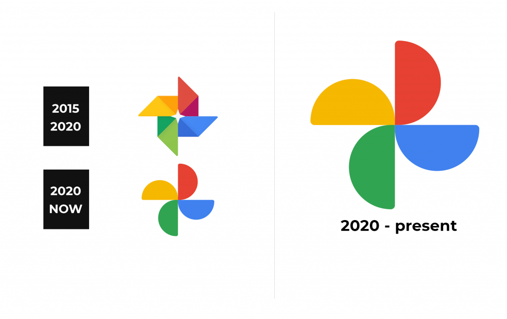
The first logotype showed four rhomboids, which in such a position that they formed something like a flower, having a vivid and high-tech style with angular and perhaps abrupt forms. At ht center of the emblem, there was an empty space, reminding a four-ended star with short bars. To the right from the rhomboids, they put the name caption, although this wasn’t always.
2020 – Today
Then, they simplified the logotype, making it more joyful, modern, minimalistic, but still familiar. The signature depicts a flower, like previously, but this time the rhomboid shapes were changed to semicircles. They’re all joined to one another in the right-hand corners. To the right, they put the inscription.
Color
In both the old and the modern emblem, they used a traditional color scheme of Google: yellow, red, blue, and green. Moreover, the old crest shows the rhomboids, each split in two by the coloring, whereas a traditional Google colors borders with its darker counterpart. One of the rhombs is yellow plus orange, another one is red and crimson, the third one green and very dark green, and the fourth rhomb is blue & darker sea blue. The names are gray in both logos.
Font
In the signature, they write the name in a classic sans-serif typeface with semibold lines and small intervals between characters. Such script is often used on Google tools logotypes. Here, they painted ‘Google’ word a bit bolder than the following ‘photos’ caption.


