Friends is a well-known TV show in the genre of a sitcom. It has 10 seasons and 236 episodes, released between 1994 and 2004. They tell the story of six mates, living in Manhattan, NYC, as they experience various private and professional events. The show got its fame for its distinctive humor, memorable personages, and catchy phrases. Friends has gotten a big audience since its launch, which keeps discussing it today.
Meaning and History
![]()
Its idea derives from the runners’ desire to create a story touching on the lives of ordinary people in New York. The concept revolved around six people – Monica Geller (Courteney Cox), Ross Geller (David Schwimmer), Rachel Green (Jennifer Aniston), Joey Tribbiani (Matt LeBlanc), Chandler Bing (Matthew Perry), and Phoebe Buffay (Lisa Kudrow).
Friends has quickly become an extremely popular series and a sensation due to its sharp dialogues, talented actors, and memorable storylines. The was additionally acclaimed due to its masterful combination of humor, love, and sadness, presented in a light and catchy story.
Throughout ten seasons, the series received a line of prestigious awards and trophies like Primetime Emmy Awards, Golden Globe Awards, and Screen Actors Guild Awards. It is also a popular show on streaming platforms like Netflix, meaning that new generations are captivated by Friends.
What is Friends?
Friends is a sitcom, whose production took place in the United States between 1994 and 2004. The ten-season story describes the life of six fellows, living in NYC, and their personal and career experiences.
1994 – 2004
![]()
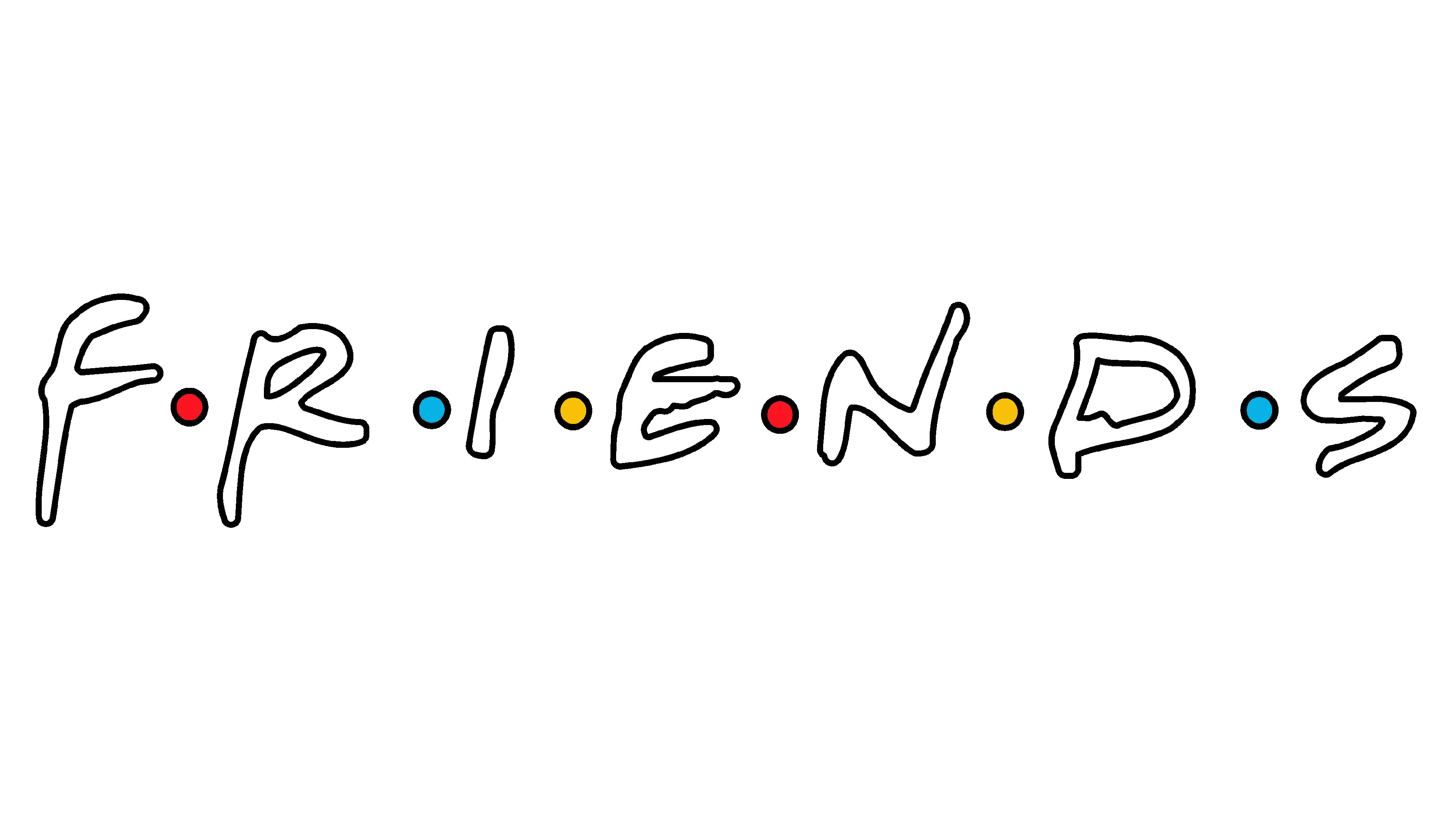
The symbol for the hit TV series was crafted by the talented artist Deborah Naysee. Though it was developed in 1994, the logo maintains its contemporary and stylish appeal even today. It features a customized black name caption with six vibrant dots set among the notes. The dots represent the friends, symbolizing the bond they share.
The characters exude warmth and friendliness as if they were personally handwritten. The delicate and smooth curves capture the spirit of the beloved show, creating a welcoming and inviting atmosphere.
2019
![]()
In 2019, they introduced the logotype that memorialized the show’s 25th anniversary. It contained the regular Friends’ wordmark plus a hand-drawn image of a rectangle, bordered by a twin black-yellow contour. This shape was further enhanced by an intricate frame, featuring four gracefully curved lines with decorative vignettes at their ends. These lines harmoniously match the black and yellow color scheme of the overall design, creating a visually appealing and cohesive logo.
Font
The show’s wordmark is made in a thick handwritten typeface. This font choice exudes a warm and inviting feel, resembling other delightful and charming typefaces like Black Racer Regular, Fave Hand Pro, and NorB Croquis.
Color
The brand’s logotype depicts thick black lettering, accompanied by two pink dots, two blue dots, and two yellow dots. These color choice not only adds a feeling of playfulness and style but conveys symbolism. Pink means love and sympathy; blue represents trustworthiness and dedication; finally, yellow embodies energy and movement.