FedEx is an American company that specializes in delivery services, transportation, e-commerce and more. It’s the most well-known and largest of such companies, with offices all over the world. It’s one of the primary transportation solutions worldwide, and it’s used by various e-commerce organizations to deliver goods. That includes, for instance, eBay, Aliexpress and Shopee.
Meaning and History
FedEx was founded in the USA in 1971 to be a paid, faster alternative to the American postal service. Originally a nation-wide transportation service, it soon became international thanks to its success at home. The current name is the abbreviation of ‘Federal Express’, the original name until 1997. It was then known as ‘FDX’ for the next 3 years until adopting the current name.
What is FedEx?
FedEx is a large American transportation service used as the go-to provider for delivering and transporting goods by millions of individuals, as well as countless businesses all over the world.
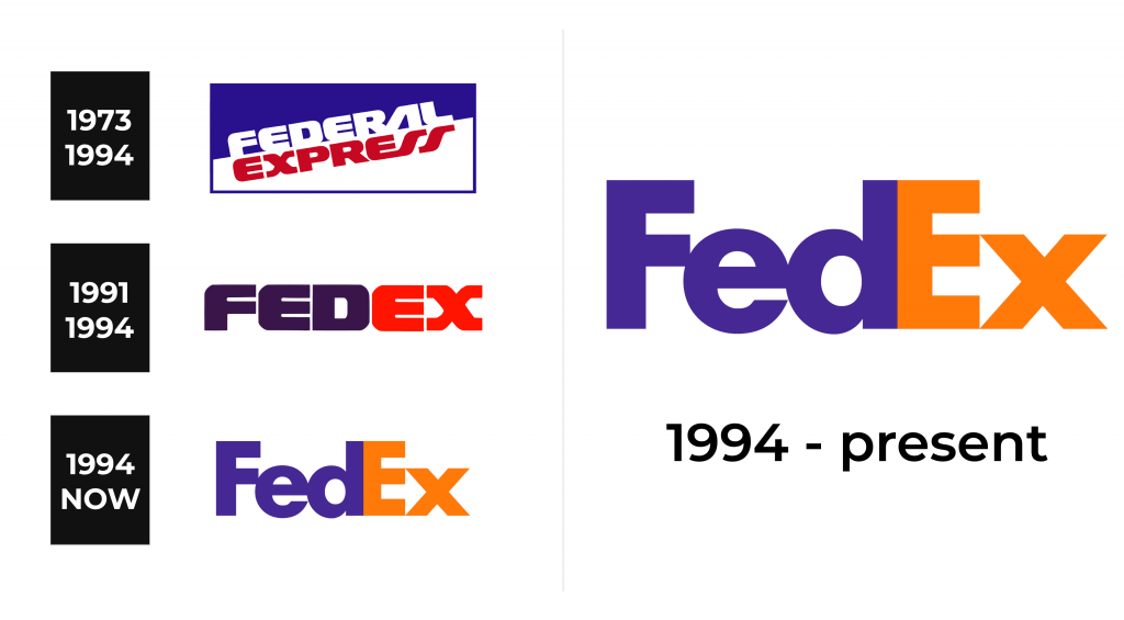
1973 – 1994
The original logo was a rectangular shape with a thin blue frame. Inside, the space was divided in two skewed parts of blue (above) and white (below). This divided also served as an environment for the wordmark of the company. The barrier that split the emblem in two was also the line to which the designers attached both words: ‘Federal’ at the top and ‘Express’ at the bottom. They used the same bold, rounded font but different color schemes. The former had white letters, while the latter – dark red.
1991 – 1994
This alternative logo used in the early 90s was adopted even before the company changed its name to ‘FedEx’. It was already a viable abbreviation, and this logo used many of the same elements as the original 1973 design. It basically just wrote ‘FedEx’ in a single line of bold, capitalized letters. The font was largely the same: big, wide and rounded characters. The ‘Fed’ part was dark blue, while ‘Ex’ – bright red.
1994 – today
In 1994, the style of FedEx logotypes was turned in a completely new direction. It depicts the company’s name, as it uses it now. As such, the emblem is based off the previous design, although with a different approach. Only the letters ‘F’ and ‘E’ are capitalized, the others are fully lowercase (like the name is written officially). The font is a lot more regular and strict. As for the colors, it’s now blue and orange respectively for the two parts of the name.
Font
The FedEx font is currently a rather basic sans-serif script with bold, tall characters. It’s still recognizable enough, and it’s associated now with this massive business. The previous typeface utilized by this company was a lot more flexible, unusual and unique, although also with bold and big letters.
Color
The FedEx primary colors are blue and orange, although the latter is often supplanted for various uses. There are various FedEx solutions, services and subsidiaries that use largely the same logotype but replace the orange in the ‘Ex’ with green, purple, red, grey, red and more.


