Ericsson is a Swedish telecommunications equipment manufacturer. After the company transferred part of the mobile phone business to Sony, it left this market. Today, Ericsson offers services, ICT software for telecom operators, traditional telecommunications and IP equipment, mobile and fixed broadband, business support services, cable TV, IPTV, and video systems.
Meaning and History
![]()
Ericsson was founded in 1876 by Lars Magnus Ericsson when he was thirty with his friend from a former job at Öllers & Co Karl Andersson as a repair shop for telegraphs. Soon his own device appeared – a desk phone with a magneto and a horn. In the late 1890s, production began to pick up and the brand went international. Ericsson’s mobile device business merged with Sony in 2001, giving birth to Sony Ericsson. In 2012, though, the acquisition of Ericsson’s share by Sony was completed and the company changed its name to Sony Mobile Communications.
What is Ericsson?
Ericsson is known as a Swedish multinational provider of communications technology and related services. In addition, the firm is working on software and services for various industries and mobile operators.
1876 – 1883
![]()
The first logo of the company was simple, yet it had all the information one would want to see in a logo and looked well put together. The company founder’s initials and full last name with “& Co.” added at the end curved along the top of the oval shape. They were printed using a bold, sans-serif font with rather uneven stroke edges. At the bottom, the logo had the company location printed in a bolder, serif font. The emblem had all caps, which added to a bold and trustworthy brand image.
1883 – 1918
![]()
This version looks like it was professionally designed with multiple interesting details. The logo used an abstract drawing of a sun as the base. Around the border, it said “Stockholms Allmanna Telefonaktiebolag”, which is translated as Swedish General Telephone Company. The orange and yellow colors created a very energetic and enthusiastic impression. The center of the emblem had zigzag, lightning-like lines coming out of something that resembled a fountain.
1918 – 1942
![]()
The logo was slightly redone in 1918, mainly the color palette. The border, which had the name was now done in blue and had white lettering. This enhanced an image of a reliable and trustworthy company. The sun got a brown square background while the center was now decorated by an image of a telephone of that time. It is done in the same beige color as the sun’s rays.
1942 – 1982
![]()
The new logo looks very modern. It features a very delicate, elegant “Ericsson” calligraphic inscription with bold, large “LM” initials in the background. The “Ericson” portion of the name is placed on a diagonal and has the last letter curve and underline the word. The initials are done in contrasting white with a black outline to make the letters stand out on any background.
1982 – 2009
![]()
The Ericsson company was quite progressive when it comes to logo design. It created a very minimalistic look with three diagonal strokes next to the name that added dynamics. It also chose a sky blue color that is associated with reliability, stability, and responsibility. As for the font, it is a simple, sans-serif typeface with smooth, thick strokes and straight cuts.
2009 – 2018
![]()
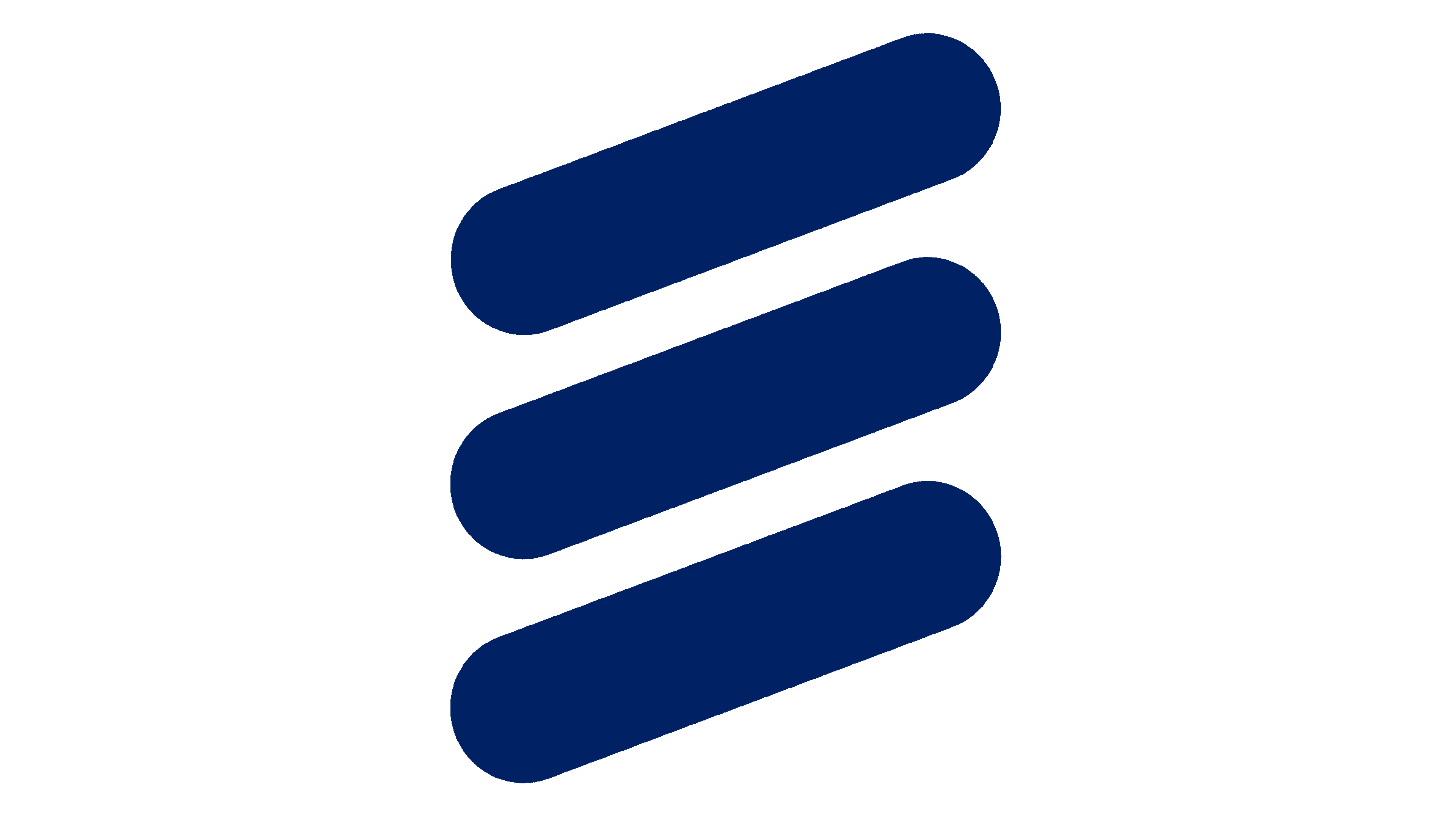
Although the designers used the same element as in the previous logo, the few modifications introduced this time made a huge difference. The company went for a darker blue color choice for a confident and impressive appearance. The diagonal lines are now the main element of the logo as they got enlarged and placed above the name.
2018 – Today
![]()
This update was not as drastic as the previous modification. Nonetheless, the company managed to change the feel and impression of its logo by simply hanging the color. It went for a classic, formal choice. Black is a color that is associated with power, sophistication, as well as security.
Font and Color
The font Ericsson company has been using for its logo since 1982 closely resembles a sans-serif font that combined straight and angled cuts called Myriad Pro Black SemiExtended. Earlier it used an elegant cursive font as well as traditional sans-serif typefaces and a font that had bold strokes and wedge serifs. The original logo as well as logos that followed after 1942 were all done in a conservative color palette that used white as the base and black or blue as the main color. The other two logos used a more colorful, warm color scheme.