From the beginning of its journey, Dolby decided to produce only professional devices, and license technologies for ordinary users. Over time, many of the company’s innovative developments have become the entertainment technology standard among both professionals and the consumer market. Batman Returns(1992) was the first film to use Dolby Digital. Since then, Dolby has released a series of increasingly advanced products, including Dolby Digital Plus,
Meaning and History
![]()
Dolby began its history in 1965 when the scientist Ray Dolby decided to devote himself entirely to sound and create his own business. Initially, his company was located in London, but in 1976 the headquarters was moved to San Francisco (USA). A year after being founded, the company introduced its first product to the market – the A-Type professional noise reduction system. As early as 1996, Dolby received the Science and Engineering Award from AMPAS for the development of the Dolby Digital sound system. In 2001, Dolby Digital technology was used in more than 30,000 theaters, outperforming all other formats in North America and worldwide. In parallel with technological discoveries, Dolby is developing its presence around the world.
What is Dolby Digital?
Dolby Digital is an audio codec developed by Dolby Labs. It creates multi-channel sound and is often referred to as the “industry standard”. Dolby Laboratories has developed many innovative technologies that have taken audio and video playback to a whole new level.
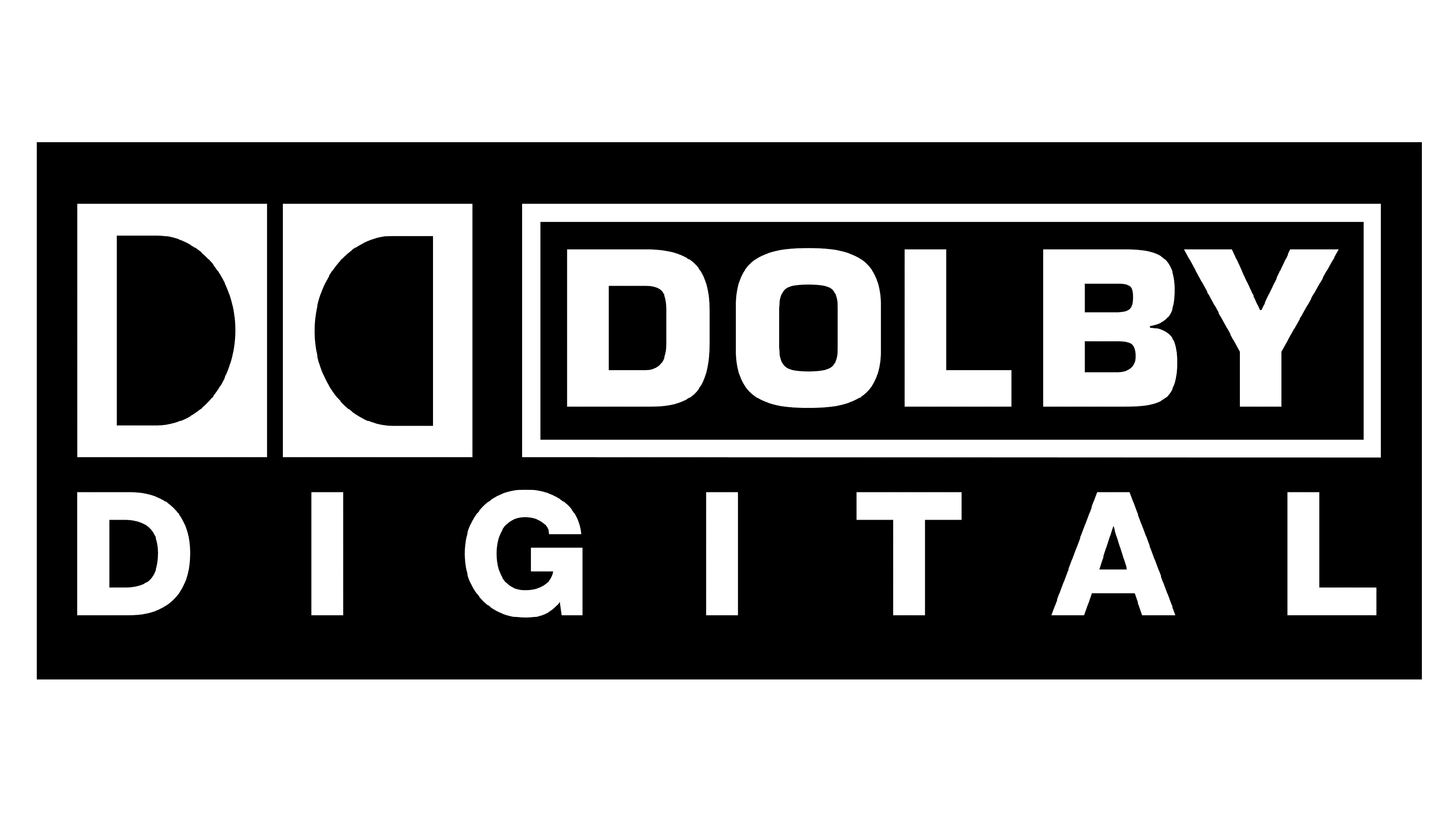
1995 – 2018
![]()
This logo was created in 1995 when the company has already existed for thirty years. It has the name of the product split into two lines the upper line is indented to the right and has a rectangular border. To the left, there is an iconic emblem. It features two black rectangles with a white “D” in each. The second letter is mirrored to create a symmetrical look. The word “Digital” is printed on the second line and uses the same font only adding more spacing to create a rectangular logo.
2003 – 2007
![]()
This logo version looks very similar to the one created in 1995. The designers merely removed the white space around the “Dolby”, placing the framing closer to the letters. The two rectangles with the “double-D” were made slightly shorter to go with the rectangle on the right. As for the line at the bottom, it stayed unchanged. For many, these changes went unnoticeable, but they created a more balanced look because previously the two black rectangles looks much heavier than the predominantly white half of the logo. The logo was also accompanied by the tagline “In Selected Theaters”.
2007 – 2012
![]()
The “Dolby” portion of the name now has no framing and is enlarged. The second line, on the other hand, had a borderline above and on the right of it. It no longer said “Digital”, but “Digital Plus” in smaller font. The logo was a perfect blend of the product visual identity used by the company for over 10 years and the introduction of a new product.
2012 – now
![]()
Five years after the last logo was created, a new version was introduced. Given that the company is constantly updating its products, it was more reasonable to keep a more universal logo. Thus, they removed the “Plus” phrase. The double “D” emblem was enlarged, so it now was the same height as the two lines of the name. The logo looked balanced and preserved its original, recognizable image.
Font and Color
The company went for black with a white background for its Dolby Digital products. It is a classic choice that has a formal and professional appearance and boosts one’s confidence in the product. The company used the same font since its foundation, which allowed it to create a recognizable product image. It is a bold, sans-serif font that is very close to Gustan Medium, created by Lux Typographic.