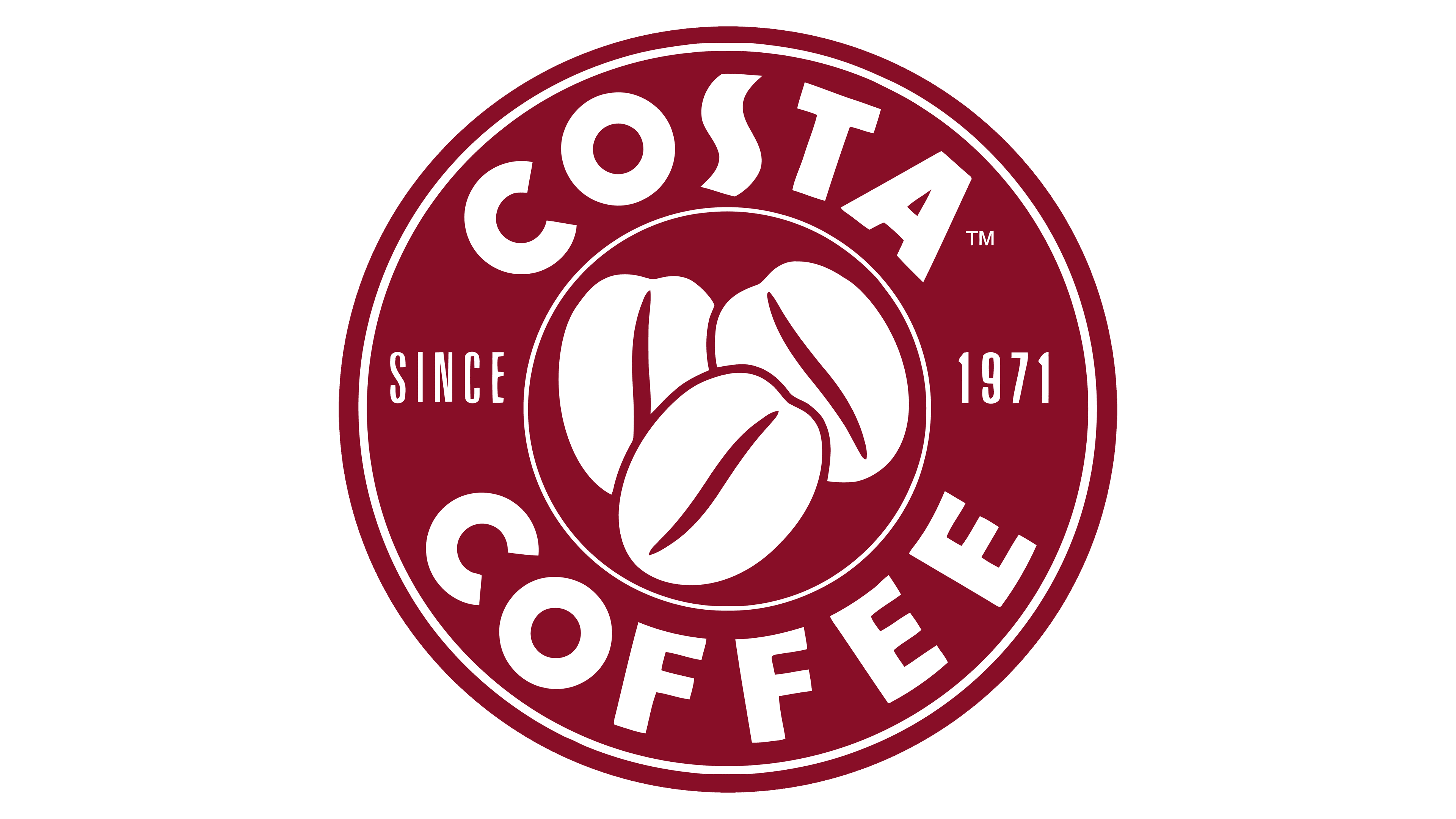
Costa Coffee Logo
Tags: coffee shops | shop chain | top-tier coffee
Costa Coffee is a well-known chain of coffee shops present all over the world. Founded in 1971, the company has gained its share of fame due to the excellent customer service in its establishments and high-quality coffee. It offers traditional types of coffee such as espresso or latte, as well as coffee with different types of milk and cream, raffa, etc.
Meaning and History
Originating in London in 1971, the enterprise emerged under the guidance of two Italian brothers hailing from the Costa family. In line with the Italian tradition, the founders opted to imbue their newly minted brand with their own family name. Notably, the year 2019 witnessed their acquisition by none other than the Coca-Cola Company.
Despite its storied history, this renowned coffee chain has embarked upon a solitary logo redesign over the years. Both iterations are characterized by the same focus—coffee. Nevertheless, the initial and latest renditions of the company’s visual identity diverge strikingly in their style and composition.
What is Costa Coffee?
Costa Coffee is a renowned global network of coffee shops, spanning the globe. Established in 1971, the company has achieved prominence thanks to its commitment to exceptional customer service and its dedication to serving top-tier coffee. The menu encompasses a wide array of traditional coffee offerings, as well as various creative options featuring diverse types of milk and cream.
1971 – 1995
The earliest version of the logo was a lowercase inscription with the family name. Written in a semicircle, the name found its place on a white background. The font style was bold, sans-serif, with many elegant curves. The most prominent element of the logo was the letter ‘o’, stylized as a coffee bean with a wide-brimmed hat over it.
1995 – today
In 1995, Costa Coffee completely changed its logo. The new version includes a red circle with two outlines inside it: one separates the center with three large coffee beans, and the other is closer to the edges of the circle. The brand name is written in big bold letters in two parts at the top and bottom. Along the center halves is the inscription ‘Since 1971’, written in condensed capital characters.
Color
The logo radiates coziness and an invitation to have a cup of coffee in a warm, small cafe with a pleasant smell, music and people. How did the designers of Costa Coffee manage to do this? A combination of delicate red and white colors could help them.
Font
The wordmark is robust and confident due to its bold sans-serif script. This typographic choice closely resembles the Lemon Milk Pro Bold font, albeit with a subtle modification to the letter “S,” which has been delicately elongated in a vertical direction.


