Comcast is one of the largest cable television and broadband operators in the USA, as well as one of the largest pay television operators in general. Among other companies involved in this sphere, it shows constant growth and is one of the most successful players in the market. Comcast owns several brands specializing in television, film, sports, broadcasting, and music. Each individual company serves millions of subscribers and owns an absolutely incredible amount of assets.
Meaning and History
![]()
In the early 60s of the twentieth century, there was a need for television broadcasting in rural areas. This was the time when the Comcast Corporation began functioning in Philadelphia. More specifically, Joe and Ralph Roberts incorporated a new company in 1969. The corporation developed successfully. A few years later, about 40 thousand people began to use its services. Further, pursuing an aggressive policy of mergers and acquisitions, Comcast became the third-largest cable operator in the country by 1994. The company acquired its modern appearance in 2011, acquiring NBC Universal from General Electric.
What is Comcast?
Comcast Corporation is a telecommunications conglomerate with roots in the United States. Comcast owns film studios, news outlets, streaming services, and even theme parks.
1969 – 2000
![]()
This logo does not look like it was designed over half a century ago. Its clean lines, classic black color, and overall simplicity are what make it somewhat timeless. The logo consists of the “Comcast” inscription as well as an emblem on the left. The designers used a stylish and daring geometric font. It uses all-caps characters that are closely spaced together, which gives the brand a confident look. The emblem has a rectangular shape with slightly arched sides. A white “C” creates an almost perfect ring on the black background, making the emblem look symmetrical.
2000 – 2007
![]()
This logo looks very different from an earlier version but has the same simplicity. The name, which is once again done in black, uses only lowercase letters. The bold font has multiple letters that resemble a round shape with straight cuts. The emblem to the left was replaced by a red moon-shaped “C” that wrapped around the first letter. the logo turned out very stylish and the red color added a powerful touch and drew attention to the brand.
2007 – 2012
![]()
Barely noticeable adjustments were made to some of the characters. The “S” had its ends cut at a diagonal. The diagonal cut was also supported in the last letter, which also had a more complete curve at the bottom. These minimal changes made the logo appear more original.
2013 – 2024
![]()
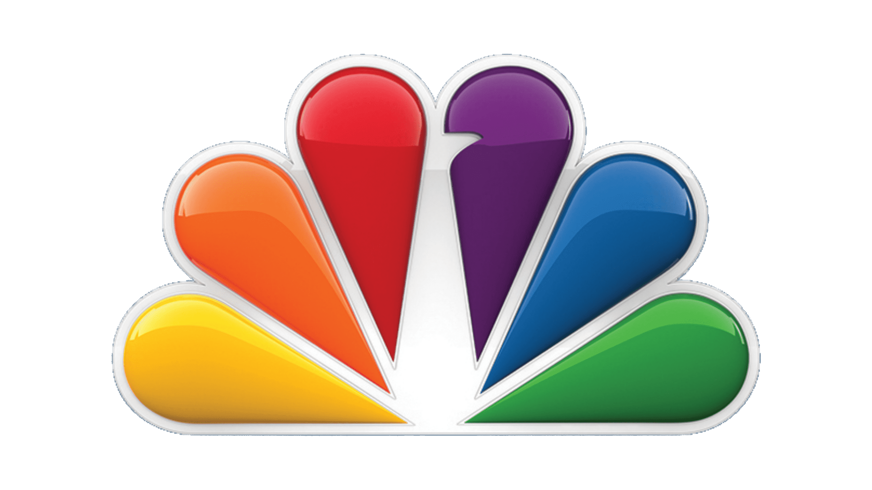
A more vibrant version was presented in 2012, which happened soon after the acquisition of NBC Universal. The key element was still the name, but it now featured a finer font and large spacing between the characters. The logo looked airy and welcoming and at the same time, it was a perfect match for a confident and giant company. A more reserved inscription was accompanied by a whole, multi-color palette. It had the shape of an old-fashioned handheld fan. It surely turned out very creative and unique.
2024 – Today
![]()
The logo includes the full brand name “COMCAST” beneath the peacock icon. The typeface is modern, with clean lines and rounded edges, which conveys accessibility and friendliness while maintaining a professional appearance. The peacock above uses a gradient effect within each feather, giving the image depth and a three-dimensional feel. The full-color logo against a white background makes the peacock more subtle compared to the black background but equally effective at symbolizing the company’s diversity and range of services. The combination of the icon and wordmark in this logo represents Comcast’s role as a leading provider in the telecommunications and media industries.
Font and Color
The latest logo features a custom sans-serif typeface that appears to be from the Intervogue Family fonts. It is very different from earlier font choices that feature bold strokes and closely spaced letters. The first logo, for instance, has a font that looks a lot like Microgramma Std Bold Extended. It was replaced by something similar to the Futura font (with a few adjustments). The other font looks a lot like the previous one and resembles URW Geometric Arabic SemiBold.