CNN (Cable News Network) is a 24-hour news cable channel. Currently, it is one of the leading news networks and one of the most respected and reliable sources of news and information. CNN is broadcast in seven languages in more than 200 countries. The audience of the TV channel is 2 billion people. CNN was destined for success, thanks to the hard work and foresight of its creator. Conducting live broadcasts from the places of events in the era of rapidly developing information and telecommunication technologies led to the inevitable expansion of the channel.
Meaning and History
![]()
Ted Turner became the founder of CNN. It was the first information channel to air continuously around the clock, starting on June 1, 1980. CNN expanded outside of the USA in 1985. However, the TV channel’s history begins a little earlier. After losing his father when he was just 24 years old, Robert Edward (Ted) Turner took over as owner of Turner Outdoor Advertising in 1970, only to discover that the business was beset by financial difficulties. Ted Turner made an unanticipated but wise choice when he purchased two small TV stations in North Carolina and Atlanta. Turner, who had faith in cable television’s future, built a successful business in just three years. It was TBS or Turner Broadcasting System, which by 1975 had reached the national broadcasting level. The owner of CNN and TBS is the American Time Warner, it also owns HBO and Warner Bros.
What is CNN?
This is one of the leading television and radio companies in the world. Currently, it owns over 25 satellite and cable channels, radio stations, websites, and other services operating under the CNN brand. News is delivered to 2 billion people in over two hundred countries.
1980 – 1984
![]()
Designed by Anthony Guy Bost, the logo has barely changed since it was originally created. Here, we can see the familiar inscription where the letter “C” flows into the next letter and the two “N”s share one vertical line. The black letters have a thin line going through the center. It further underlines that the logo is one continuous line that is cut straight at the ends while the turns form nice curves.
1984 – 2014
![]()
There is one significant difference in the logo and it is the color. A modest and more traditional black color was replaced by a daring and vivid red color. It was a perfect way to bring more attention to the network and make the logo stand out on any background. The designer continued to use the same font for the inscription, spelling out the name as one continuous line.
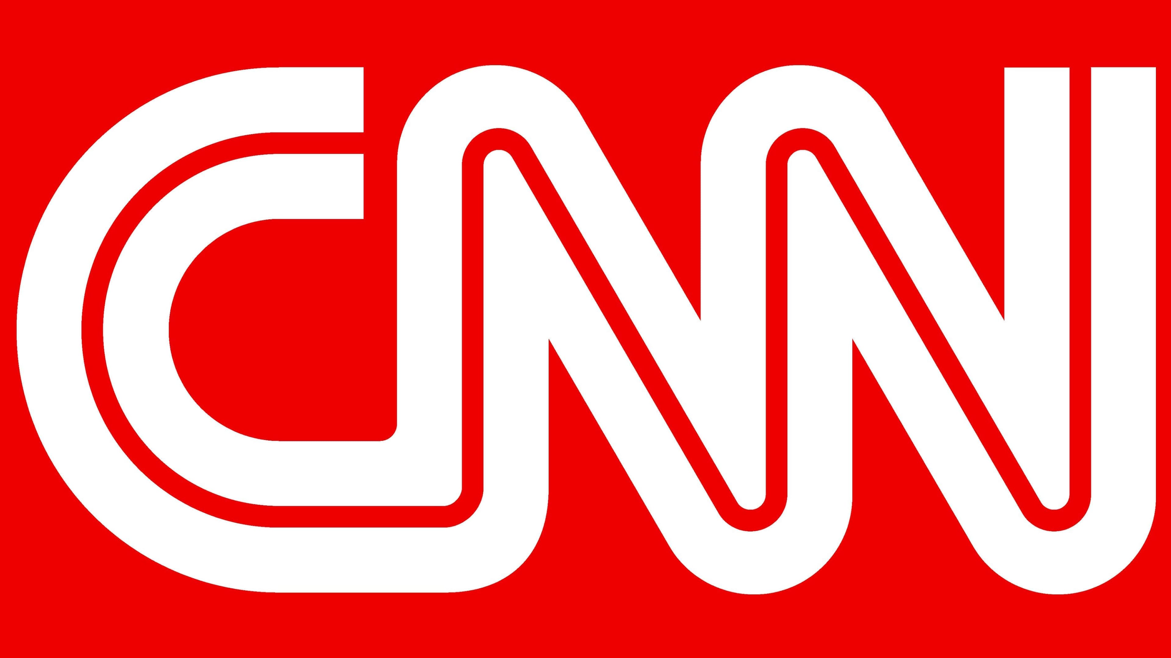
2014 – Today
![]()
A minimalistic and simple design of the logo allowed the company to use it with only minor modifications for almost half a century. It looks stylish and bold, while a darker red color gives it a more modern and sophisticated appearance. The shape of the inscription was not changed. The designer surely got the visual identity of the brand right from the very start and the company decided to keep it unchanged, which further enhanced its recognition.
Font and Color
The company originally went the safe route and chose black and white colors for its logo. The new red color palette with white accents brought more energy. It not only made the logo more noticeable but also reflected the growing power and influence of the network as well as its passion for what it was doing.
Although it has been almost half a century since the first logo of the CNN Network appeared, the sans-serif font designed for the network has not changed from the very start. It features a stroke that creates smooth curves and has straight ends. It seems that two lines were running right next to each other or as if one thick line was split in half by a thin line running down its center.