Central Perk is a coffee house where the characters from the ‘Friends’ meet up and discuss everything. It is present in all the seasons of this sitcom show, which was live from 1994 to 2004. Although it originated as fictional, people open eponymous coffee houses across the world.
Meaning and History
The television sitcom “Friends” made its debut on September 22, 1994, and it continued to entertain audiences for a remarkable ten-year run. Throughout the series, one recurring setting that became iconic is the Central Perk Café. The significance of the café’s name is multi-faceted.
On a surface level, the name “Central Perk” bears a phonetic resemblance to “Central Park” in New York City, which immediately connects the café to its urban surroundings.
Delving deeper, the name carries a clever play on words. “Perk” in Central Perk is a shortened form of “percolate,” a term often associated with the brewing of coffee. This subtle reference underscores the café’s primary function: a place to enjoy a freshly brewed cup of coffee.
Moreover, the word “perk” also invokes the concept of “perking up,” signifying a boost in one’s spirits or mood. This association further encapsulates the café’s essence as a welcoming spot where visitors can not only savor coffee but also find comfort and a cheerful atmosphere, making it a pivotal backdrop for the show’s memorable moments.
What is Central Perk?
Central Perk is a place where the characters of the ‘Friends’ show gather to discuss topics that touch on their lives, careers and education. It appears in all seasons of the show, lasting from 1994 to 2004.
1994 – 2004
![]()
The logo of the fictional Central Perk Café is a small but significant detail that underscores the careful thought put into creating the TV show. The designers opted for a design that blends familiar elements with a touch of creativity.
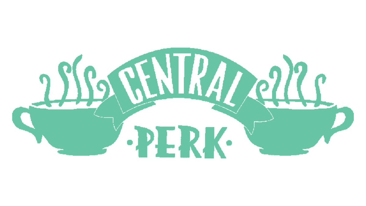
At the heart of the logo are two white coffee mugs, each emitting the enticing steam that rises from a freshly brewed cup. These mugs are symmetrically positioned on either side of the café’s name, adding a balanced and visually appealing element to the emblem.
The word “Central” is presented in bold red letters, elegantly displayed on a curved beige banner. These letters are crafted in a traditional sans-serif style, giving them a timeless and easily readable quality.
In contrast, the word “Perk” takes on a distinctive personality. It appears in white against a grassy green rectangular background with rounded ends. The font choice for “Perk” is unconventional and somewhat funky, aligning perfectly with the deliberate misspelling of the word. This creative font adds a playful and inviting touch to the logo.
The entire emblem is set against a clean white background and outlined, lending it a sticker-like appearance that contributes to its overall charm and recognizability. This logo becomes an integral part of the show’s identity, instantly recognizable to “Friends” fans worldwide.
Color
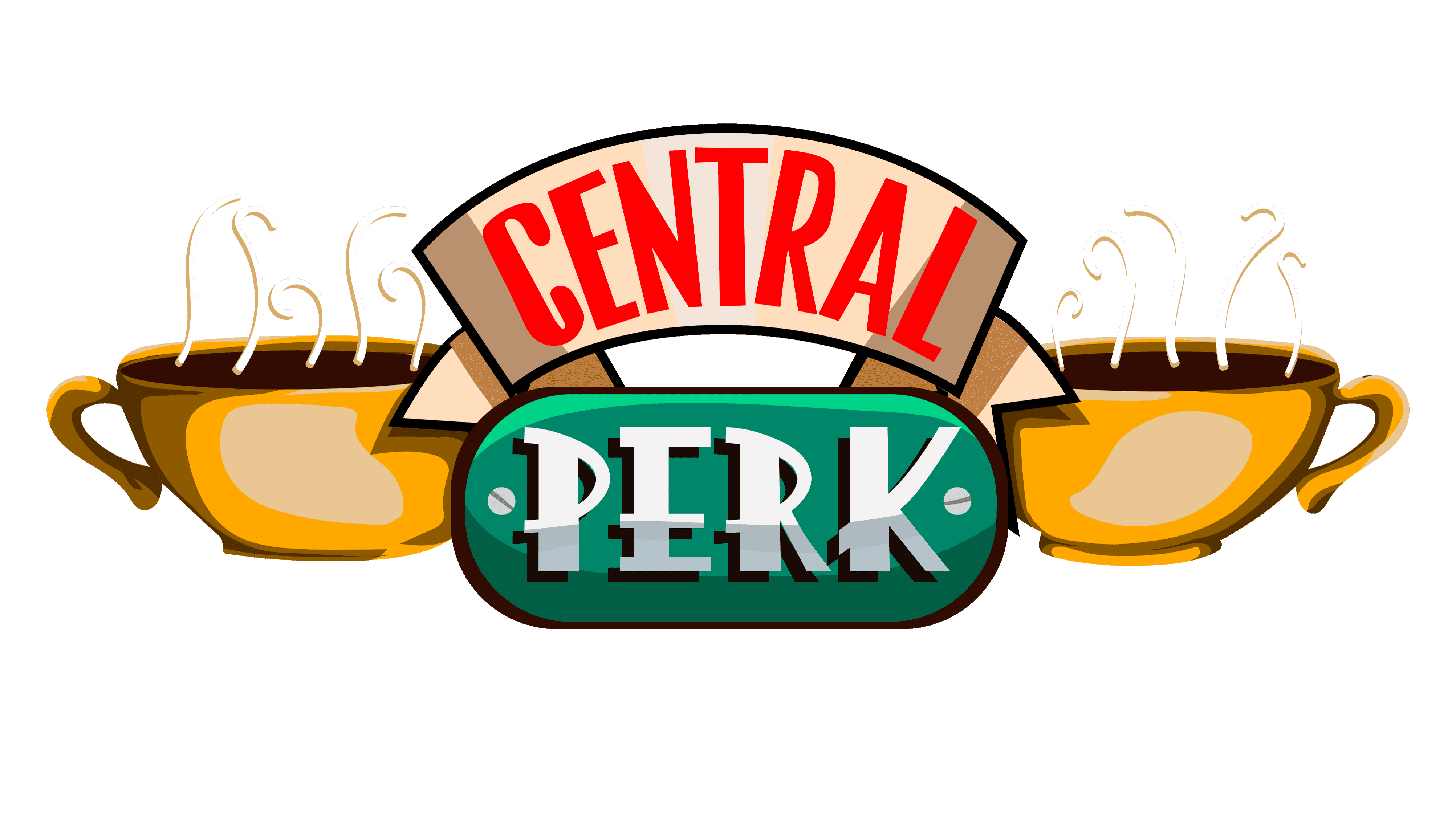
The colors that dominate the logo are vibrant green, bold red, and pure white. These colors are chosen for their eye-catching and energetic qualities, designed to draw attention and make the café stand out. The logo incorporates secondary elements in black, beige, brown, and light gray, adding depth and contrast to the overall design.
Font
One notable aspect of the logo is the use of two distinct fonts, a strategic decision to appeal to a diverse audience. The first word, “Central,” is presented in a bold, sans-serif, and geometric font. In contrast, the second word, “Perk,” adopts a more playful and whimsical font style, reminiscent of fonts like “Pinky Style Regular” by Attype Studio.