Cartoon Network is a place of endless fun and adventure. It has popular cartoons such as Scooby-Doo, Ben 10, and Foster: Home for Fantasy Friends. Amusing jokes and good stories will make kids have the best time. The Cartoon Network App is, as the name suggests, the official application of the Cartoon Network TV channel. If a kid does not want to miss a single episode of their favorite series, including any episodes that have already aired on TV, they can watch their favorite TV shows anywhere, anytime using the app.
Meaning and History
![]()
Ted Turner, the owner of a major television company, Turner Broadcasting, bought the animation studio Hanna-Barbera Productions in 1990. The channel first showed old cartoons from the MGM and Warner Bros. cartoon library for 1948. Later, in 1995, the latter started making cartoons for the channel. In 1996, the company was bought by Time Warner, after which the channel received access to the entire library of Warner Bros. cartoons aired during the 50s – 80s and later. On April 8, 2022, the AT&T conglomerate, which includes WarnerMedia (the owner of Cartoon Network), and Discovery Inc. completed the merger. The company is now known as Warner Bros., while the channel has preserved its name – Cartoon Network.
What is Cartoon Network?
Cartoon Network is the world’s largest American children’s entertainment channel that shows comedy and adventure animated series. It is part of the Warner Bros. Corporation. The channel’s target audience are children aged 6-12.
1991
![]()
This logo looks more like a draft logo instead of the actual emblem. This impression is mainly because the whole logo is done in a black-and-white color palette, where black is a less prominent color. The name of the company is printed around the center portion in white. Each character has a thin black outline, although it did not help much when it comes to making the name stand out against the white background. The rounded shape of the letters gave the logo a friendly and charming touch, which is more than appropriate for a network oriented toward the younger population. The round shape of the emblem can be associated with community, strength, and friendship.
1992 – 2004
![]()
Corey McPherson Nash, Tom Pomposello, Primal Screen, and DESIGNefx with Hatmaker Studio as the lead made up the team that worked on creating this logo. They used a font similar to Eagle Bold to print the name of the channel in two lines. Each character had an alternating black or white square base behind it, creating a checkerboard. This pattern added a fun touch to the logo, which is appropriate for a channel that was targeting a younger audience. Its bold look was sure to stand out even against colorful cartoons.
2004 – 2010
![]()
The full name at the bottom of this logo was done in black and featured bold, sans-serif letters with a straight cut. The letter “C” was cut on a diagonal, which added an interesting touch. The name was printed using the same font as in the original logo. The most notable part of the logo, though, were two large, black and white squares. The original logo served as the inspiration for this version. The designers left only two squares and placed them at different heights and slightly overlapping each other. This added a fun and playful touch to the rather serious look of the emblem. Thanks to the shadows and slightly curved shape of the squares, it appeared as if they were sticker notes. The first held the letter “C”, while the second had an “N” in contrasting black.
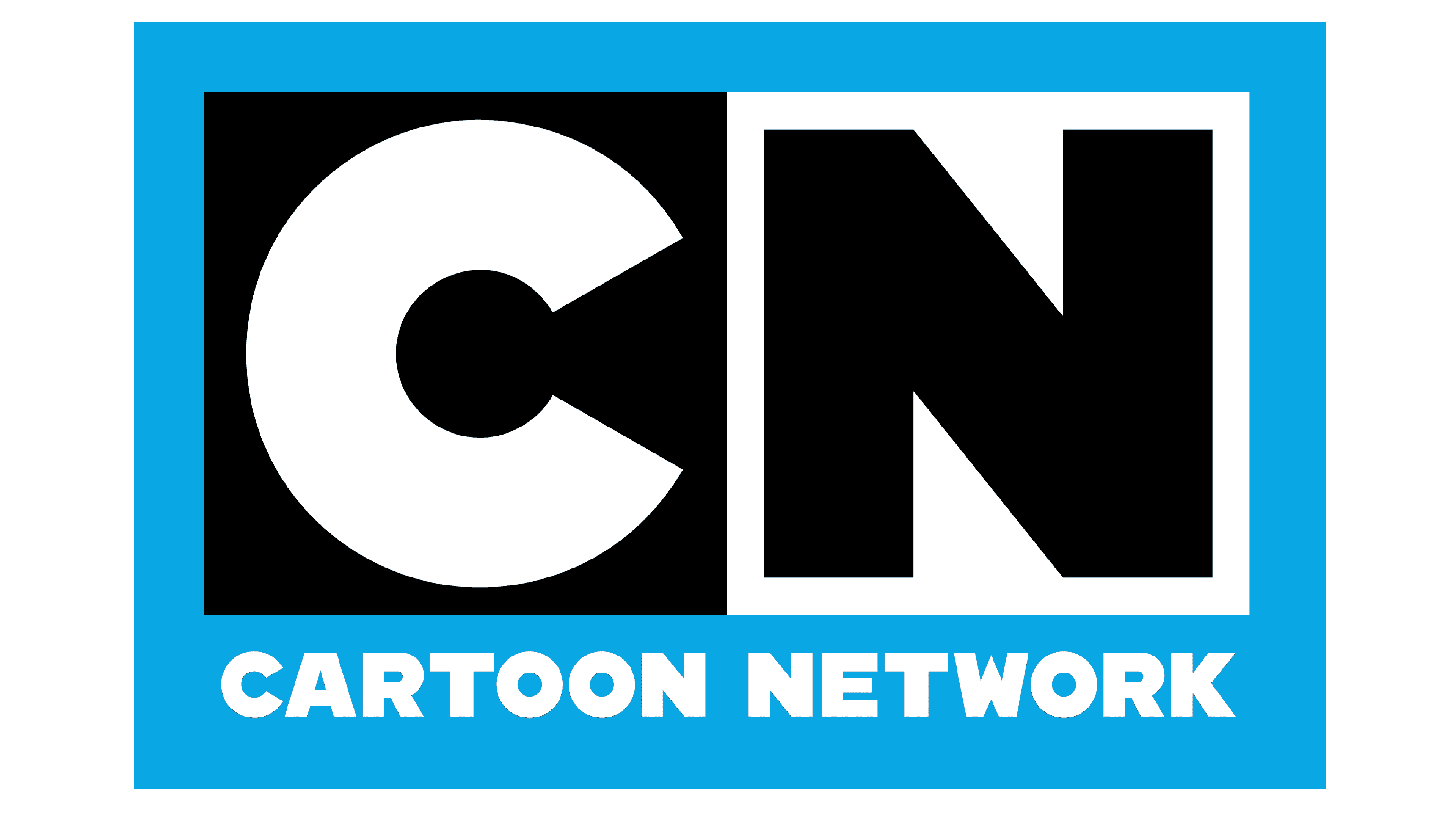
2010 – Today
![]()
This logo does not look much different from the earlier version. The company simply straightened the squares and made them look flat. This modification gave the logo a more serious image and reflected the solid position of the channel. The inscription underneath was done in the same style, but the letters were bolder and space closer. This allowed the full name not to get lost against the rather bold initials.
Font and Color
The company used the same font for all three versions of its logo. It is an Eagle Bold font that has straight, clean, thick strokes and no serifs. The pointed, sharp turns and straight cuts give a geometric feel. The company went for a black-and-white color palette, which is quite unusual for a channel that has young viewers. However, this surely allowed it to stand out and gave the logos a formal, timeless appearance. Considering that the channel was initially showing older cartoons, the black-and-white color palette was a better fit for the classical cartoons.