Bratz dolls do not need introductions. Sets of accessories and all sorts of other items that are extremely necessary for a doll’s life are also actively sold. In addition, the lines Lil Bratz (a budget line with smaller size dolls) and Bratz Boyz, as well as a series of Petz animals, which in turn are divided into subseries Catz, Dogz, and Foxz, were launched. Bratz-branded CDs, DVDs, and video games have been added later on. A full-length film seemed like a self-evident continuation of the Bratz story, but the dolls and their owners didn’t have much luck with the movie.
Meaning and History
![]()
Until the release of the full-length film about the Bratz girls, these girls were dolls. They were born in 2001: it was then that designer Carter Bryant showed the head of MicroGames America Entertainment, Isaac Larian, sketches of the dolls he had invented, and he immediately approved the sketches. In its first year, the Bratz line performed fantastically, selling in huge numbers around the world and receiving several of the most prestigious professional toy awards. Only Barbie was ahead, but in 2004 the number of Bratz dolls sold in the UK exceeded the number of Barbies sold. The name Bratz comes from the English word “bratty” – “bold”, “willful”)
Appearing at the dawn of the new millennium, Bratz can be called the Spice Girls of the world of toys – bold, stylish, and original heroines quickly captured the minds of girls around the world. In addition to their distinctive aesthetic and experimental approach to fashion, the Bratz dolls were notable for their inclusivity. Their appearance did not make it possible to accurately determine their nationality and provided for the possibility of wide representation.
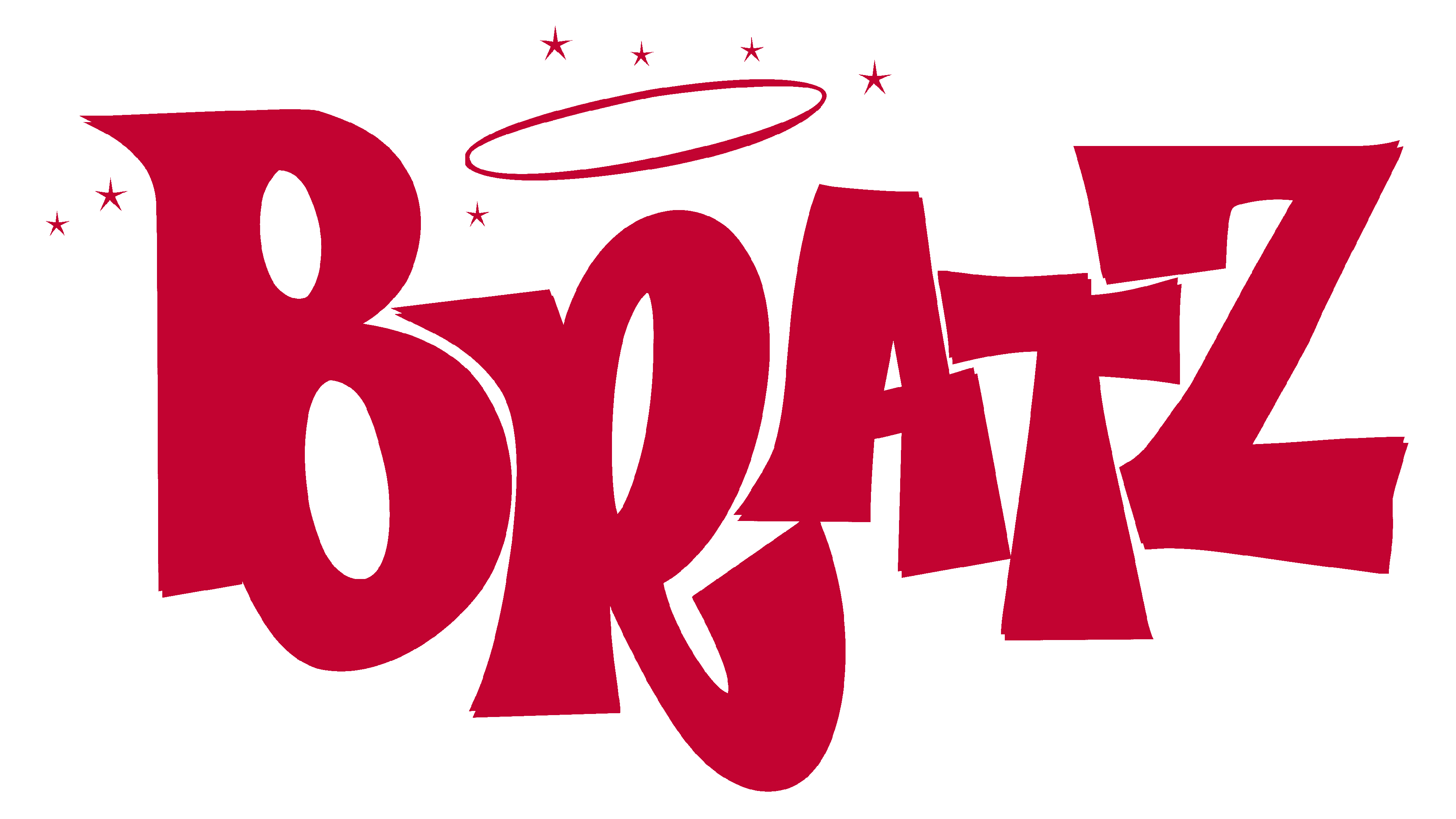
2001 – 2009
![]()
Angular, capitalized, and randomly placed letters are just as bold and daring as the dolls of the brand. The pink color of the emblem is quite stereotypical, but the brand surely knew what it was doing. The pink letters had a golden outline with a shadow. A unique detail of the logo is the golden halo above the “R”. Despite looking quite daring, the girls were depicted as good and innocent.
2007
![]()
This is one of the logos that stood out from somewhat similar other versions. It is done in a very saturated and bright pink color. The only element that connects it with the earlier logo is the fact that the logo consists of a name and a halo above the “R” ” When it comes to the font, the designers chose rounded strokes that had highlights and shadows that gave the characters an appearance of volume. In some way, they made an association with the curves and glamourous appearance of the Bratz dolls.
2010 – 2012
![]()
The original logo was brought back with a few modifications. First of all, the shadow was replaced by a black outline that was the same thickness as the golden outline. This made the brand and its products look more confident and allowed the letters to stand out better. The pink color was pretty close to the original but slightly muted.
2012
![]()
Although this version was used for a relatively short period, it looks glamorous and is a perfect match for the dolls sold under the Bratz brand. The pink color was replaced by sparkly golden. The pink was not completely gone and replaced the golden outline around the letters. It is also worth noting that the space between the strokes was filled with black color, making the letters pop even more. Such a logo surely stood out on the shelves of the stores, ads, and other media.
2013 – 2014
![]()
This time, the designers went pretty far from that glamourous girly look. It is done in a black-and-white color palette, which could have been the brand’s attempt to create a more timeless and universal logo. The font somewhat resembles the font used in the Barbie logo, but the strokes are more uneven and look handwritten. The only thing that connected this logo to the familiar brand image was the halo. Surprisingly, it was enough to make it recognizable.
2015 – 2017
![]()
The familiar Bratz inscription was brought back, but it now had a different feel. The golden color was used only for the halo, which was placed directly on the “R” for the first time. Here, the designers used purple for the inscription. Instead of adding an outline, they added a white base that repeated the shape of the inscription. A light shadow allowed it to stand and even look like a sticker. There was also a new small, yet noticeable detail. It was a drawing of puffy, pink lips that also had a white outline and were added in the lower right corner, slightly overlapping the inscription. It was not hard to guess that these lips belonged to Bratz dolls.
2018 – Today
![]()
This logo looks familiar and that is not surprising. It is exactly the same logo as the one introduced in 2001 and used for several years straight.
Font and Color
With the exception of two logos, the Bratz logos all feature the same font. It is Funkhouse Regular font. This a bold and stylish font with daring, pointed strokes and no serifs. The other font was cursive, looked more rounded, and had some volume. The other font resembled the font used for the Barbie logo but it had a more handwritten appearance.
The color palette was predominantly pink and golden with just a bit of black for accent. There was also a predominantly golden version as well as a more daring black-and-white logo. For around two years, the company also used purple instead of pink. It is a sophisticated and powerful color. The pink and golden leave no doubt that the main target of the brand is girls.