Ryanair Logo
Tags: flights | Ireland | Irish airline | low-cost
Ryanair is one of the largest airlines in Europe, with over 400 planes covering 40 countries in Europe, the Middle East, North America and more. It’s an Irish low-cost company that initially offered short-distance flights between the UK and Ireland. Since the 90s, it’s been reorganized into a more commercially viable services provider, which ultimately made it one of the most successful such firms in the world.
Meaning and History
Ryanair was created in 1984 by one T. Ryan, hence the name. Ryan is one of the most common Irish names, which contributes to the brand’s recognition. The company has long been using traditional Irish symbols, including a golden harp (the national emblem of the country) and the dark blue color.
What is Ryanair?
Ryanair is a low-cost Irish airline created in 1984. Originally offering short-distance flights between the UK and Ireland, it’s now one of the biggest airlines in Europe and the world.
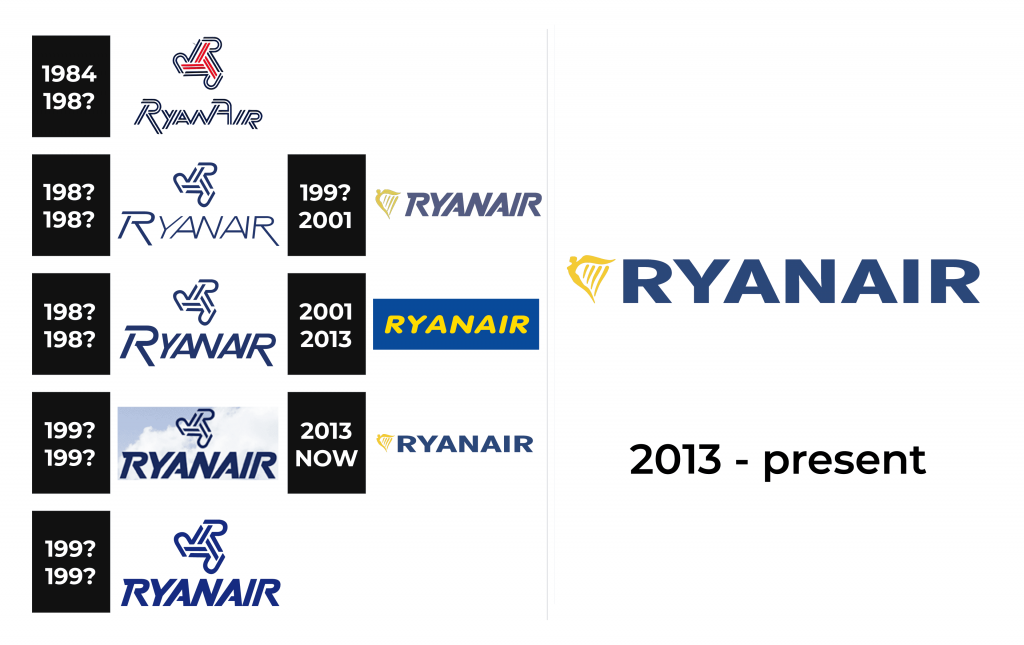
1984 – 198?
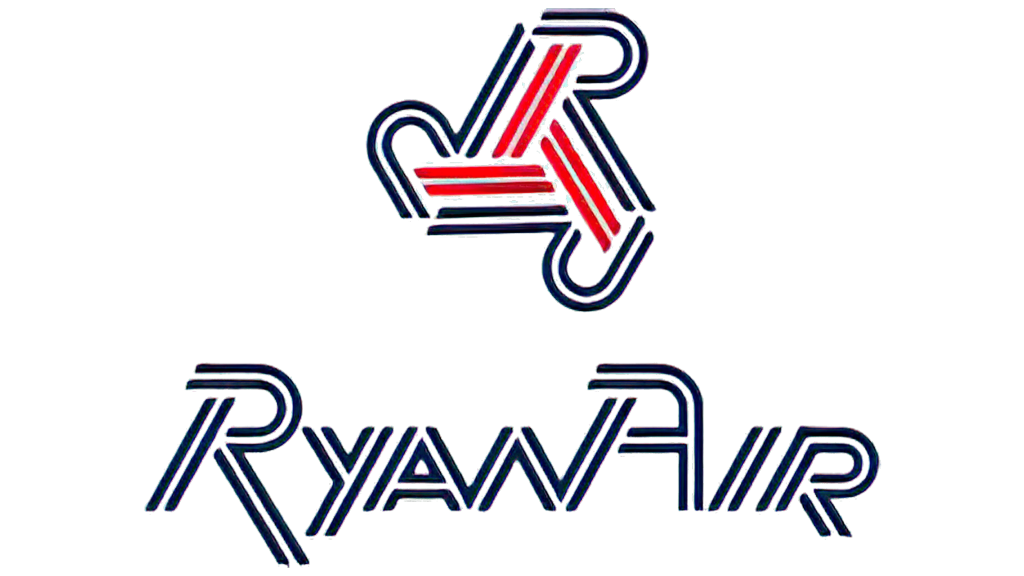
The original logotype consisted of an emblem and a wordmark.
The emblem is supposed to resemble a triskelion, a typical Celtic symbol consisting of three round objects typed together in the middle. Instead of the usual round elements, the triskelion parts look like the tails of a plane. The entire thing is depicted using double lines: red in the center, dark blue on the outside.
The word ‘RyanAir’ (written in displayed) is also depicted using these double lines. The coloring is fully blue. The letters are somewhat titled to the right, but the overall font is seemingly a sans-serif style. All of these letters are big and capitalized, but some are smaller than others. The lines are supposed to represent the runway markings.
198? – 199?
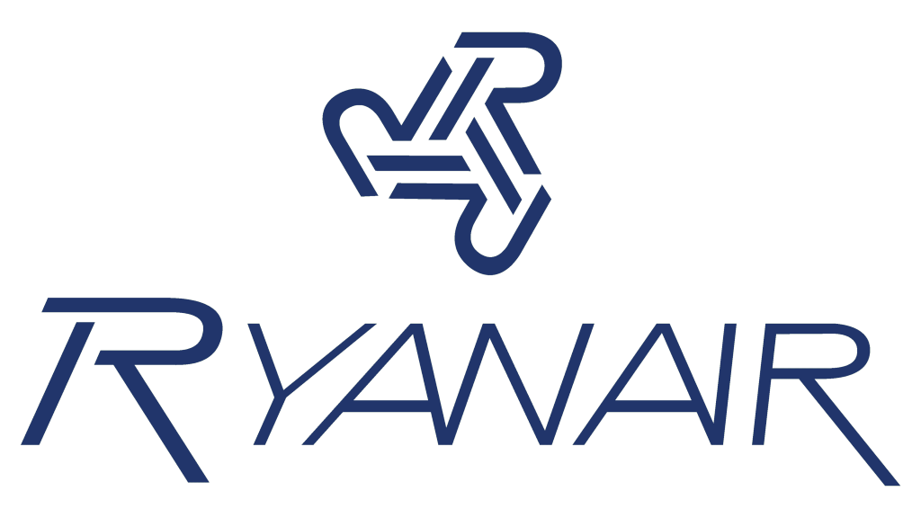
The airline introduced a monochrome version of its logo. It preserved the “R” emblem but turned the double line into a single. The full name was also written using a single line with the first letter being larger and bolder. The font used to write the name resembles Simplicity Oblique JNL by Jeff Levine. It looks polished and refined. The font has some similarities with the previous one as the “R” has an elongated leg and the “A”s are connected at the bottom to the next letter.
198? – 199?
The updated logo looks almost identical to the previous version. The main difference is that all letters are bold here, having noticeably thicker strokes than the “R” in the previous logo. There were also minor modifications to the font itself. The curve of the “R” was wider vertically, while the “Y” and “A” were not as wide. With the exception of the “A”, all the letters were italicized.
199? – 199?
The logo was modified, but once again not drastically. First of all, they added a blue sky with light, white clouds, which is a very appropriate image for an airline. The font looked different yet the inscription remained instantly recognizable as the overall image looked very similar. The major alteration was the fact that all letters were now the same height and the inscription no longer had “R”s with an elongated leg. The “R” emblem was made slightly smaller in this version, which put an accent on the name.
199? – 199?
The blue sky in the background was gone, but the logo otherwise stayed the same. To compensate for the lack of background, the “R” emblem was made larger again. There was another minor change – the color got one shade lighter, creating a more airy image.
199? – 2001
In 1987, a classic Ryanair logotype was introduced. The two elements are now depicted side-by-side, and the triskelion bit was replaced with the now-iconic harp image. It’s a simplistic design, depicting the harp with four strings of varying width, with the frame molded into a woman’s likeness (a humanized image of the country). The image is colored pale gold, like in various media depictions.
To the right, the word ‘Ryanair’ is written in all capitalized letters, tilted to the right. The color is still dark blue, but now much paler. The font is overall a sans-serif, but it has several artistic depictions that make it very unlike the usual typographic fonts. The characters are overall clean and elegant.
2001 – 2013
The 2001 logo is a much simpler design. The colors are now a lot brighter: a regular blue rectangle with striking yellow letters inside. The letters slightly tilted, capitalized and use a noticeably rounded sans-serif style. They are also further apart from one another compared to the previous version.
2013 – today
The 2013 design reintroduces many of the similar elements from the 1987 logotype. The harp bit is much smaller, but is overall identical (except for the much brighter yellow coloring). The wordmark to the right, however, uses a much simpler font with upright letters. They are still capitalized, but the font is just a regular typographic variety. The coloring isn’t as pale, but it’s still pale enough.
Font
Ryanair used a plethora of different fonts throughout the years. The most recent variety introduced in 2013 is a very simple typographic sans serif with fully upright characters. They are bold, linear and rather wide.
Color
Ryanair has largely used the Irish national colors throughout the years, except for the initial logo design. It doesn’t mean the mainstream green and orange, but the much older and culturally significant dark blue and yellow. Dark blue is typically used for the letters, whereas the yellow gold is used for the harp emblem.
