American Airlines is a 1930-established company operator of passenger and cargo flights across the United States and the world. It plays an important role in the aviation industry, flying to over 300 destinations with a fleet of 900 planes. It has also created Oneworld, one of the three largest alliances of airlines today.
Meaning and History
American Airlines has a storied history that spans over nine decades, filled with pioneering achievements and a commitment to aviation excellence. The airline took flight in 1930, starting on a remarkable journey that would shape the future of air travel. From its humble beginnings as a small mail and passenger carrier, American Airlines has grown into a global aviation powerhouse, connecting people across continents.
American Airlines has been a trailblazer in the industry, constantly pushing boundaries and embracing innovation. It played a pivotal role in the advancement of aviation technology, introducing groundbreaking aircraft and pioneering new routes. The airline’s dedication to safety and efficiency has earned it a reputation as a trusted and reliable carrier.
Over the years, American Airlines has expanded its network, offering passengers access to a wide range of destinations worldwide. Through strategic partnerships and alliances, the airline has created a seamless travel experience, allowing passengers to enjoy convenient connections and a global reach.
As American Airlines continues to soar to new heights, it remains committed to providing exceptional customer service and a memorable travel experience. Let’s now explore the captivating logotypes that symbolize the essence of American Airlines, embodying its spirit of adventure and its unwavering commitment to connecting people and cultures.
What is American Airlines?
American Airlines is a globally recognized cargo and passenger transferring air company that operates since 1930. This is the largest airline in the world, with 900 planes flying to 300 destinations. Its main office is based in Dallas, Texas.
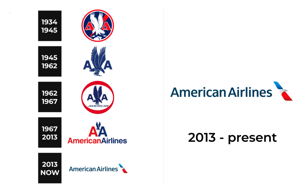
1934 – 1945
The earliest logotype of American Airlines was a circle with a bold outline. It contained an image of an eagle with its wings widespread upwards. The bird has been crossed by a diagonal line, dividing the circle in two, and placed between two characters ‘A’. At the circle’s bottom, there is a part of the Earth’s globe. The iconic black, red & white color scheme of the American flag was a part of the logo.
1945 – 1962
The next logotype featured the familiar eagle, looking right instead of left. It was still between two letters ‘A’, which changed their script: previously, it was a bold sans-serif with the right bars thicker than the left ones; in the 1945 redesign, it was a simple serif-free typeface with angular edges.
The entire color code was blue on a white backdrop.
1962 – 1967
The 1962 brand mark contained a circular frame with the upper and lower edges thickened. Inside it, the image of an eagle between two symbols ‘A’ from the previous logo found its place. It stood on a white backdrop.
1967 – 2013
At the end of the 60s, the American Airlines brand design team made a logotype that had been in use for about 50 years. It featured a minimalist nameplate, written in a simple serif-free font with the first letters of each word capitalized. The word ‘American’ was red, while the part ‘Airlines’ was blue. Respectively, the two capitals ‘A’ above them were red and blue. Between them, as before, was an eagle. At that time it was composed of two stylized bars crossing each other.
2013 – today
The latter logotype depicts the familiar name caption in a lightened color code. It stands on the left flank of the logo – a diagonal bar split into two gradient blue and red halves by a minimalistic head of an eagle.
Font
The typeface, used to write the brand’s name is quite traditional. It has semibold characters with small inter-letter gaps.
Color
Since the start, the company has been using the traditional colors of the American flag: blue, red, and white. In the latter logo, they use two types of blue: simple dark blue for the name and gradient blue upper part of the emblem. The background and the eagle’s head are white, and the bar’s lower section is red.


