Young Men’s Christian Association is a youth volunteer organization and one of the largest in the world. Officially not associated with any church or government, the organization’s main goal is the instilment of Christian values in young people. In the United States, the organization often helped people from rural areas settle in the city, giving them temporary housing and work. Almost every organization runs children’s and youth camps, practices scouting and international exchanges, various trainings, and more. Many cities have their highlights – theaters, children’s studios, youth centers, and even hostels.
Meaning and History
![]()
It was way back in 1844 when Englishman Sir George Williams founded the YMCA. It first united Williams’ close acquaintances and colleagues, and one of the first to join the organization’s activities was his father-in-law and employer George Hitchcock. In 1894, for his charitable work that contributed to the healing and strengthening of England, George Williams was knighted by Queen Victoria and became Sir Williams. Now, the concept of the organization has changed somewhat, and in many countries, the YMCA is simply called “Y” so as not to limit other religions.
What is YMCA?
The YMCA is the largest and oldest youth movement with over 60 million members in over 130 countries. In North America, they are best known for their hostels for young workers. They own hotels, sports complexes, and clinics. They also do summer camps.
1881 – Present
![]()
The first logo of the organization had many details and looked like the designer put a lot of thought into it. In the center, it featured the Bible with the John 17:12 verse. Behind, it had “XP” printed using bold serif letters, symbolizing Christ’s name. it also had rays of varying lengths coming from the center. It was surely meant to represent the enlightenment the organization desired to bring. The black, thick border had all the continents printed in white, serif font. This was another way to show that the organization does not discriminate and brings all the people together. This is further confirmed by an inscription outside the round emblem that says “World Alliance of YMCAs”.
1891 – 1895
![]()
A more familiar triangular shape pointing down appeared in 1891. It was drastically different from the earlier version as the logo literally consisted of a red triangle with a white center. There was also a word on every side of the triangle. These inscriptions were meant to symbolize the main aspects that the organization strived to develop in every individual. The simplicity of the font choice and the overall design make it clear that the organization wants to make one’s life better and easier.
1895 – 1897
![]()
This logo is a combination of the previous two versions. It has a red triangle and also features the Bible with a verse and large “XP” initials in the background. The whole emblem has a light border in the form of a white line outlined by two thin black lines. The designers were able to successfully combine the main values of this organization.
1897 – Today
![]()
It looks like a simpler version was easier for the organization to use internationally. First of all, it was easier for people to read and comprehend the sign. In addition, it did not refer to the specific values and beliefs of the organization, which showed that it opens doors to everyone who desires to help others and receive help and grow as an individual.
1967 – 2014
![]()
The logo features the acronym ‘YMCA’ in a bold, sans-serif typeface. The letters are black, creating a stark contrast against a white background, ensuring strong visibility and a modern aesthetic. What distinguishes this logo is the red triangle placed within the ‘Y’. The triangle is oriented with its point downwards, and its color is a bright red, which stands out prominently against the black text. This red triangle is historically significant in the YMCA logo, representing the organization’s focus on the development of body, mind, and spirit. The logo’s clean lines and simple color scheme convey a sense of clarity and straightforwardness, reflecting the organization’s commitment to inclusivity and community service.
1967 – Today
![]()
The designer preserved the color palette of the emblem but gave it a completely new spin. The logo was now just a letter “Y”, which is what the organization was referred to as lately in an effort to not discriminate against non-Christian members. The designer was able to incorporate the familiar red triangle making it the right diagonal stroke of the letter. It was a very creative and successful design that is still used by the organization.
2010 – Today
![]()
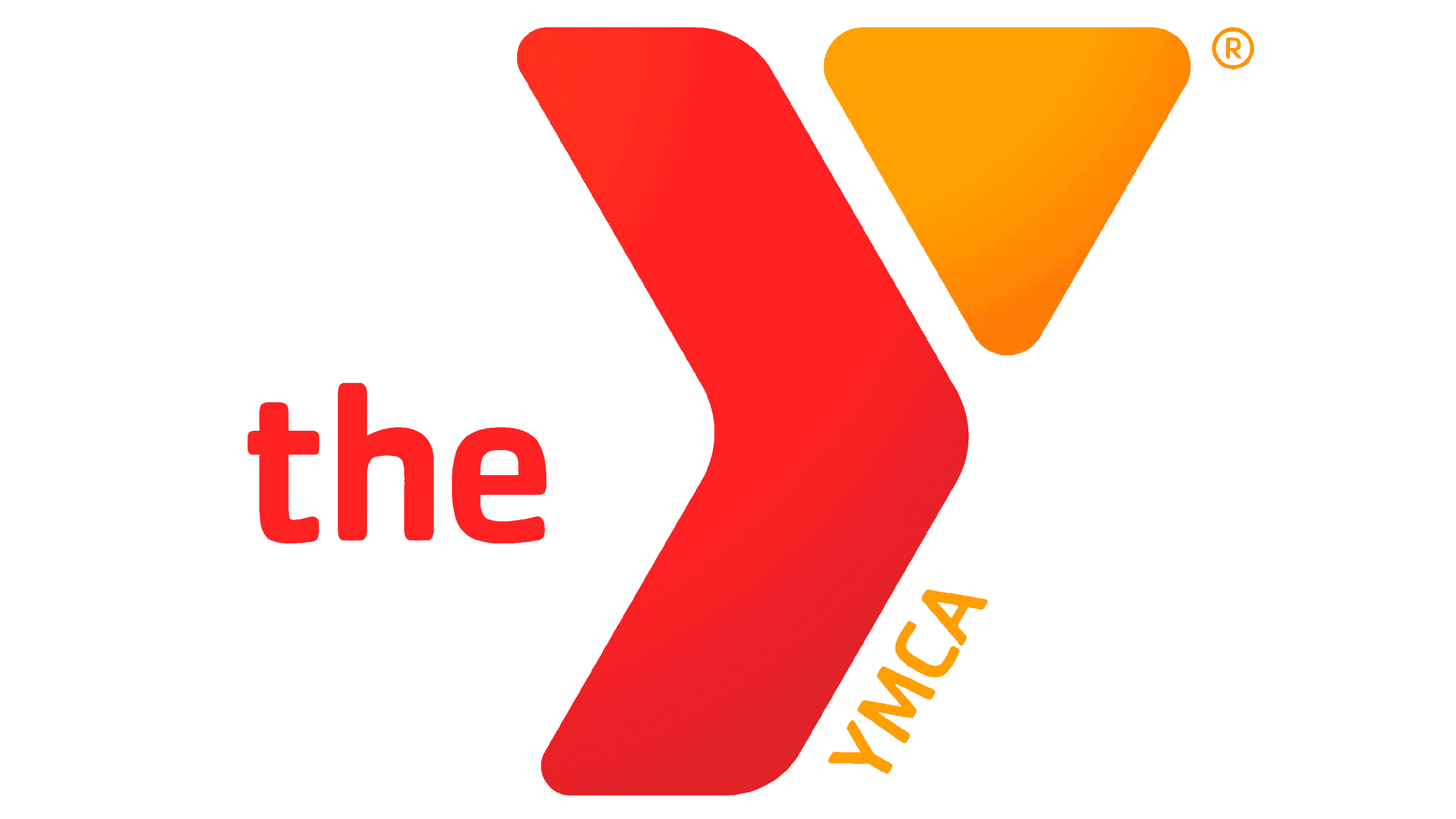
The “Y” symbol is now completely black with the red triangle becoming a solid shape. The rounded corners give it a friendlier appearance and make it seem more approachable. The logo also had new elements in the form of an article “the” to the left of the vertical leg of the “Y” and “YMCA” running along it on the right. This emblem turned out very stylish, modern, and youthful.
2014 – Today
![]()
This logo, while similar in representing the same four letters ‘YMCA’, adopts a different stylistic approach. This rendition is also in black but each letter has been given a unique three-dimensional effect. The letters appear interconnected, with shadows cast in a manner that creates depth, suggesting the interconnectedness of the YMCA community. This logo’s design suggests solidity and foundation, symbolizing the organization’s established presence and strength in bringing communities together.
Font and Color
Throughout the years, the organization used a bold red and black color palette. In some versions, these colors were used on their own, which further enhanced their image. The black color looks sophisticated, classic, and formal. The red color, on the other hand, added a powerful touch that instantly attracted the attention. The red color symbolizes activity, love, and joy.
The original emblem features an elegant font with bracketed slab serifs. It was very appropriate for those times. All the other logos feature simpler, sans-serif fonts with clean, straight lines. It was a more universal font that allowed the logo to be easily readable by people across the globe.